![]()
2020 • Apple
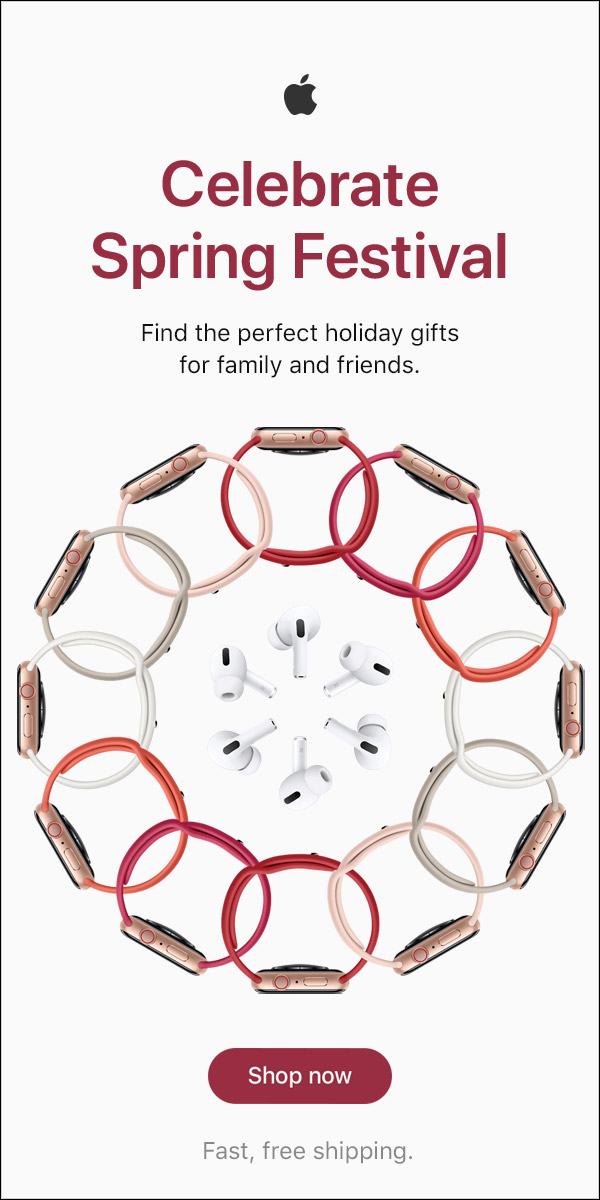
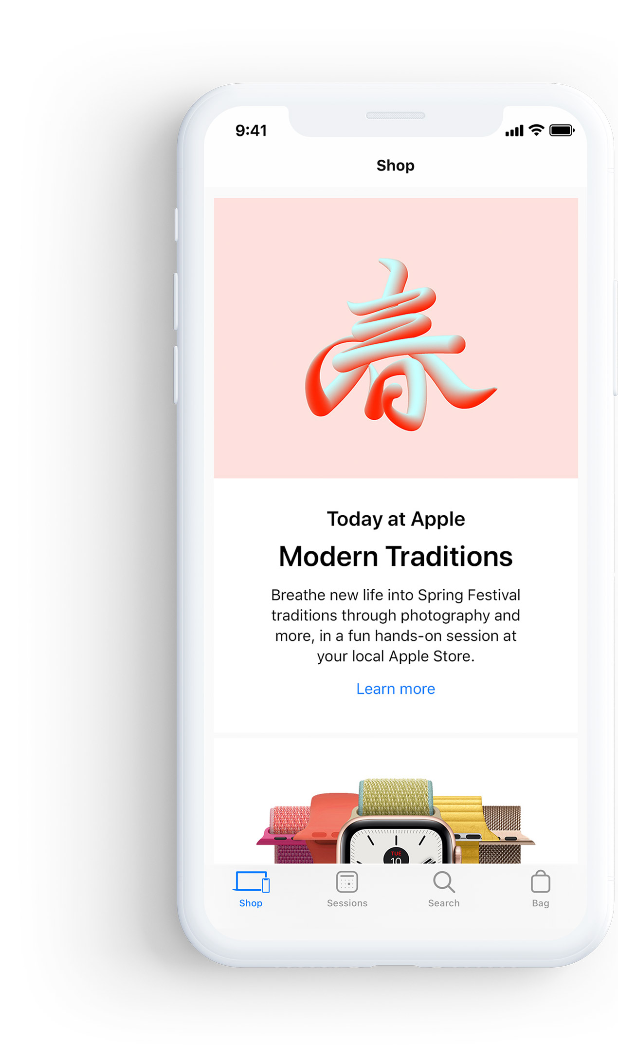
Celebrate
Spring
Festival
• Product Design & UI / UX
2020 • Apple
Celebrate
Spring
Festival
• Product Design & UI / UX
![]()
![]()
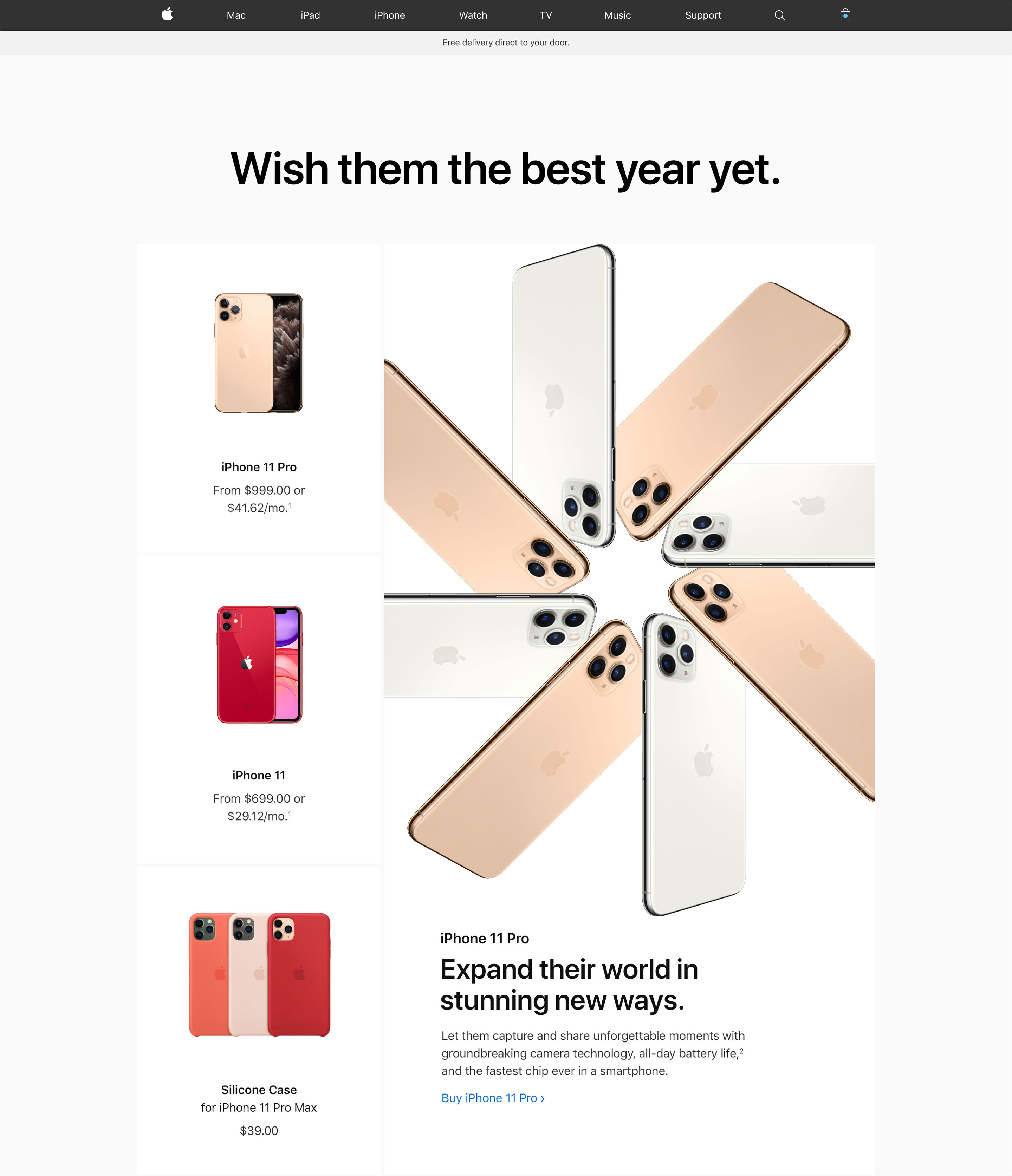
Wish them the best year yet.
![]()
Wish them the
best year yet.
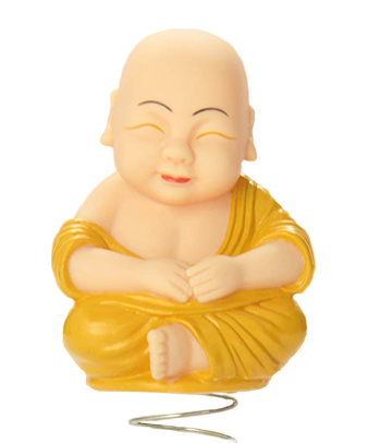
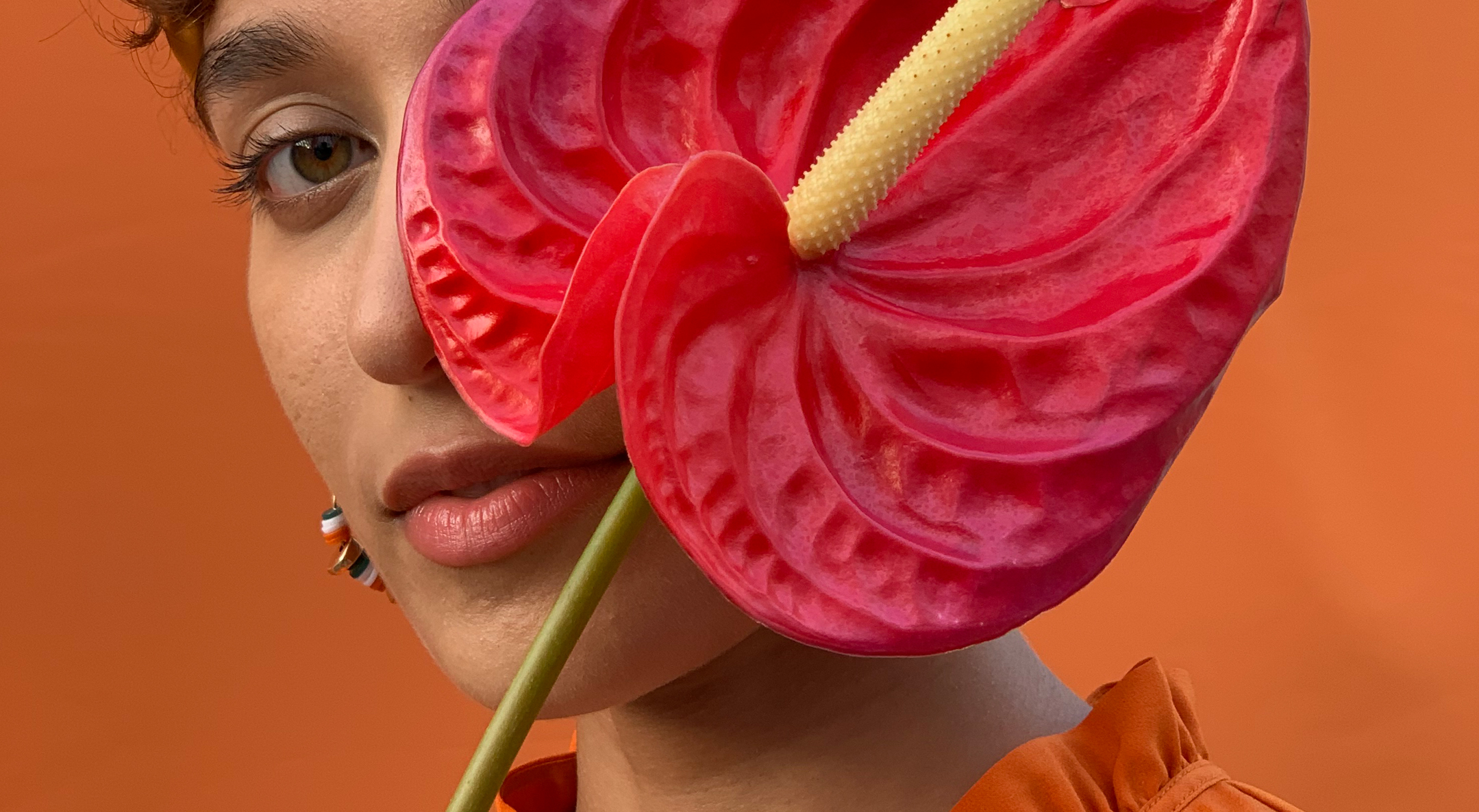
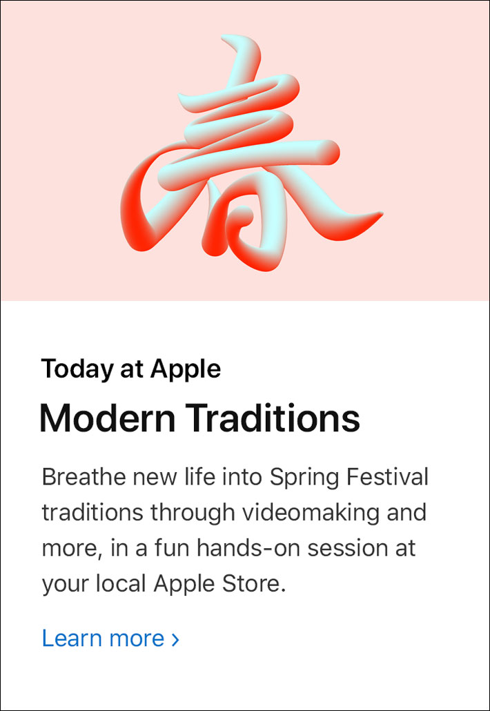
The goal for this project was to conceptualize and create a landing page around the Chinese New Year holiday. This landing page showcases specific Apple products promoting to customers in China and other surrounding countries. Chinese New Year is a festival that celebrates the beginning of a new year on the traditional Chinese calendar. The festival is usually referred to as the Spring Festival where Chinese families gather for their annual reunion dinner, lighting firecrackers and giving money in red paper envelopes. Each year there is a represented zodiac animal attributed that is repeated every 12 years. This year is the Year of the Rat.
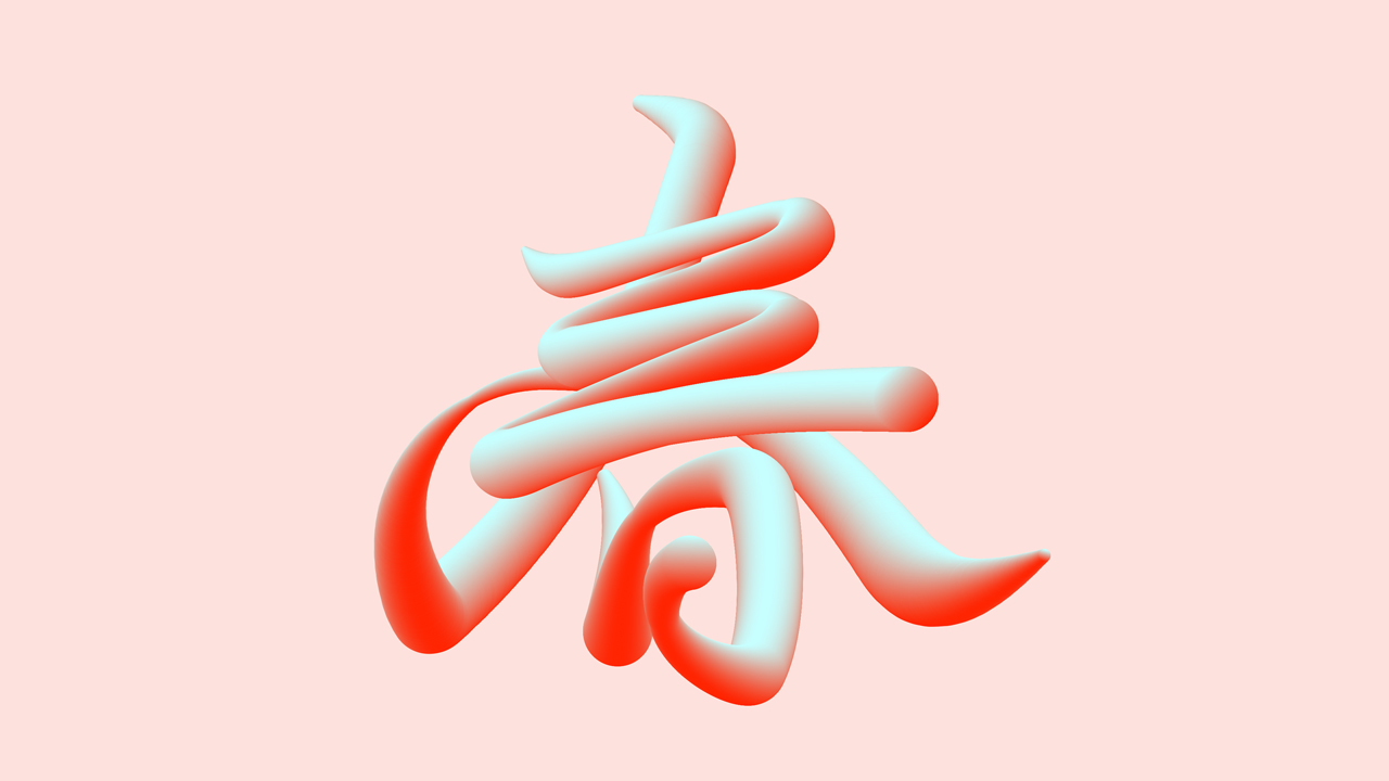
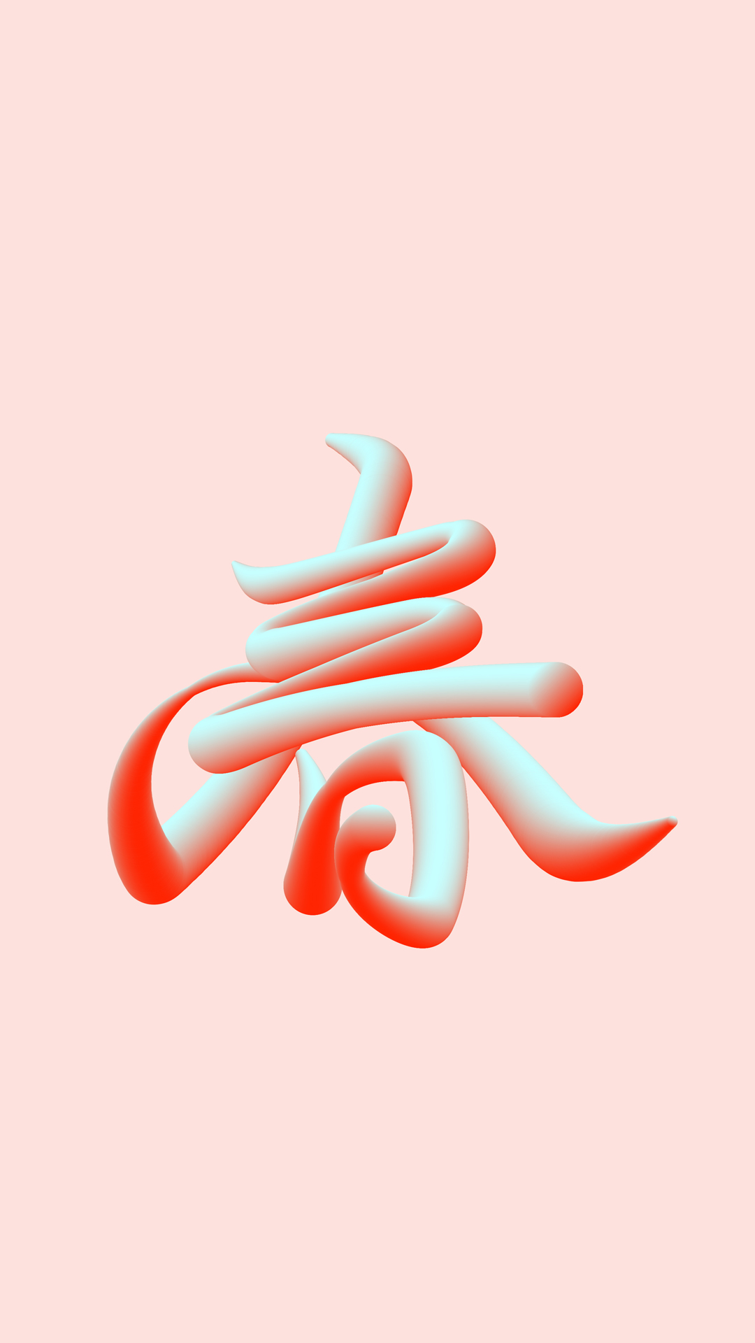
Every year Apple creates a Landing Page as well as other assets including emails and banners that promote the Spring Festival. The page consists of new and existing promoted products that Apple suggest as the perfect gift. These products help and enrich users lives. For example, through Facetime, families can spend the holiday together, even if they are hundreds of miles apart. Typically Apple promotes their products using specific colors for the campaign that they are promoting and this project was no different. We focused on trying to pull colors that were similar to the Chinese flag, such as reds and golds.
The goal for this project was to conceptualize and create a landing page around the Chinese New Year holiday. This landing page showcases specific Apple products promoting to customers in China and other surrounding countries. Chinese New Year is a festival that celebrates the beginning of a new year on the traditional Chinese calendar. The festival is usually referred to as the Spring Festival where Chinese families gather for their annual reunion dinner, lighting firecrackers and giving money in red paper envelopes. Each year there is a represented zodiac animal attributed that is repeated every 12 years. This year is the Year of the Rat.
Every year Apple creates a Landing Page as well as other assets including emails and banners that promote the Spring Festival. The page consists of new and existing promoted products that Apple suggest as the perfect gift. These products help and enrich users lives. For example, through Facetime, families can spend the holiday together, even if they are hundreds of miles apart. Typically Apple promotes their products using specific colors for the campaign that they are promoting and this project was no different. We focused on trying to pull colors that were similar to the Chinese flag, such as reds and golds.
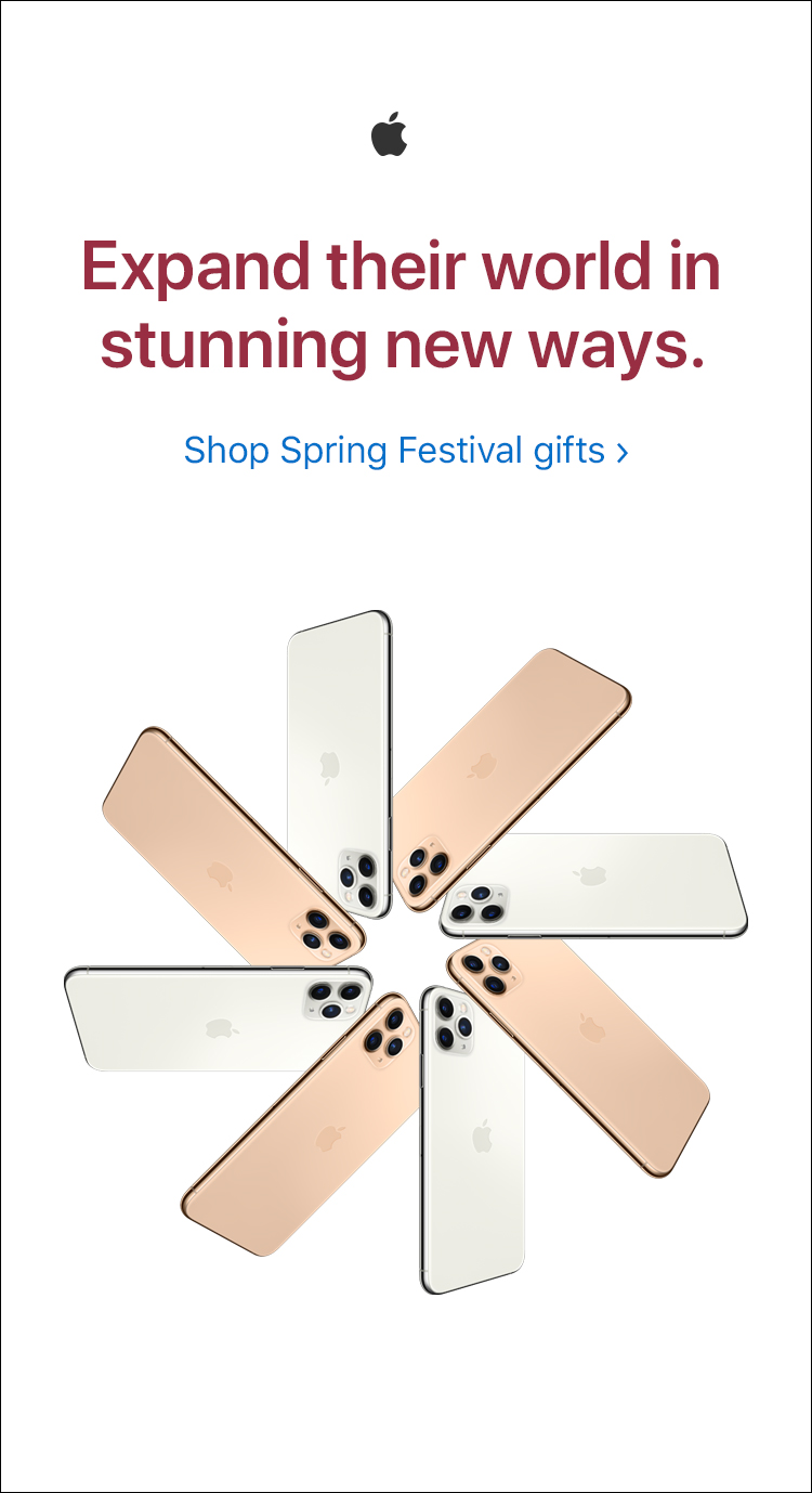
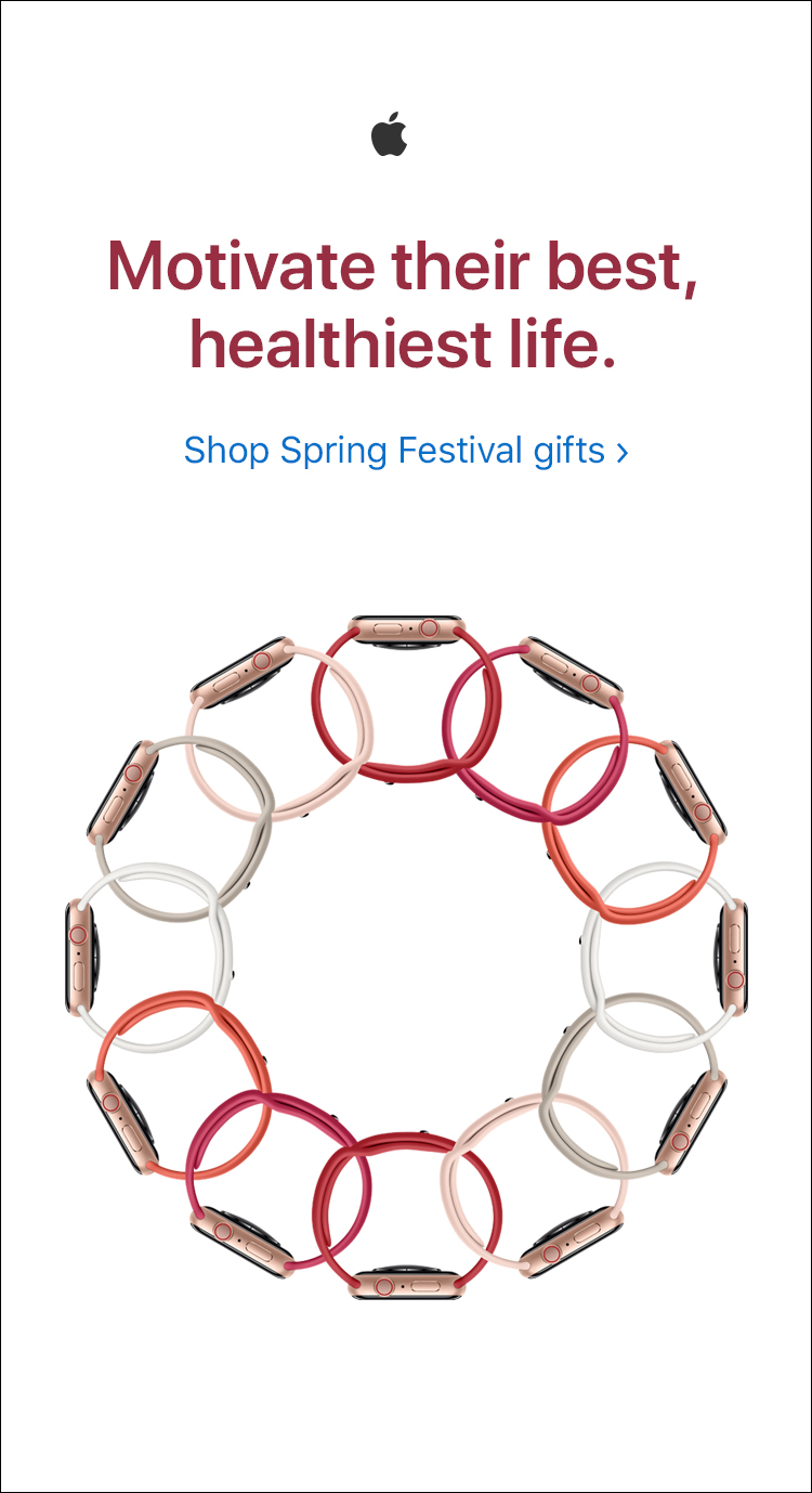
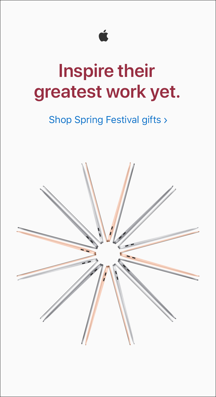
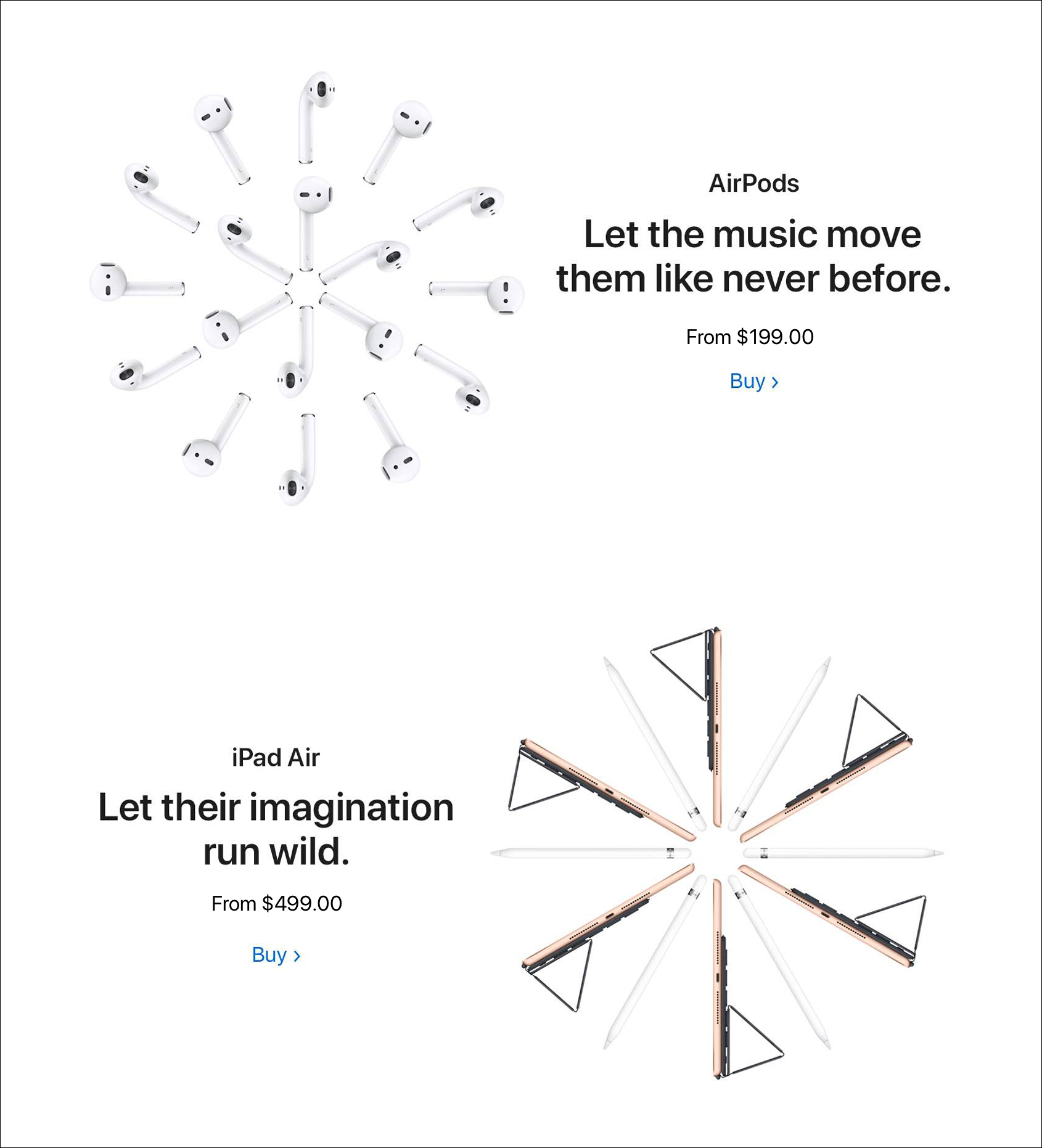
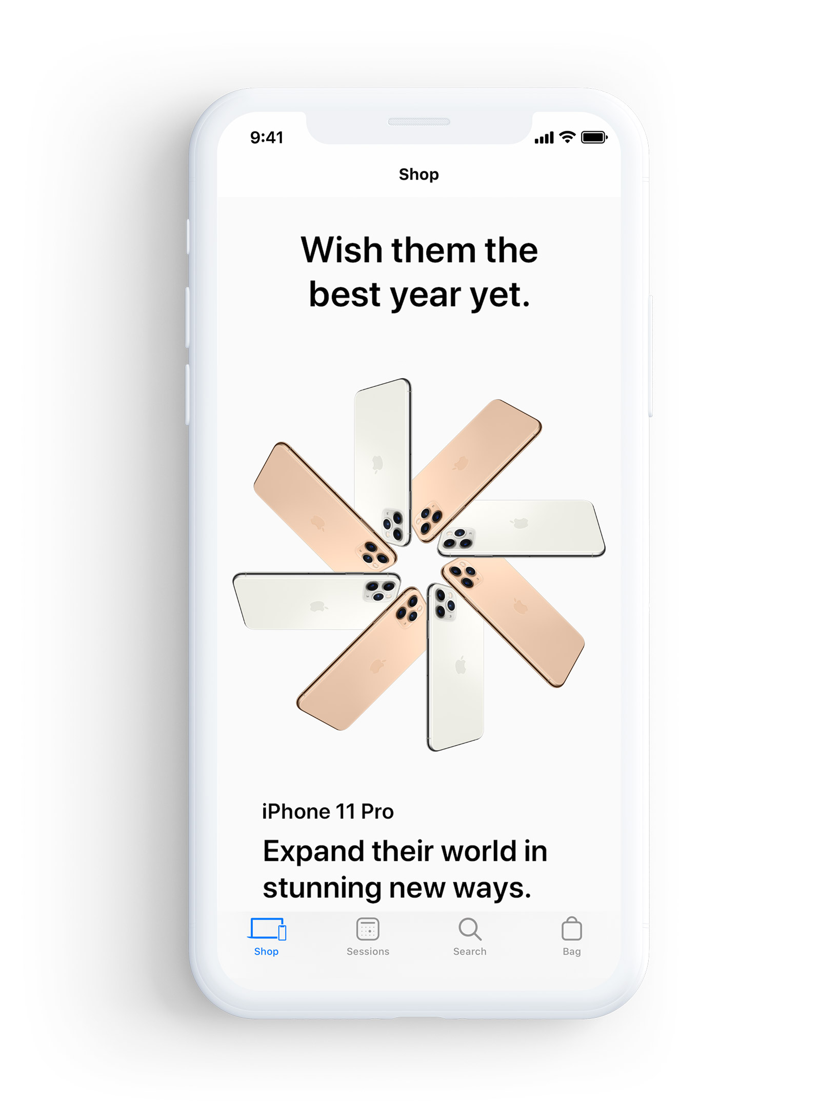
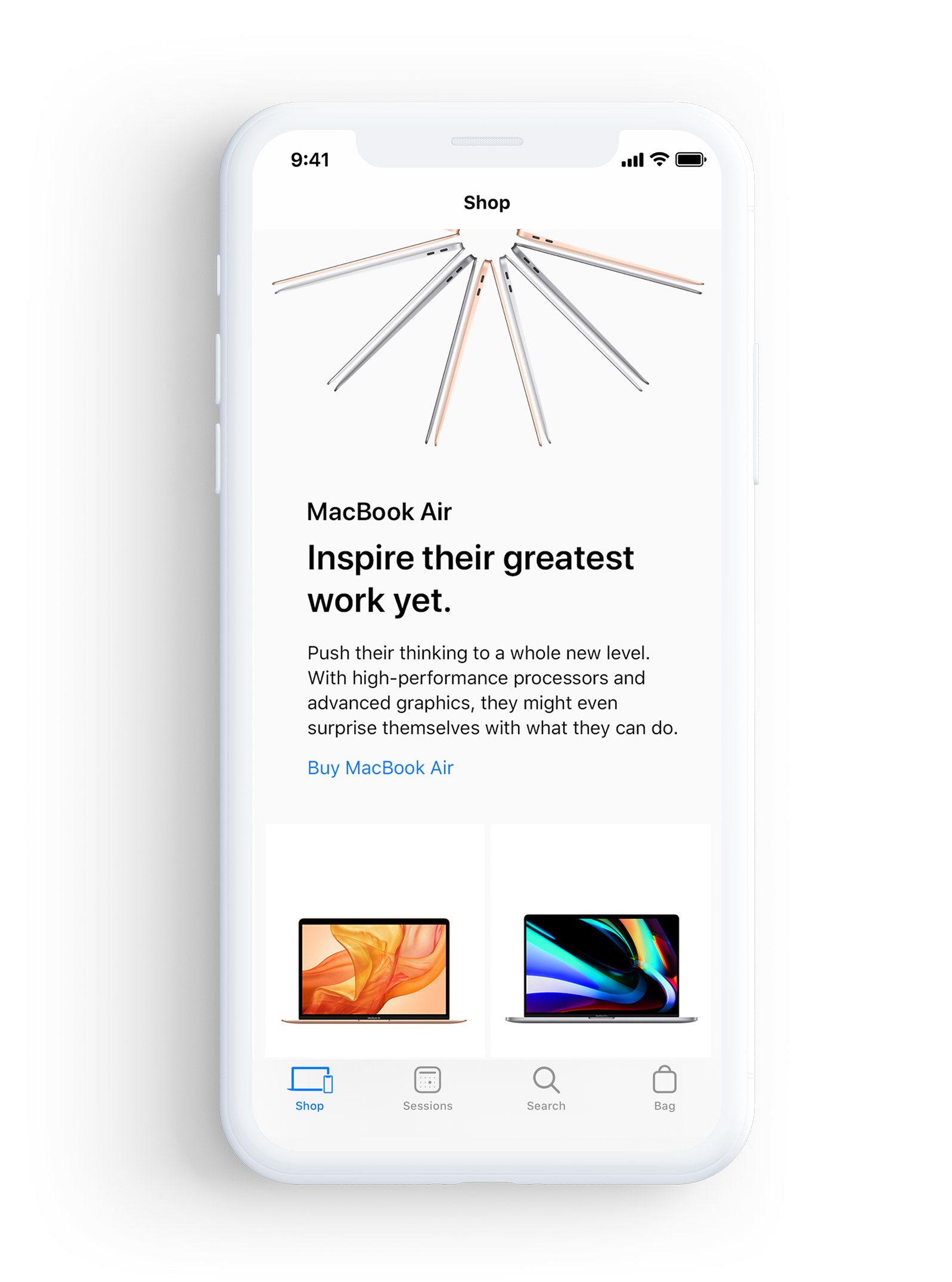
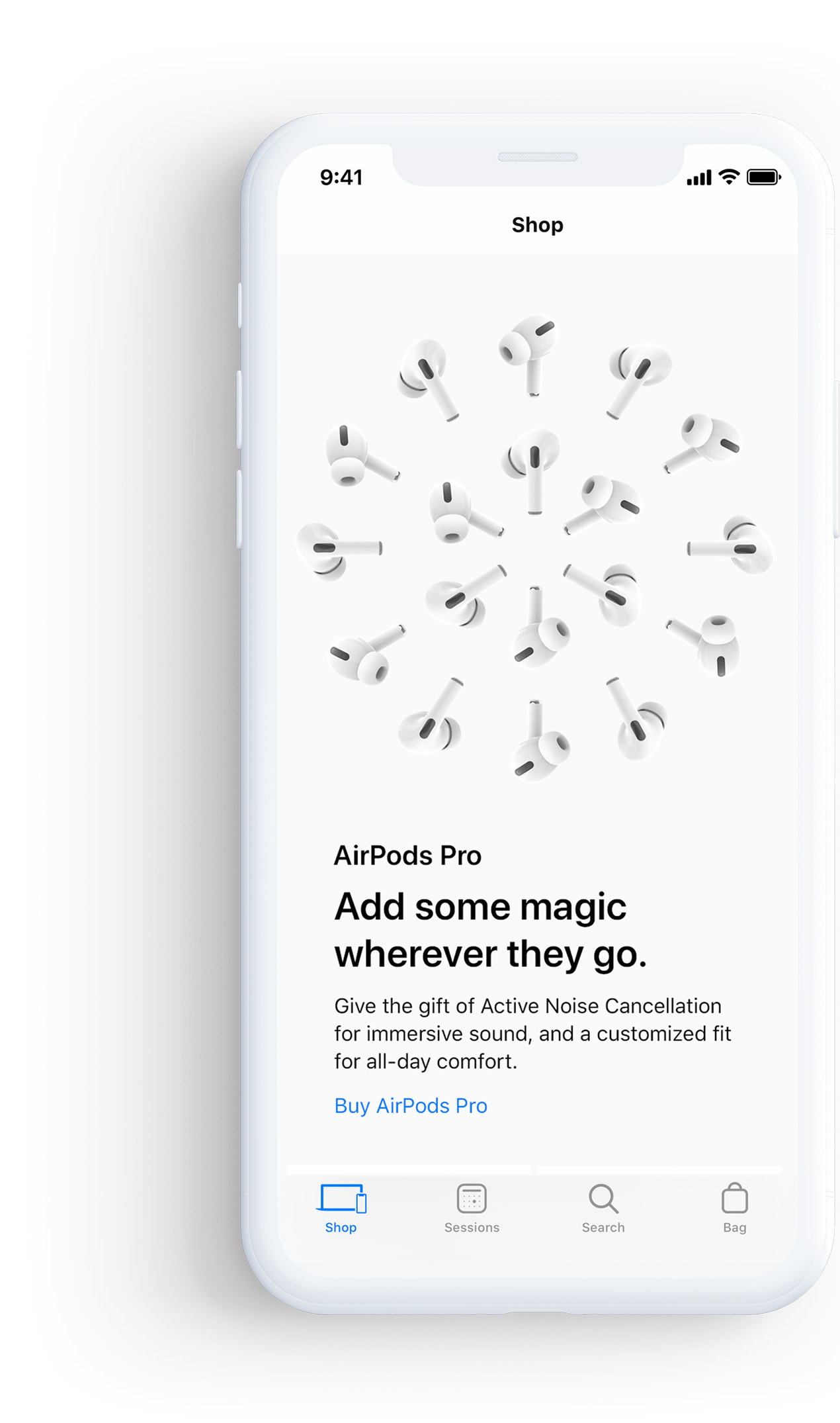
As one of the designers for this project I was able to conceptualize ideas for the layout of the landing page and other assets alike. This ended up becoming a very exciting part of the project for me. I was able to customize the page using new products such as the iPhone 11 and the AirPods Pro. Apple created several ‘snowflake’ like designs for various products that they wanted to showcase. This was not only for Spring Festival but for the entire 2019 holiday campaign. Once these snowflakes were created me and the designers on my team had the ability to take them and manipulate the art as needed.
As one of the designers for this project I was able to conceptualize ideas for the layout of the landing page and other assets alike. This ended up becoming a very exciting part of the project for me. I was able to customize the page using new products such as the iPhone 11 and the AirPods Pro. Apple created several ‘snowflake’ like designs for various products that they wanted to showcase. This was not only for Spring Festival but for the entire 2019 holiday campaign. Once these snowflakes were created me and the designers on my team had the ability to take them and manipulate the art as needed.
As one of the designers for this project I was able to conceptualize ideas for the layout of the landing page and other assets alike. This ended up becoming a very exciting part of the project for me. I was able to customize the page using new products such as the iPhone 11 and the AirPods Pro. Apple created several ‘snowflake’ like designs for various products that they wanted to showcase. This was not only for Spring Festival but for the entire 2019 holiday campaign. Once these snowflakes were created me and the designers on my team had the ability to take them and manipulate the art as needed.
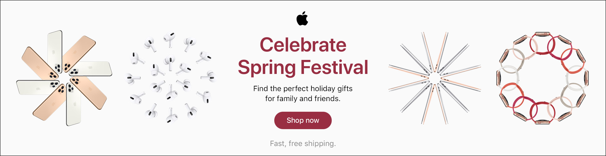
• BANNERS & TILES
A big part of this project was using the snowflake designs across different custom digital pieces. We created graphics that would tailor to individual products as well as creating graphics that encompassed several different snowflakes. For example, on some banners, we manipulated the art creating a snowflake with another one to showcase two products. Since each product is promoting a way to help the receiver of the gift, me and the design team worked heavily with copywriters to bring the story for each product to life.
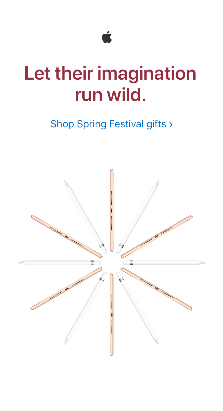
• DIRECT MESSAGES
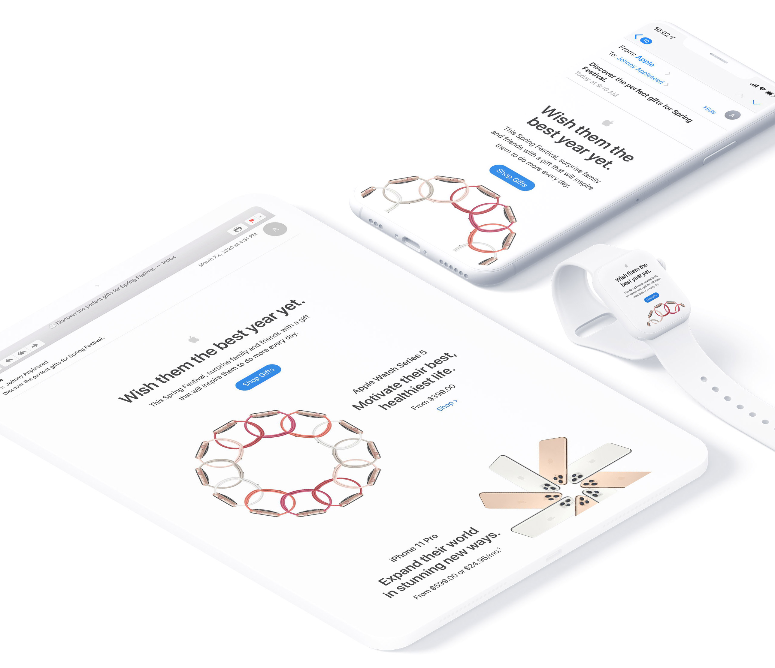
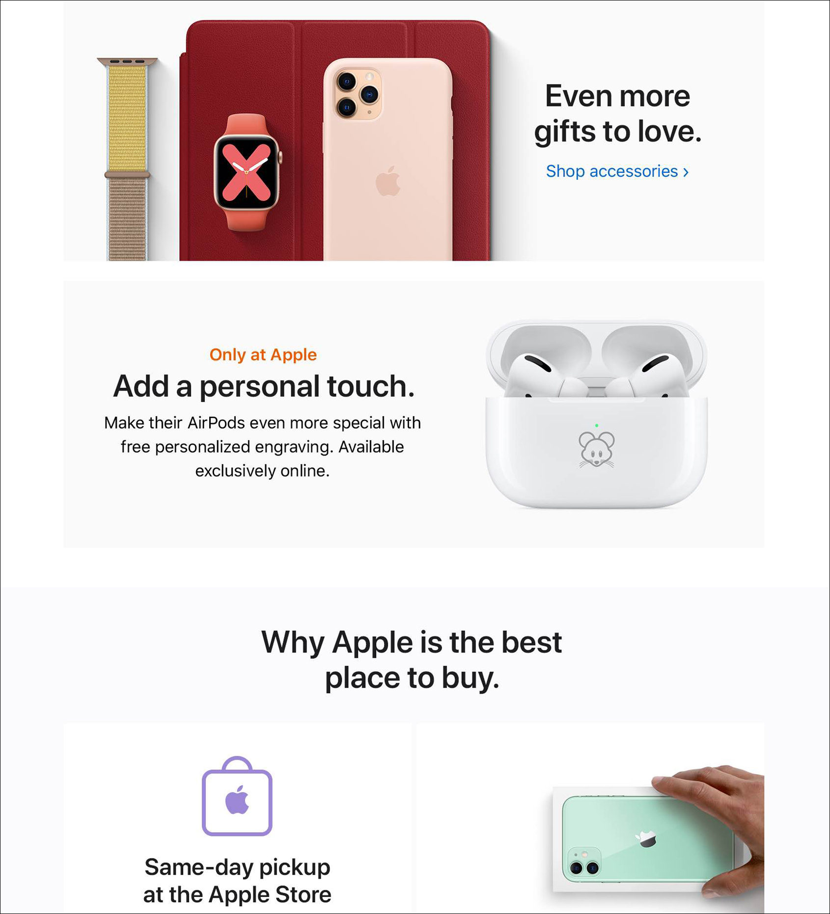
Emails are an essential asset for Apple because they generate a very high amount of revenue. Throughout the 2019 Holiday campaign there were several unique DMs showcasing not only snowflakes but specific special offers. For the Spring Festival DM, we had the ability to design something completely different. In the style of the Apple branding, we kept it minimal. The page consists of several large snowflakes, where users would be able to clearly see the beautiful design and be taken to a product detail page. This page would give them more information as well as the ability to purchase the product. This email was also a way to showcase other special offers such as the ability to personally engrave AirPods with emojis.
• DIRECT MESSAGES
Emails are an essential asset for Apple because they generate a very high amount of revenue. Throughout the 2019 Holiday campaign there were several unique DMs showcasing not only snowflakes but specific special offers. For the Spring Festival DM, we had the ability to design something completely different. In the style of the Apple branding, we kept it minimal. The page consists of several large snowflakes, where users would be able to clearly see the beautiful design and be taken to a product detail page. This page would give them more information as well as the ability to purchase the product. This email was also a way to showcase other special offers such as the ability to personally engrave AirPods with emojis.

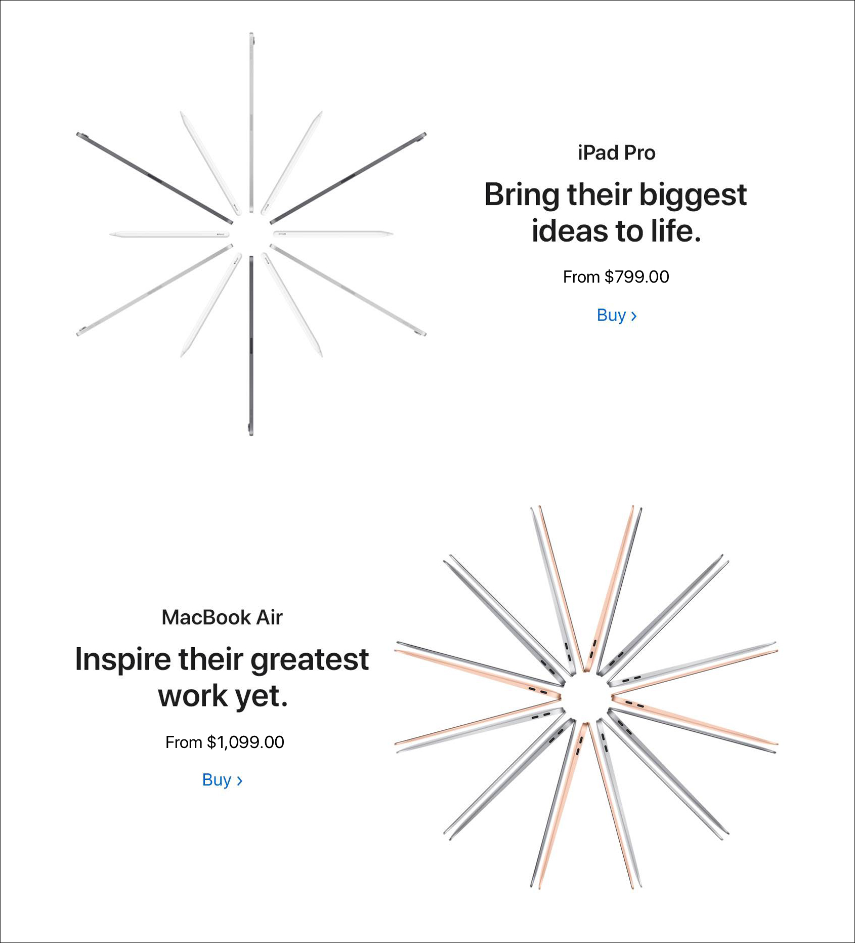
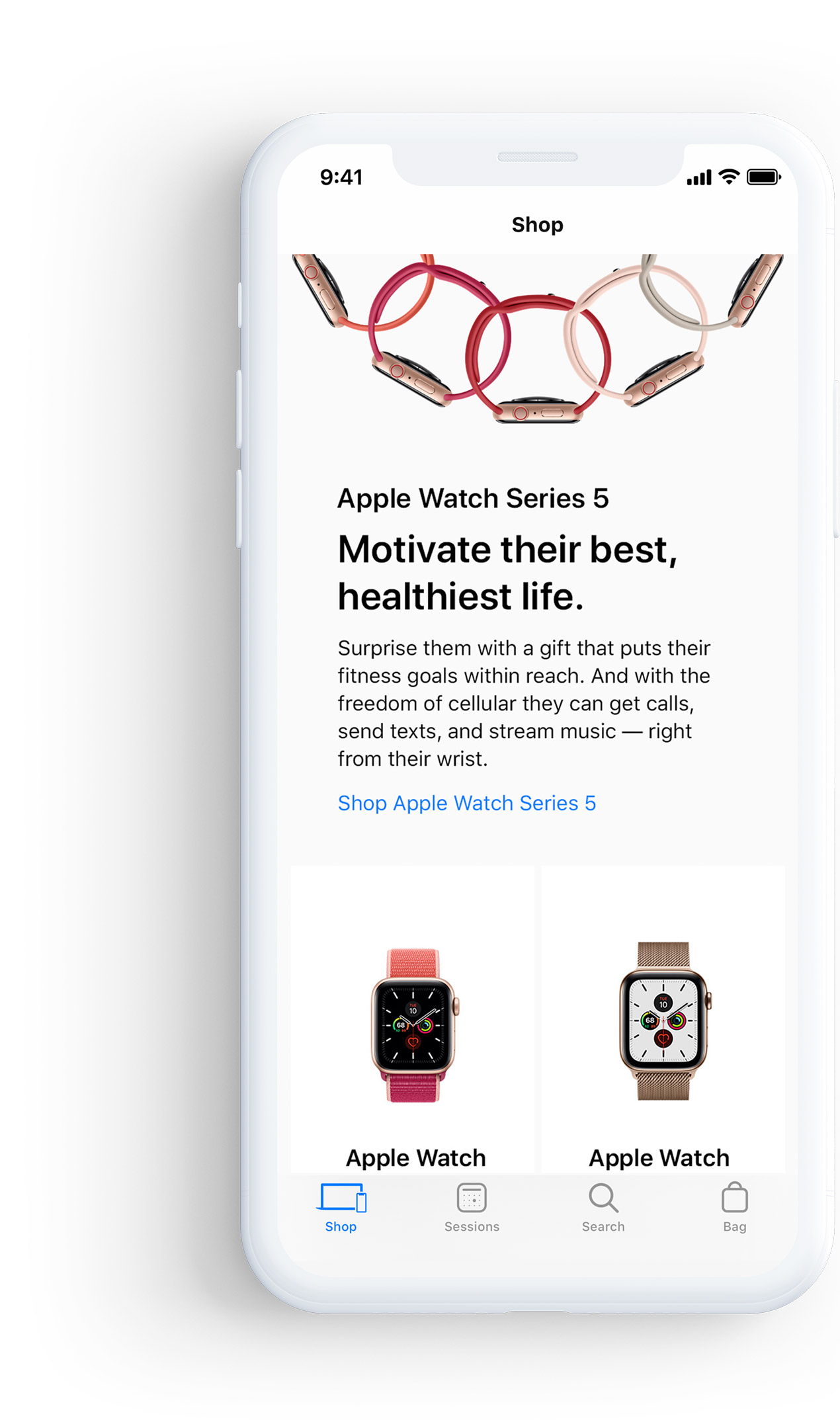
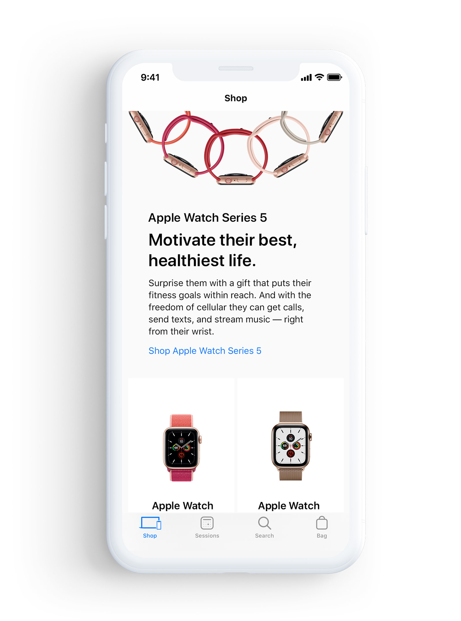
• WEBSITE DESIGN
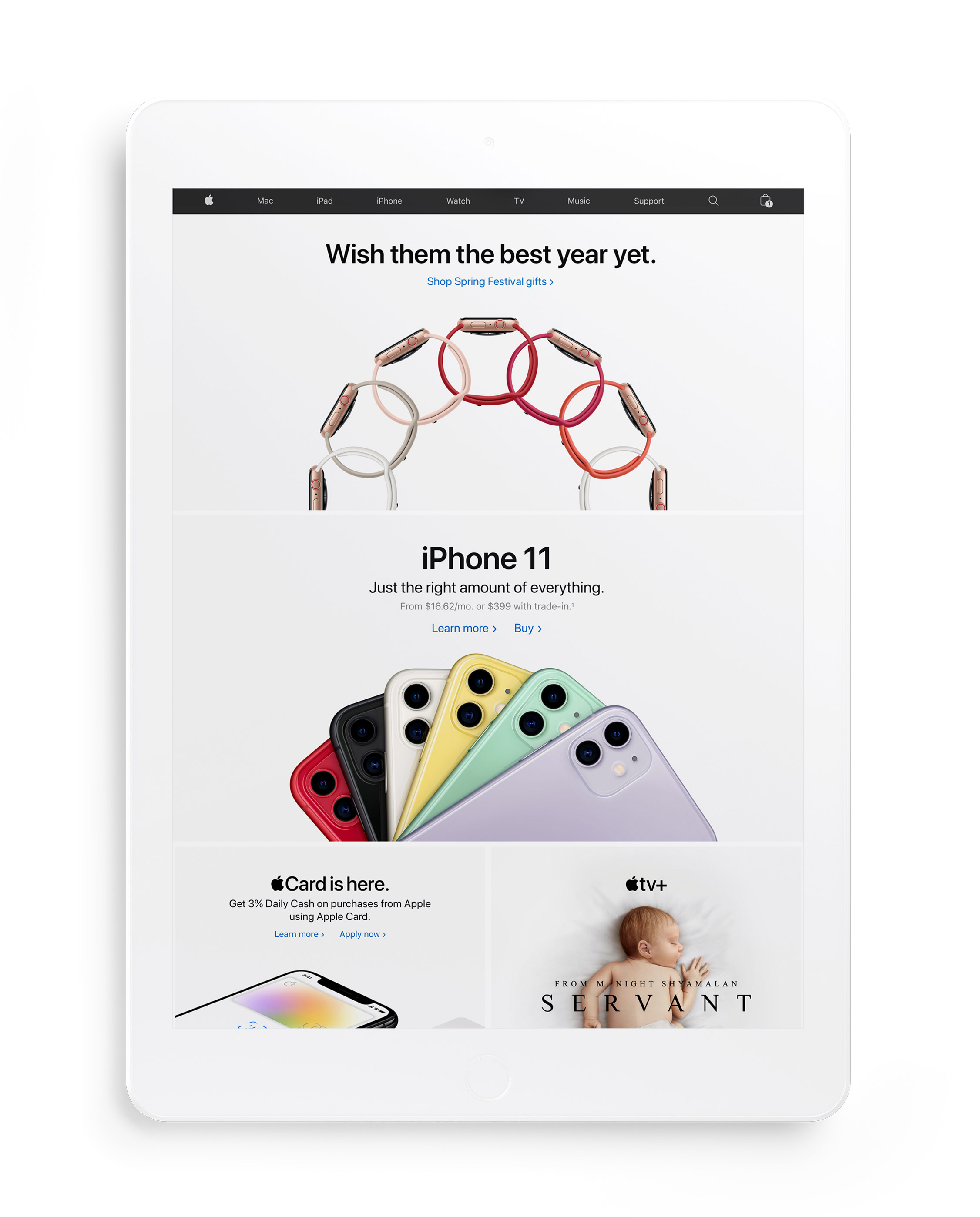
The Landing page was essential draw for the entire campaign. This generally was the page that the other assets would lead to. Like on the DM, the product were divided into sections. Each product has its own beautiful designed snowflake but also featured an array of accessories or products that were related as well as insight into why this would be the perfect gift.
• WEBSITE DESIGN
The Landing page was essential draw for the entire campaign. This generally was the page that the other assets would lead to. Like on the DM, the product were divided into sections. Each product has its own beautiful designed snowflake but also featured an array of accessories or products that were related as well as insight into why this would be the perfect gift.
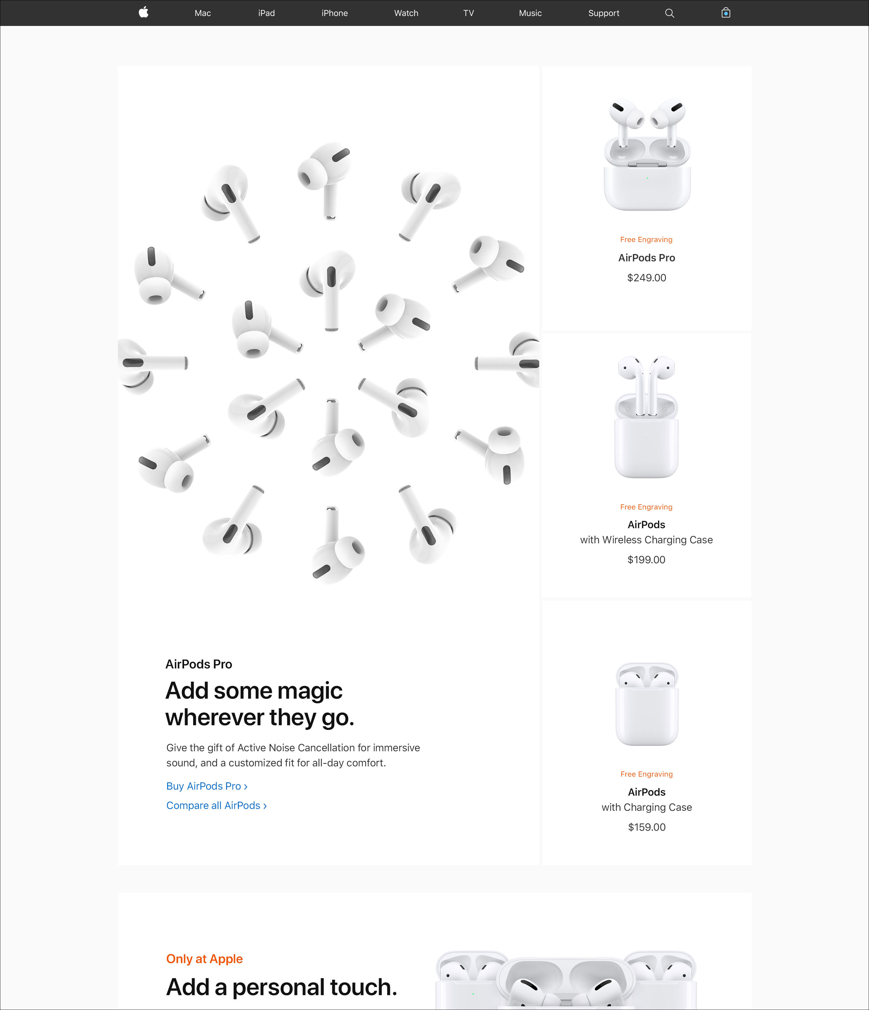
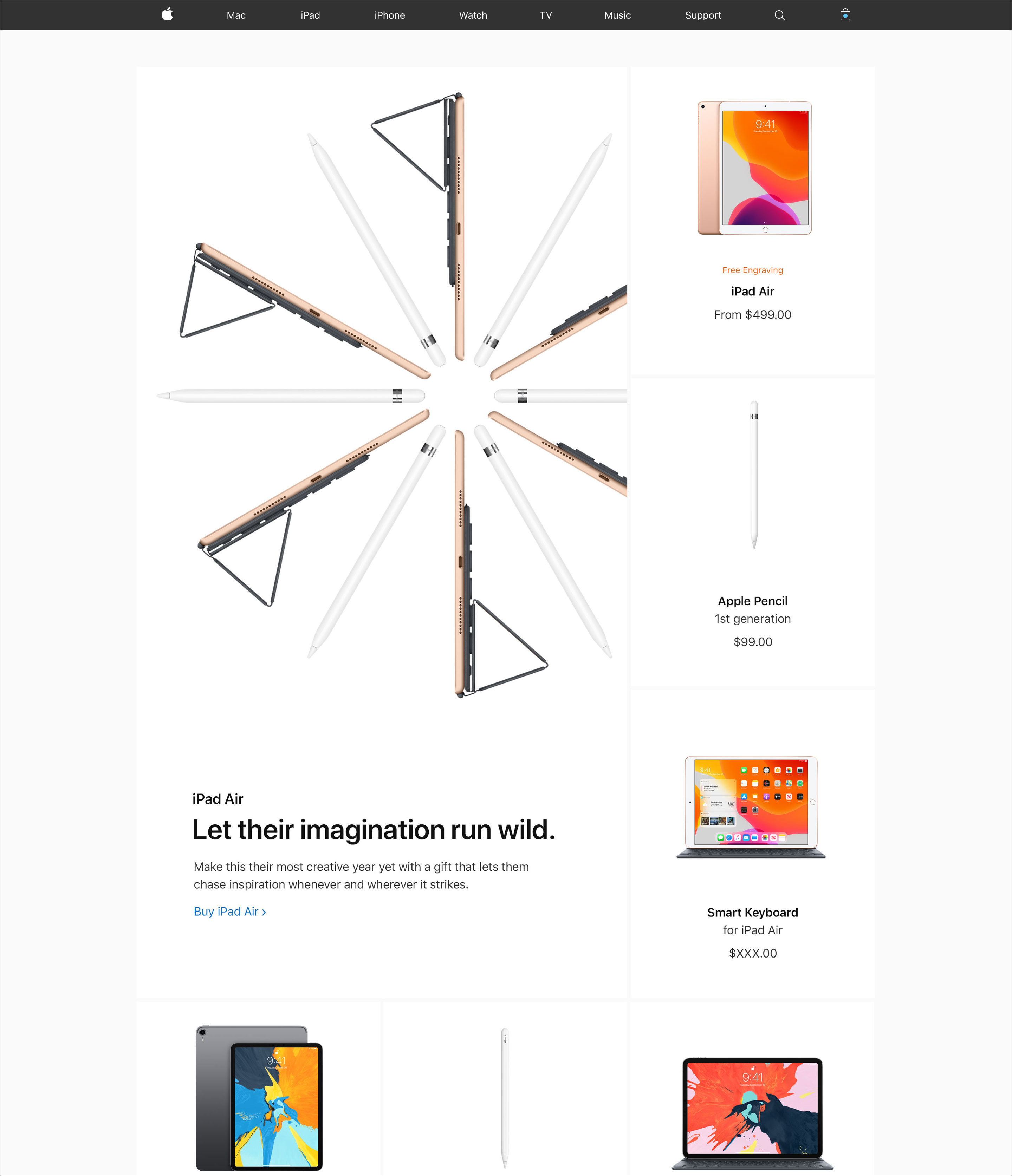
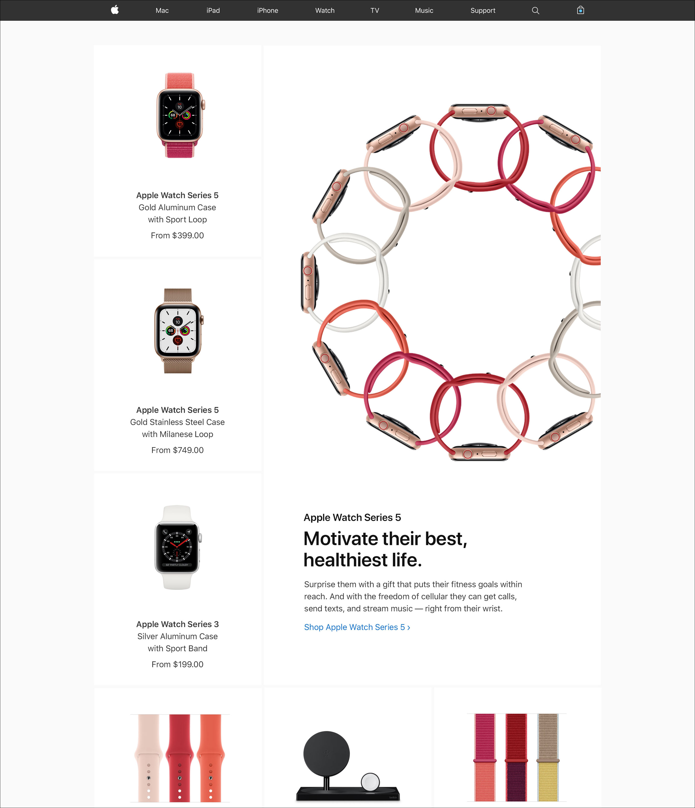
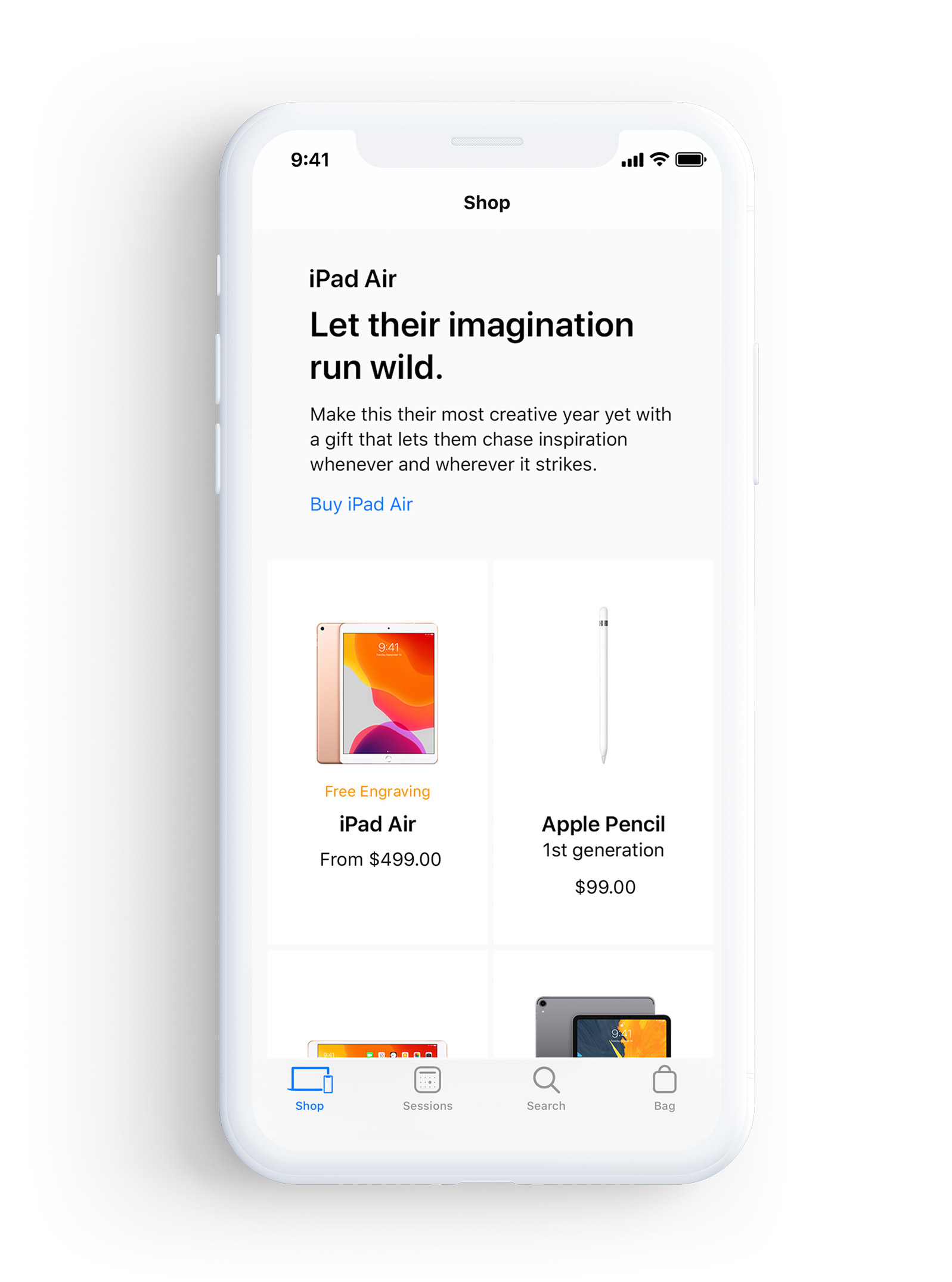
The UX and wire-framing of the landing page followed the same formula as the 2019 Holiday campaign. The biggest difference for Spring Festival was making sure we chose products that matched to the colors of the campaign. For example, the accessories for the Apple Watch and the iPhone 11 Pro used warmer colors close to red and yellow. We also had specific tiles that catered to the Chinese market. This meant designing several different alterations of the page for particular countries like Malaysia, Singapore and Taiwan.
The UX and wire-framing of the landing page followed the same formula as the 2019 Holiday campaign. The biggest difference for Spring Festival was making sure we chose products that matched to the colors of the campaign. For example, the accessories for the Apple Watch and the iPhone 11 Pro used warmer colors close to red and yellow. We also had specific tiles that catered to the Chinese market. This meant designing several different alterations of the page for particular countries like Malaysia, Singapore and Taiwan.
The UX and wire-framing of the landing page followed the same formula as the 2019 Holiday campaign. The biggest difference for Spring Festival was making sure we chose products that matched to the colors of the campaign. For example, the accessories for the Apple Watch and the iPhone 11 Pro used warmer colors close to red and yellow. We also had specific tiles that catered to the Chinese market. This meant designing several different alterations of the page for particular countries like Malaysia, Singapore and Taiwan.

![]()
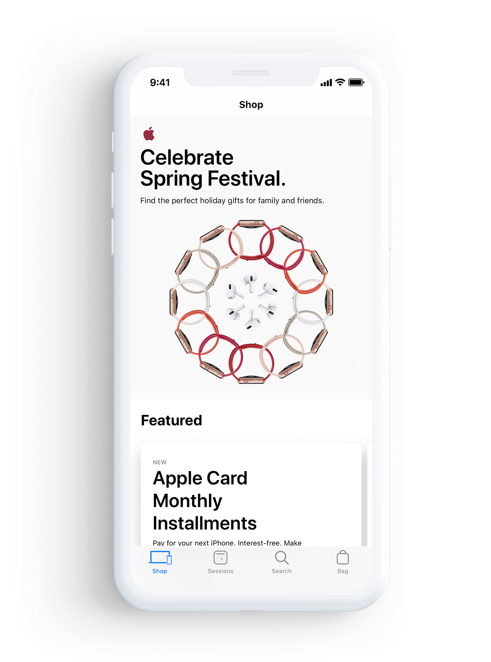
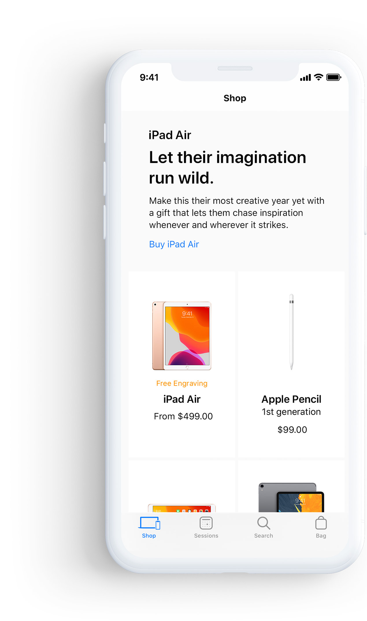
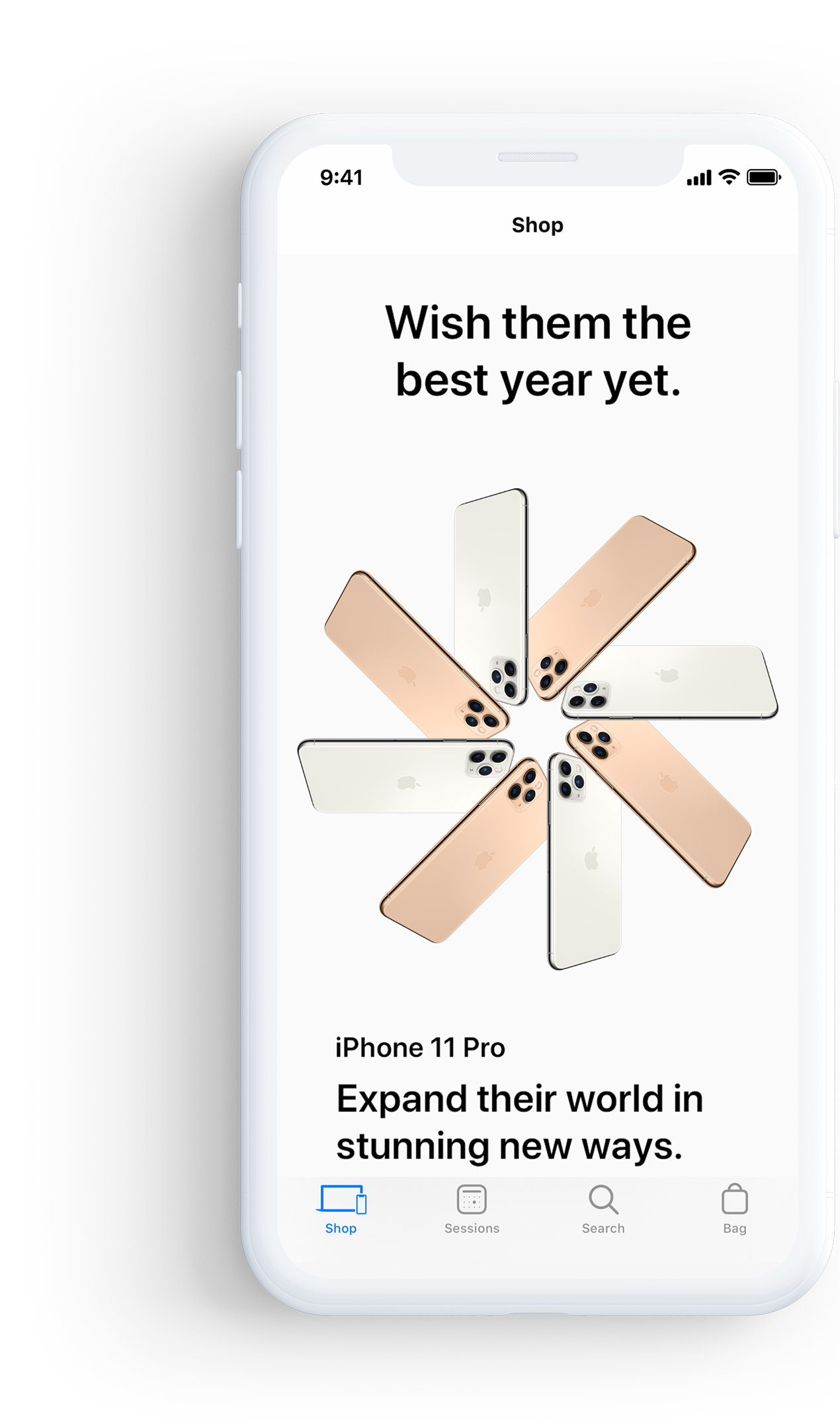
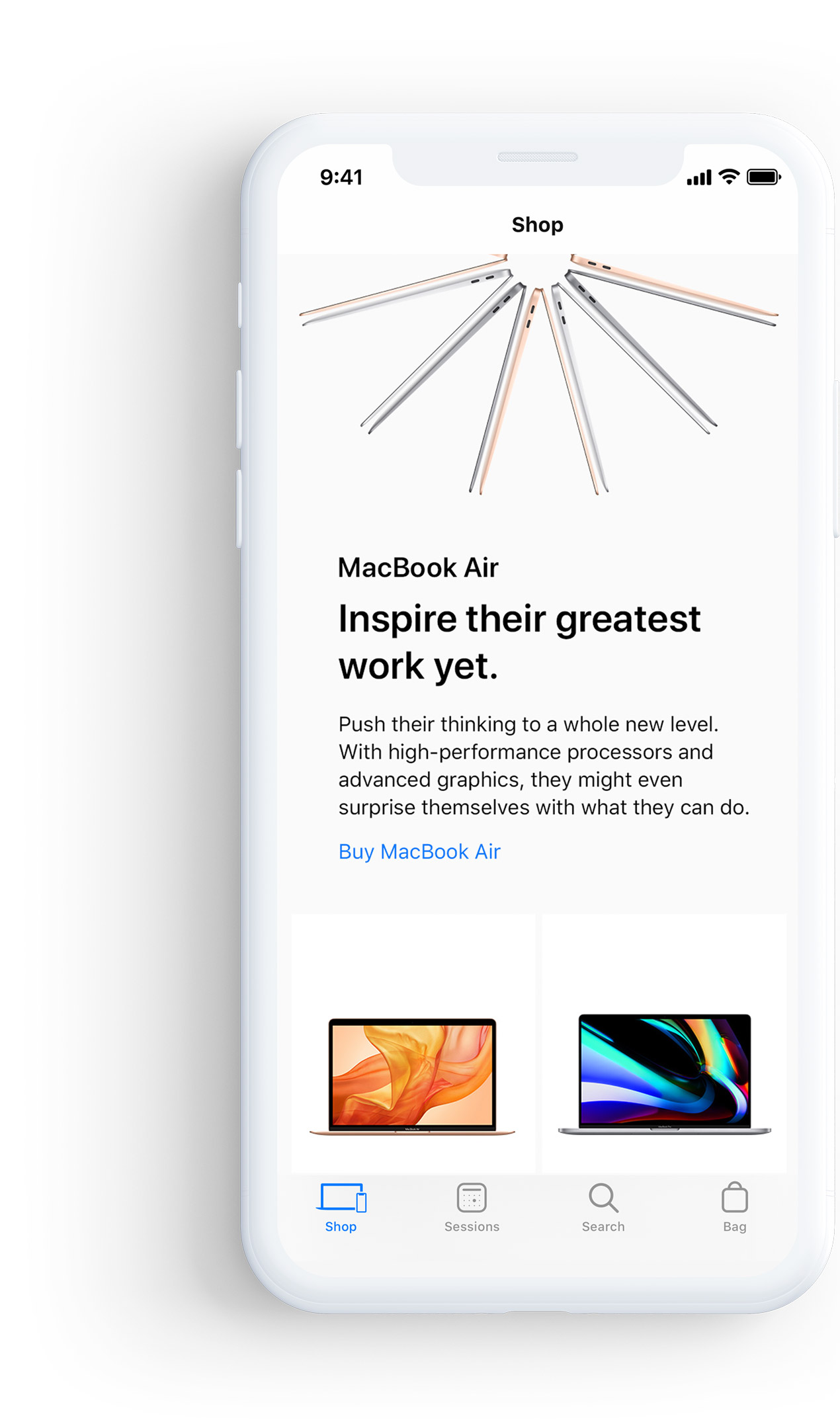
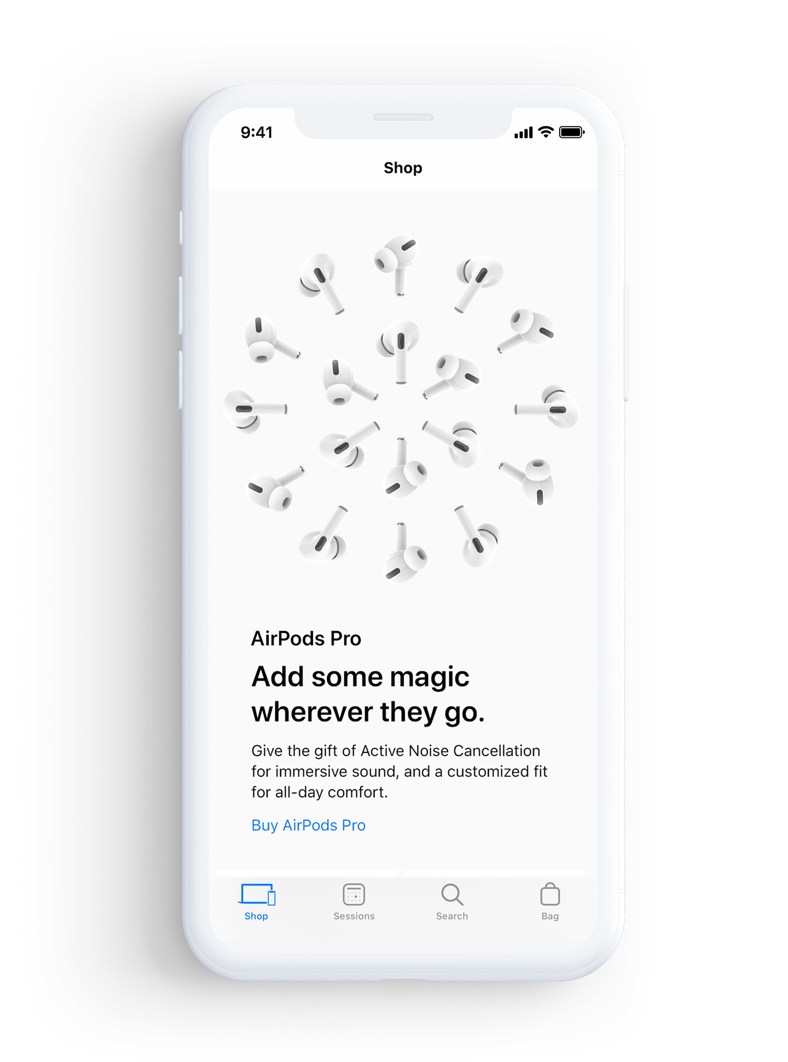
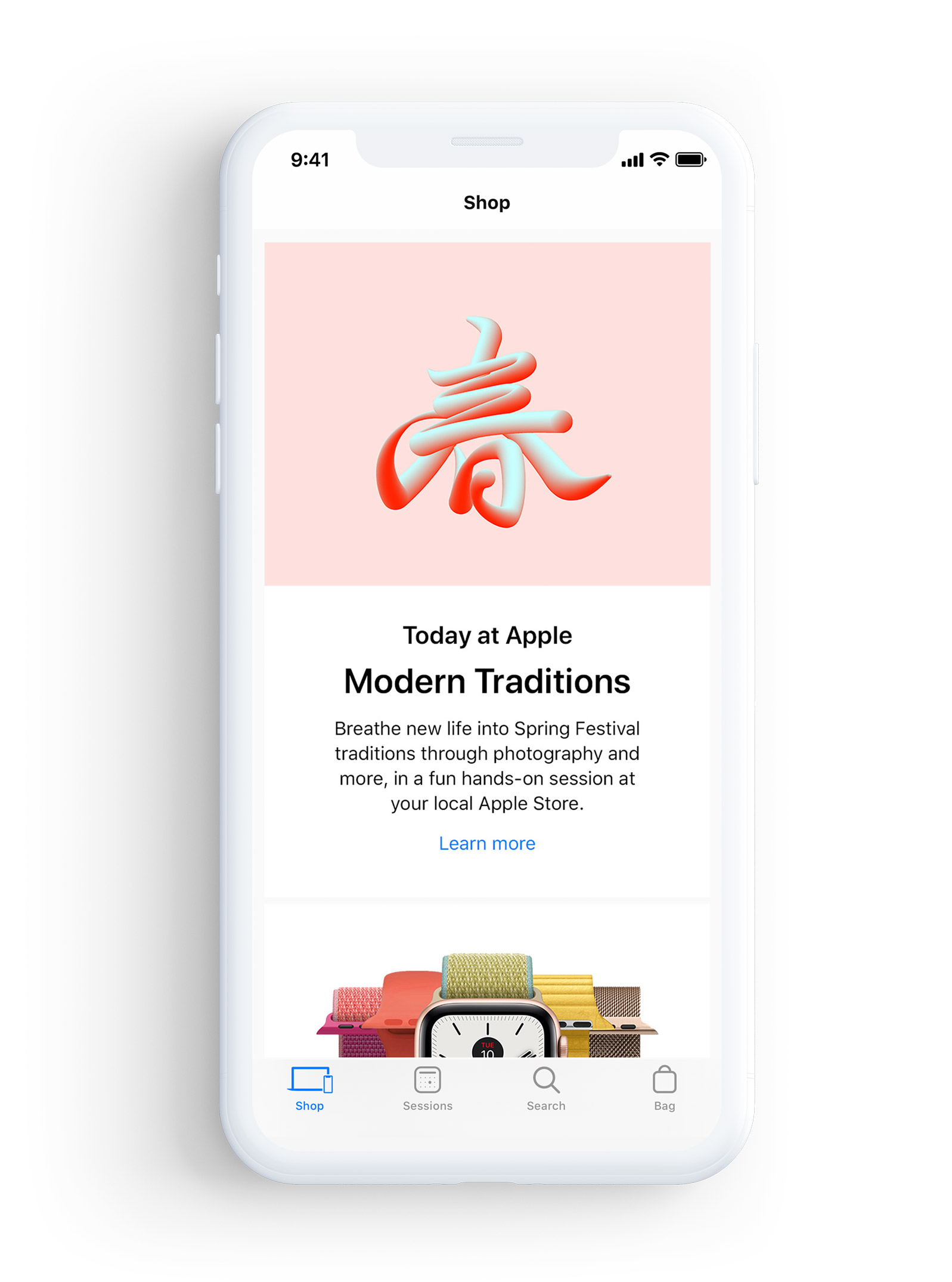
After creating the Landing Page for the Apple online store the next task was translating the page onto the Apple Store App. The page on the app would be a direct pull from the website in the design but several key things were different, like type size, fonts and spacing. The Apple store App also featured specific tiles that we needed to design for as well.
![]()
After creating the Landing Page for the Apple online store the next task was translating the page onto the Apple Store App. The page on the app would be a direct pull from the website in the design but several key things were different, like type size, fonts and spacing. The Apple store App also featured specific tiles that we needed to design for as well.
• CONCLUSION
The biggest challenge on this campaign was having to design for all types of view ports. Apple has many different sized devices and we had to make sure that if users were using an iPhone SE all the way to an iMac that they would get the best view possible. The ability to learn and work on the Apple products months before release was very exciting. It was amazing to be able to see the final product, knowing the full process and how much time and effort was put into the entire campaign.
![]() view next project
view next project
LONG DUMB
ROAD
Sh*t’s Getting Weird!