![]()
2016 • Haven Beauty
Kardashian
Beauty
• Social Campaign • Product Design • UI / UX
2016 • Haven Beauty
Kar-
dashian
Beauty
• Social Campaign • Product Design • UI / UX
![]()
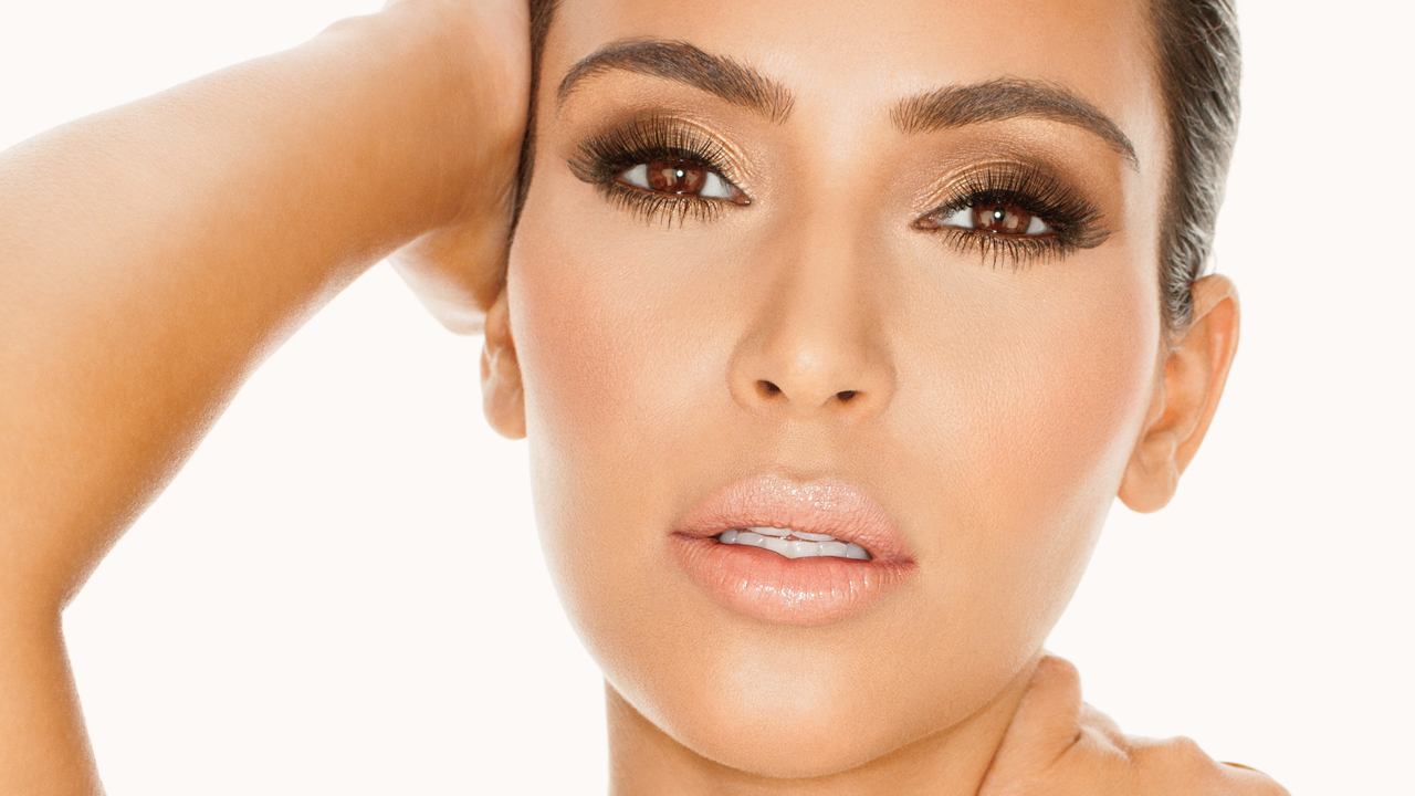
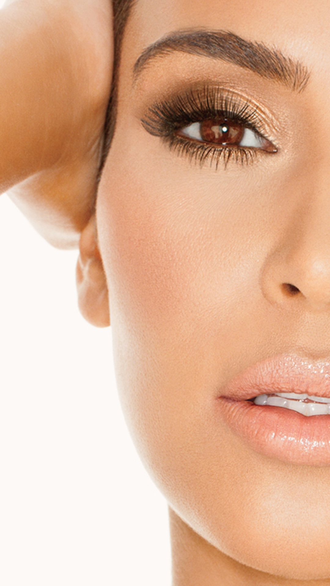
Unleash your Fierce side!
The goal for this project was to create captivating promotional banners for the Kardashian Beauty cosmetic line that would live on their website as well as dominate social media. This included creating graphics for email campaigns, daily social creative and online media. I was also in charge of creating a landing page for one of the new collection titled Fierce.
The goal for this project was to create captivating promotional banners for the Kardashian Beauty cosmetic line that would live on their website as well as dominate social media. This included creating graphics for email campaigns, daily social creative and online media. I was also in charge of creating a landing page for one of the new collection titled Fierce.
The goal for this project was to create captivating promotional banners for the Kardashian Beauty cosmetic line that would live on their website as well as dominate social media. This included creating graphics for email campaigns, daily social creative and online media. I was also in charge of creating a landing page for one of the new collection titled Fierce.
Under the ownership of Haven Beauty, my agency created the website design for the cosmetic line, which was the first assignment. I was introduced to this campaign post web design exploration and production but was still able to create several custom art pieces. This website was a huge draw for fans of the Kardashians but also makeup enthusiast. This was one of the first cosmetic brands that the sisters were apart of. It was a youth-focused, fashion forward line that was exciting to work on.
Under the ownership of Haven Beauty, my agency created the website design for the cosmetic line, which was the first assignment. I was introduced to this campaign post web design exploration and production but was still able to create several custom art pieces. This website was a huge draw for fans of the Kardashians but also makeup enthusiast. This was one of the first cosmetic brands that the sisters were apart of. It was a youth-focused, fashion forward line that was exciting to work on.
Under the ownership of Haven Beauty, my agency created the website design for the cosmetic line, which was the first assignment. I was introduced to this campaign post web design exploration and production but was still able to create several custom art pieces. This website was a huge draw for fans of the Kardashians but also makeup enthusiast. This was one of the first cosmetic brands that the sisters were apart of. It was a youth-focused, fashion forward line that was exciting to work on.
![]()
![]()
![]()
![]()
![]()
![]()
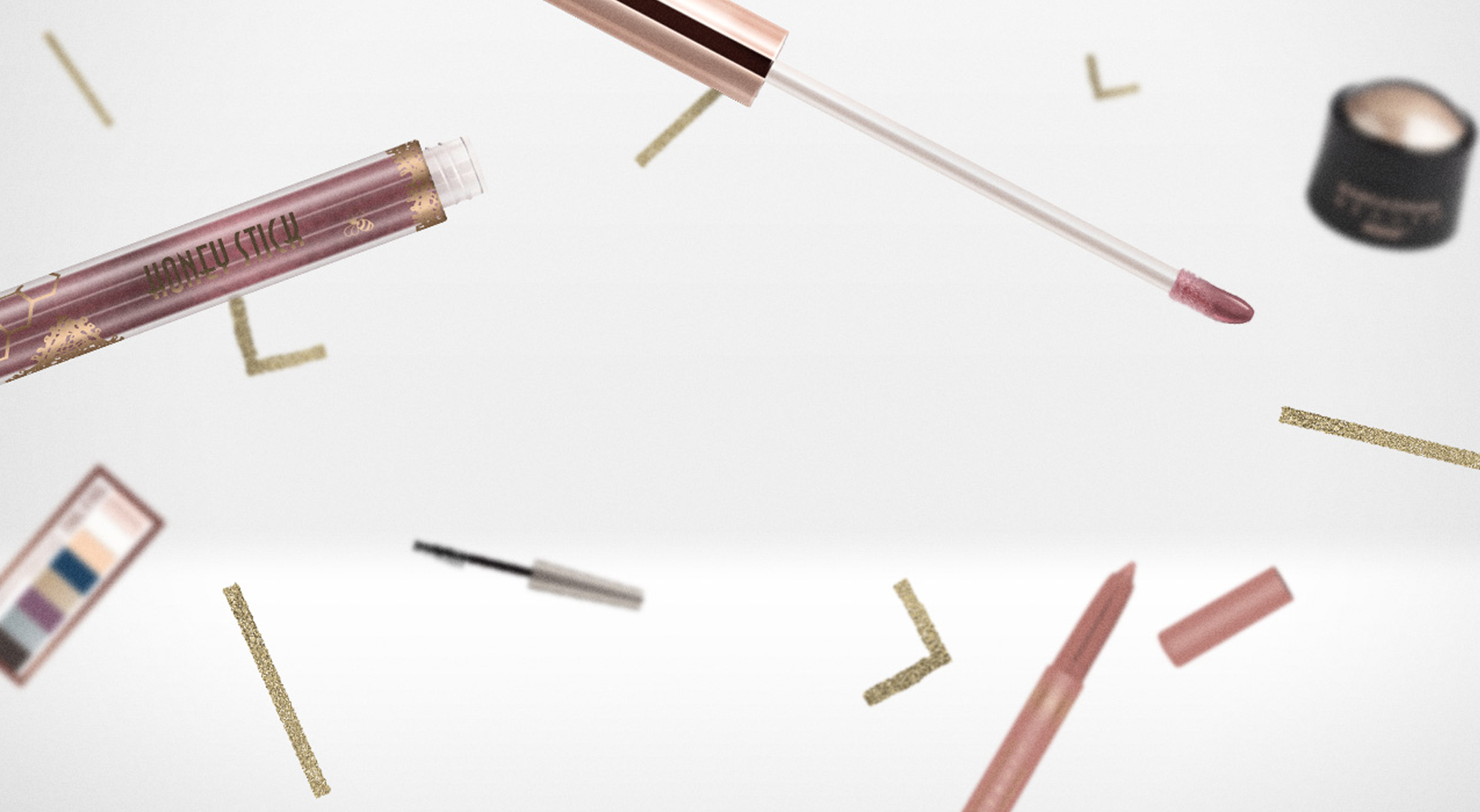
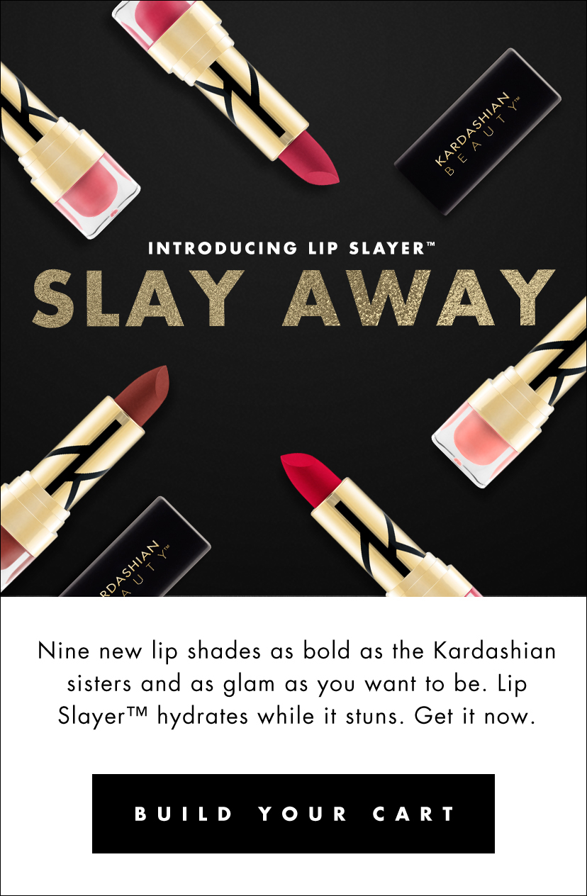
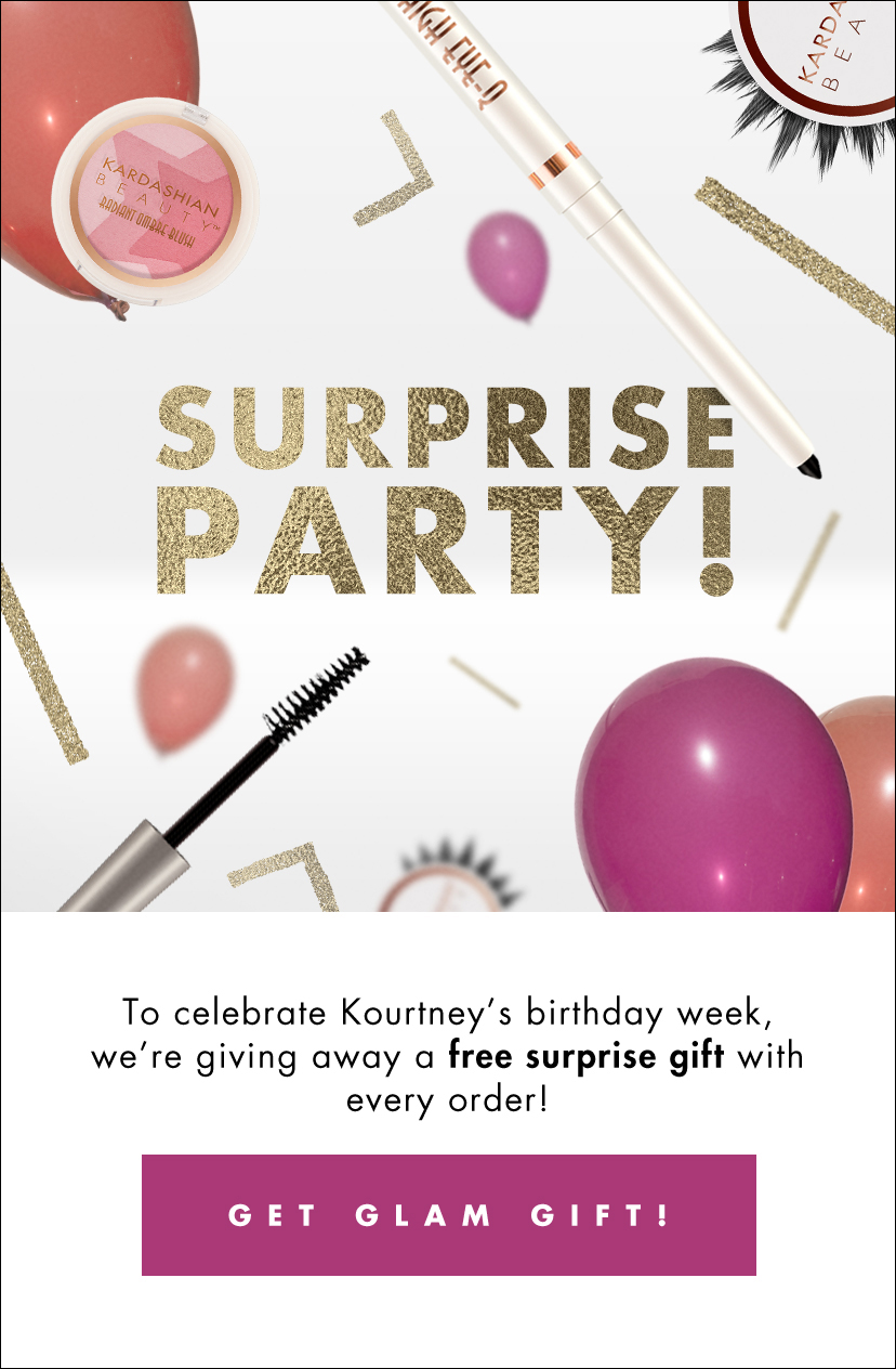
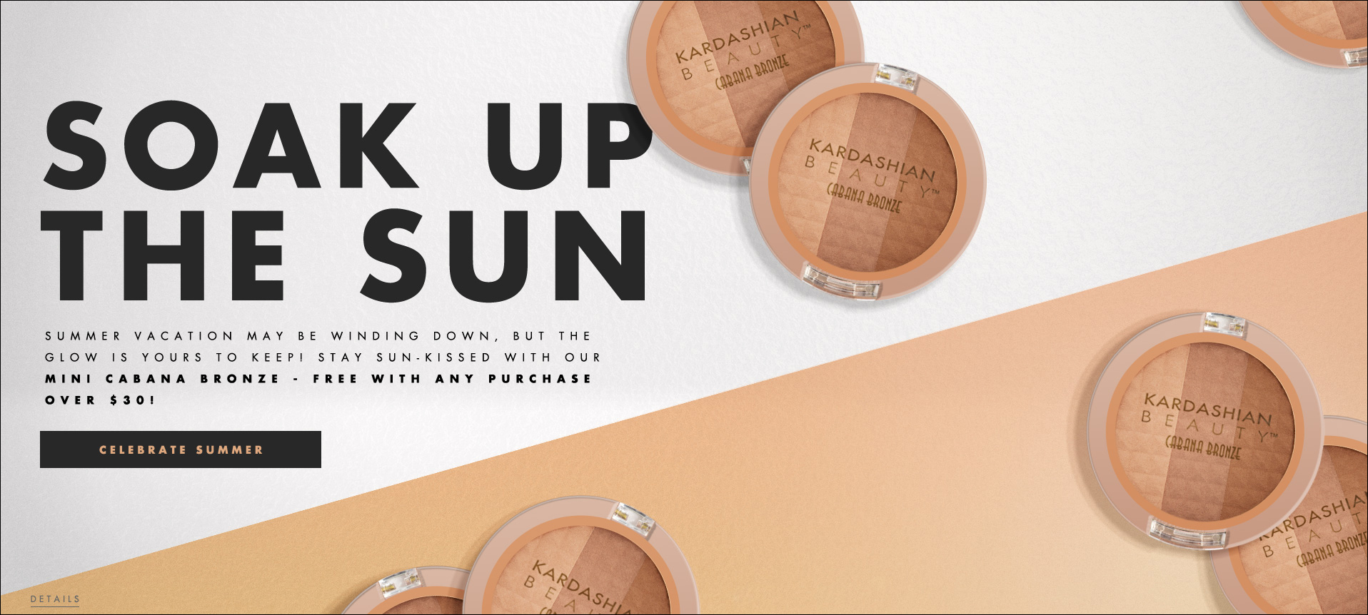
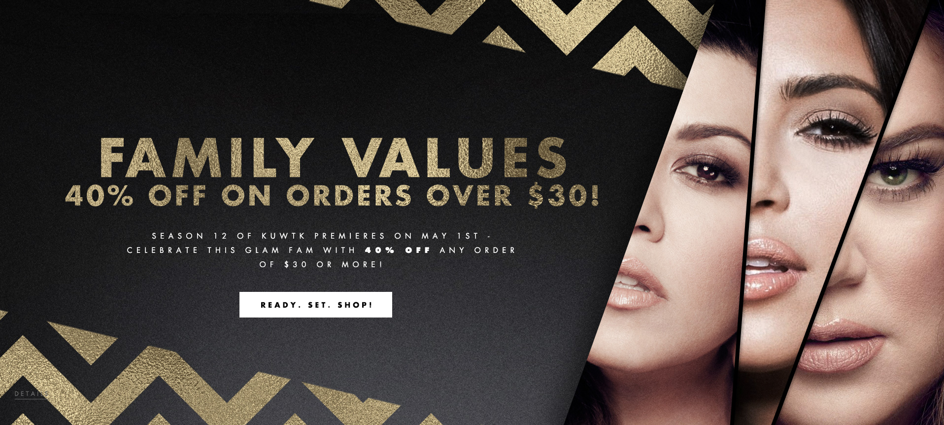
The chevron pattern and gold texture were the first and primary look of the campaign for a good amount of time. We created several graphics where we combined the cosmetic products and the chevron texture, creating visually compelling stories. The most popular look was making the products appear to float in space. As exciting as these were to create, overtime we needed to come up with fresh creative to sell the product. I was able to design new looks, which involved arranging the products in unique grids as well as using photography of the sisters.
The chevron pattern and gold texture were the first and primary look of the campaign for a good amount of time. We created several graphics where we combined the cosmetic products and the chevron texture, creating visually compelling stories. The most popular look was making the products appear to float in space. As exciting as these were to create, overtime we needed to come up with fresh creative to sell the product. I was able to design new looks, which involved arranging the products in unique grids as well as using photography of the sisters.
The chevron pattern and gold texture were the first and primary look of the campaign for a good amount of time. We created several graphics where we combined the cosmetic products and the chevron texture, creating visually compelling stories. The most popular look was making the products appear to float in space. As exciting as these were to create, overtime we needed to come up with fresh creative to sell the product. I was able to design new looks, which involved arranging the products in unique grids as well as using photography of the sisters.
“BRB, just buying all of it
and having the best
cheekbones of our
damn lives.”
– Cosmopolitan
“BRB, just buying all of it
and having the best
cheekbones of our
damn lives.”
– Cosmopolitan
“BRB, just buying
all of it and having
the best cheekbones
of our damn lives.”
– Cosmopolitan
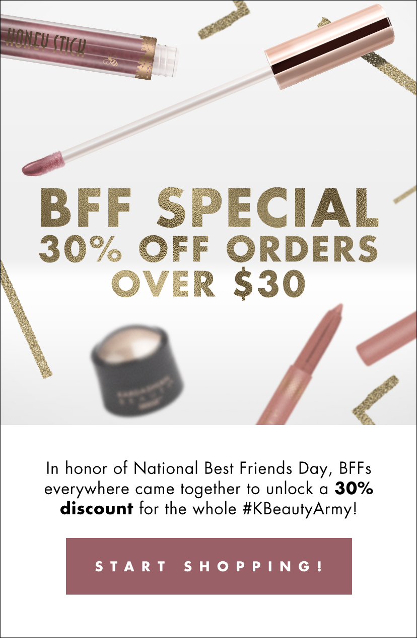
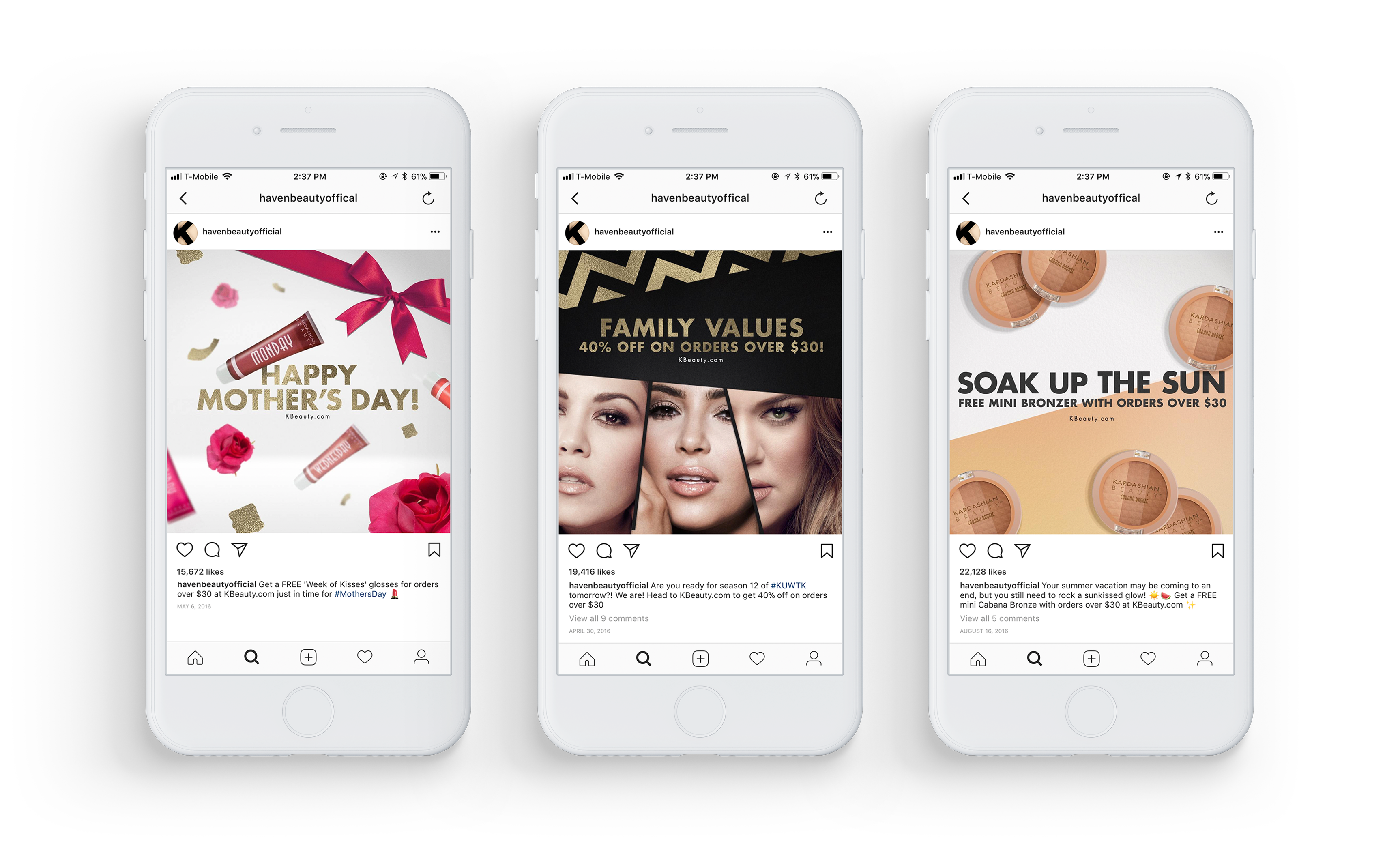
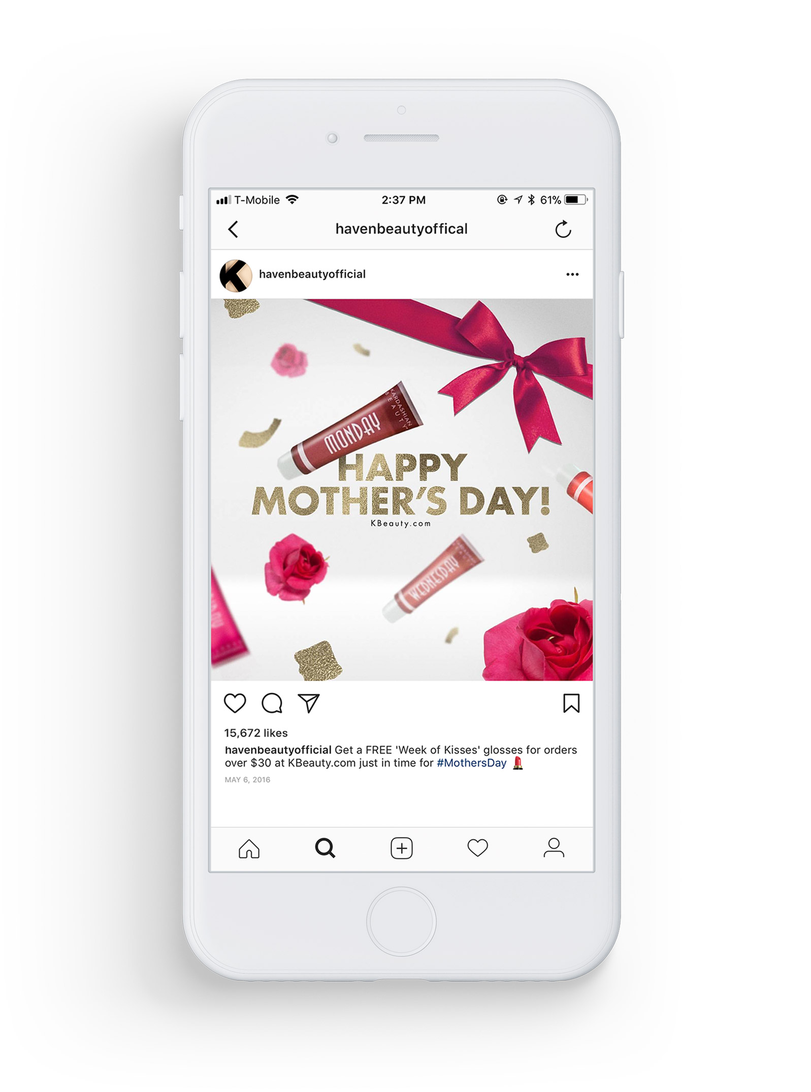
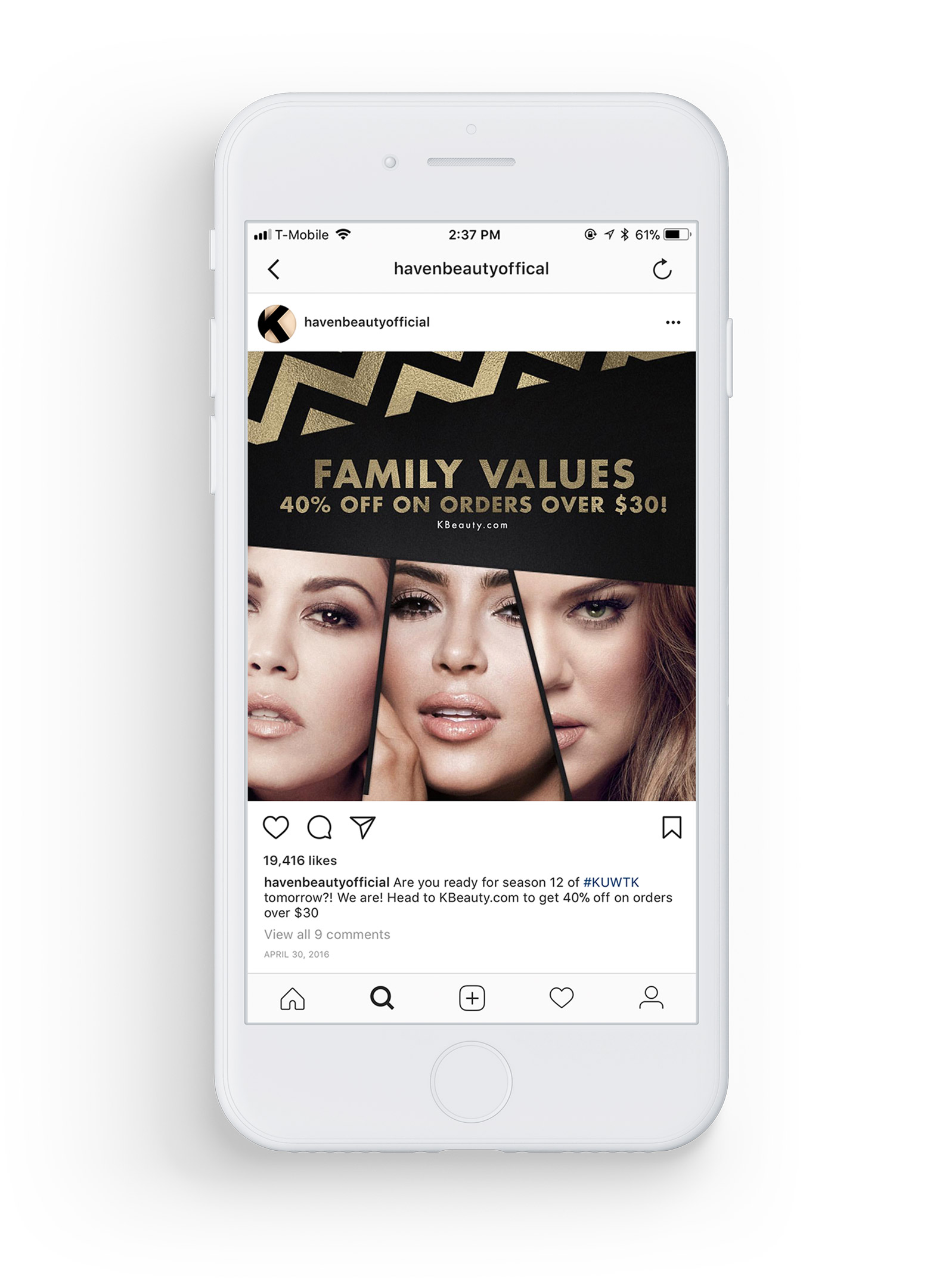
The most exciting part of this project was coming up with creative to match the promotions that we were selling. Each week there were new sales, sometimes revolving around a specific product that they wanted to focus on and other times they would promote holidays. This required us to constantly be on our toes with creative copy that would appeal to millennials but also trying to stay up with the relevancy of what was happening in the girls’ lives as well as other celebrity current events. We even created post that promoted their new season of the show simultaneously promoting their cosmetic products as well.
The most exciting part of this project was coming up with creative to match the promotions that we were selling. Each week there were new sales, sometimes revolving around a specific product that they wanted to focus on and other times they would promote holidays. This required us to constantly be on our toes with creative copy that would appeal to millennials but also trying to stay up with the relevancy of what was happening in the girls’ lives as well as other celebrity current events. We even created post that promoted their new season of the show simultaneously promoting their cosmetic products as well.
The most exciting part of this project was coming up with creative to match the promotions that we were selling. Each week there were new sales, sometimes revolving around a specific product that they wanted to focus on and other times they would promote holidays. This required us to constantly be on our toes with creative copy that would appeal to millennials but also trying to stay up with the relevancy of what was happening in the girls’ lives as well as other celebrity current events. We even created post that promoted their new season of the show simultaneously promoting their cosmetic products as well.
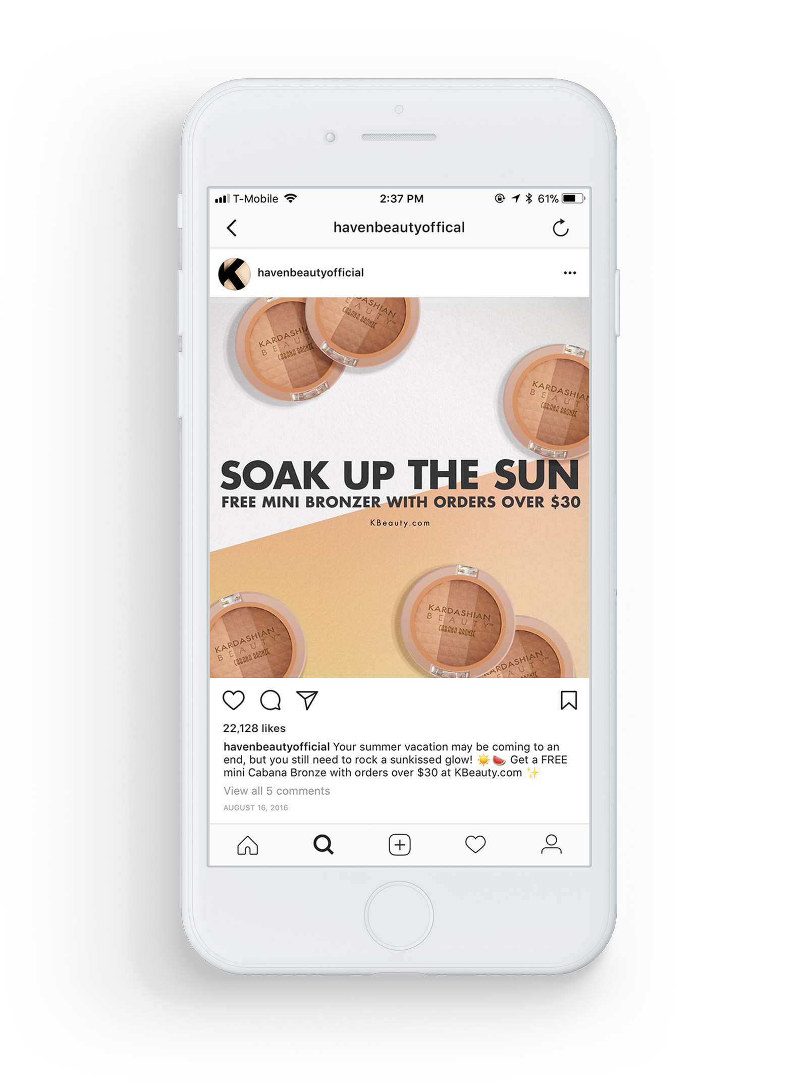
• SOCIAL
The majority of the traffic that came to the site was from social media post. We used existed promotional graphics to create post for Instagram, Facebook and Twitter. These post received hundreds of thousands of views and likes which drove up sales.
• SOCIAL
The majority of the traffic that came to the site was from social media post. We used existed promotional graphics to create post for Instagram, Facebook and Twitter. These post received hundreds of thousands of views and likes which drove up sales.
• SOCIAL
The majority of the traffic that came to the site was from social media post. We used existed promotional graphics to create post for Instagram, Facebook and Twitter. These post received hundreds of thousands of views and likes which drove up sales.

“Packaging worthy
of flaunting on
a vanity!”
– PopSugar
“Packaging worthy
of flaunting on
a vanity!”
– PopSugar
“Packaging worthy
of flaunting on
a vanity!”
– PopSugar
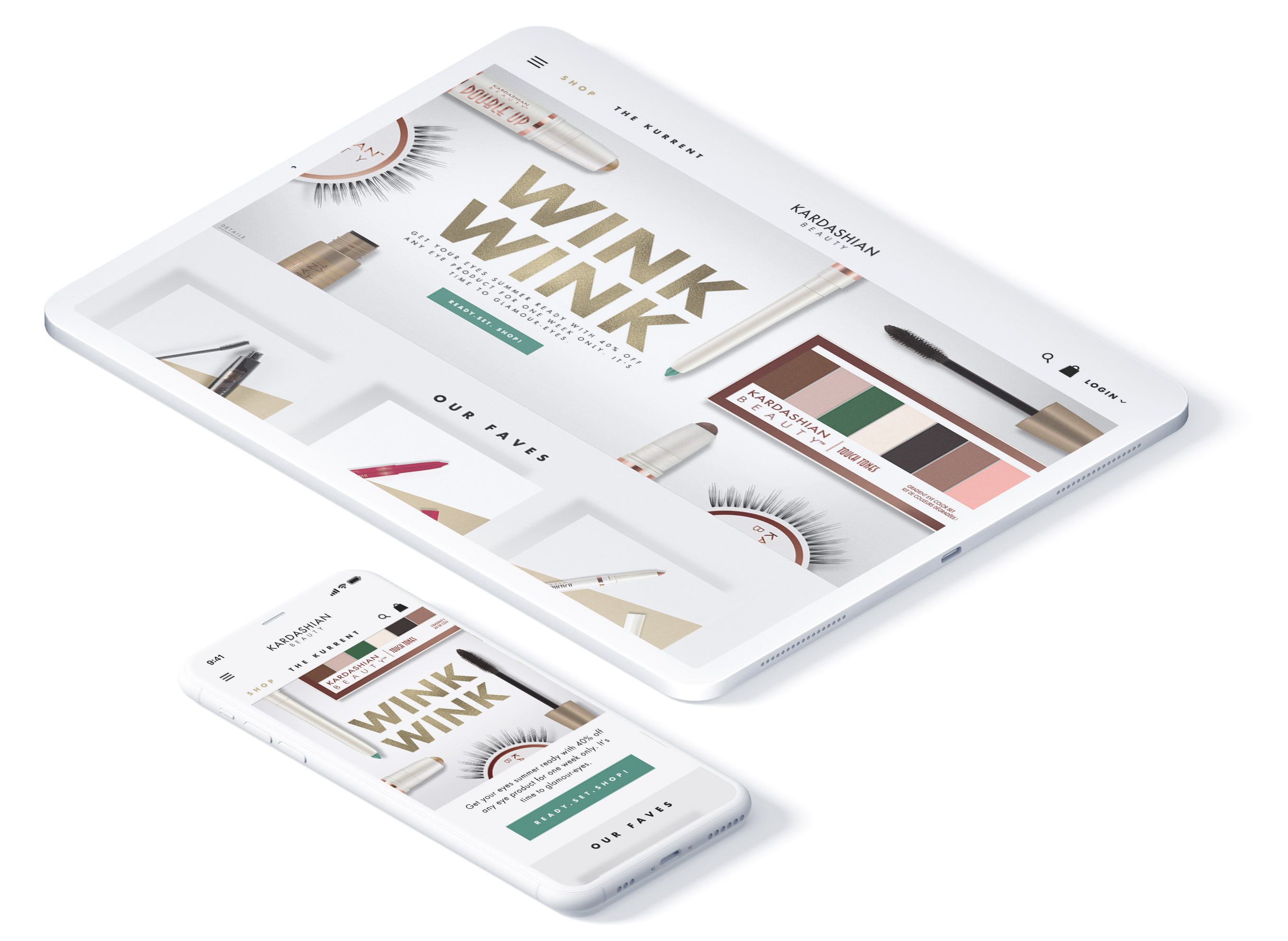
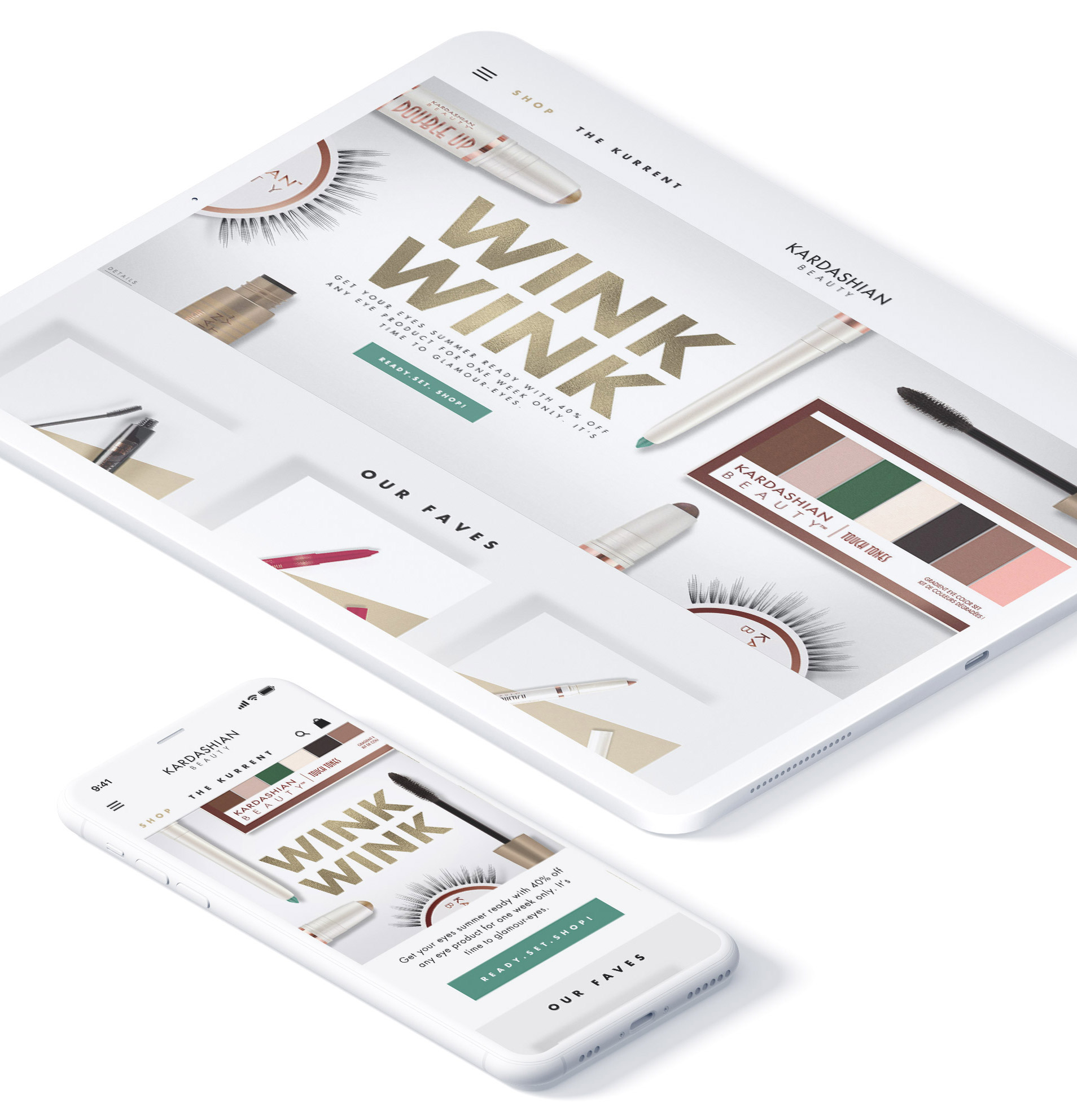
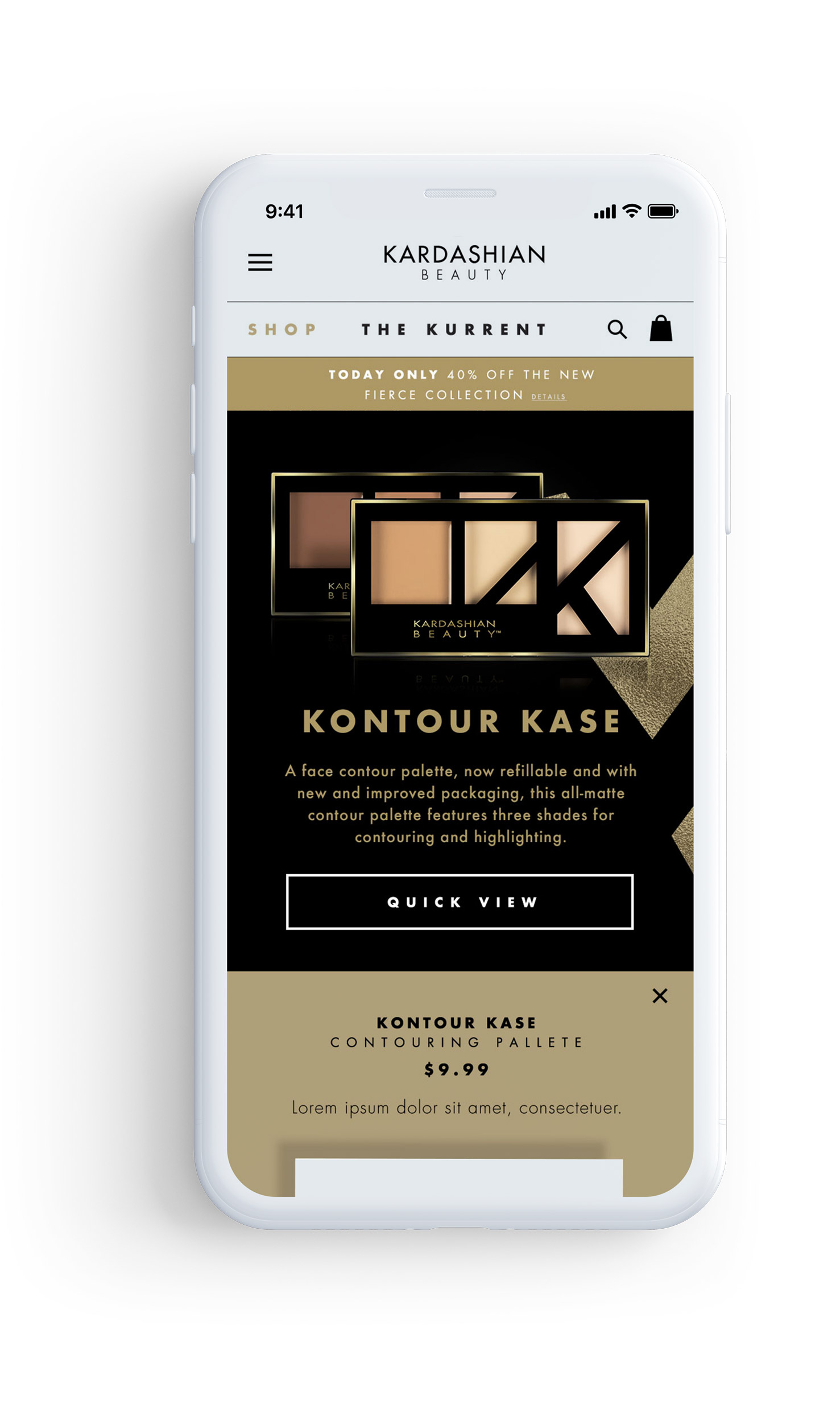
• WEB DESIGN
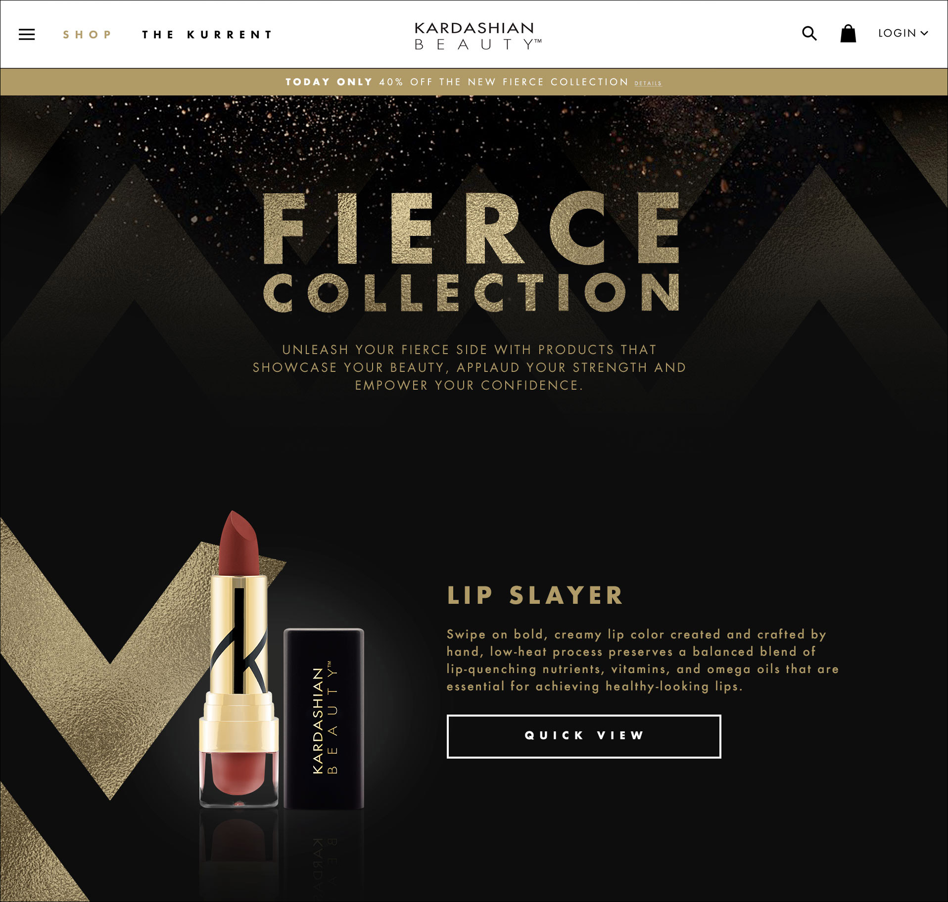
About a year into designing for the Kardashian sisters cosmetic line, we introduced The Fierce collection. Haven Beauty handled about 80% of the production work for the new campaign. This included photoshoots for the products and promotional information that they wanted to highlight. Once that was done, we took the content and created a visual look for the cosmetic line. Haven Beauty even sent us the actual makeup so we could analyze the scale and also just play with the new products. This new collection was going to be the largest production since their premiere and this required a fresh, new landing page. I had the opportunity to be the lead designer for creating this new page.
• WEB DESIGN
About a year into designing for the Kardashian sisters cosmetic line, we introduced The Fierce collection. Haven Beauty handled about 80% of the production work for the new campaign. This included photoshoots for the products and promotional information that they wanted to highlight. Once that was done, we took the content and created a visual look for the cosmetic line. Haven Beauty even sent us the actual makeup so we could analyze the scale and also just play with the new products. This new collection was going to be the largest production since their premiere and this required a fresh, new landing page. I had the opportunity to be the lead designer for creating this new page.
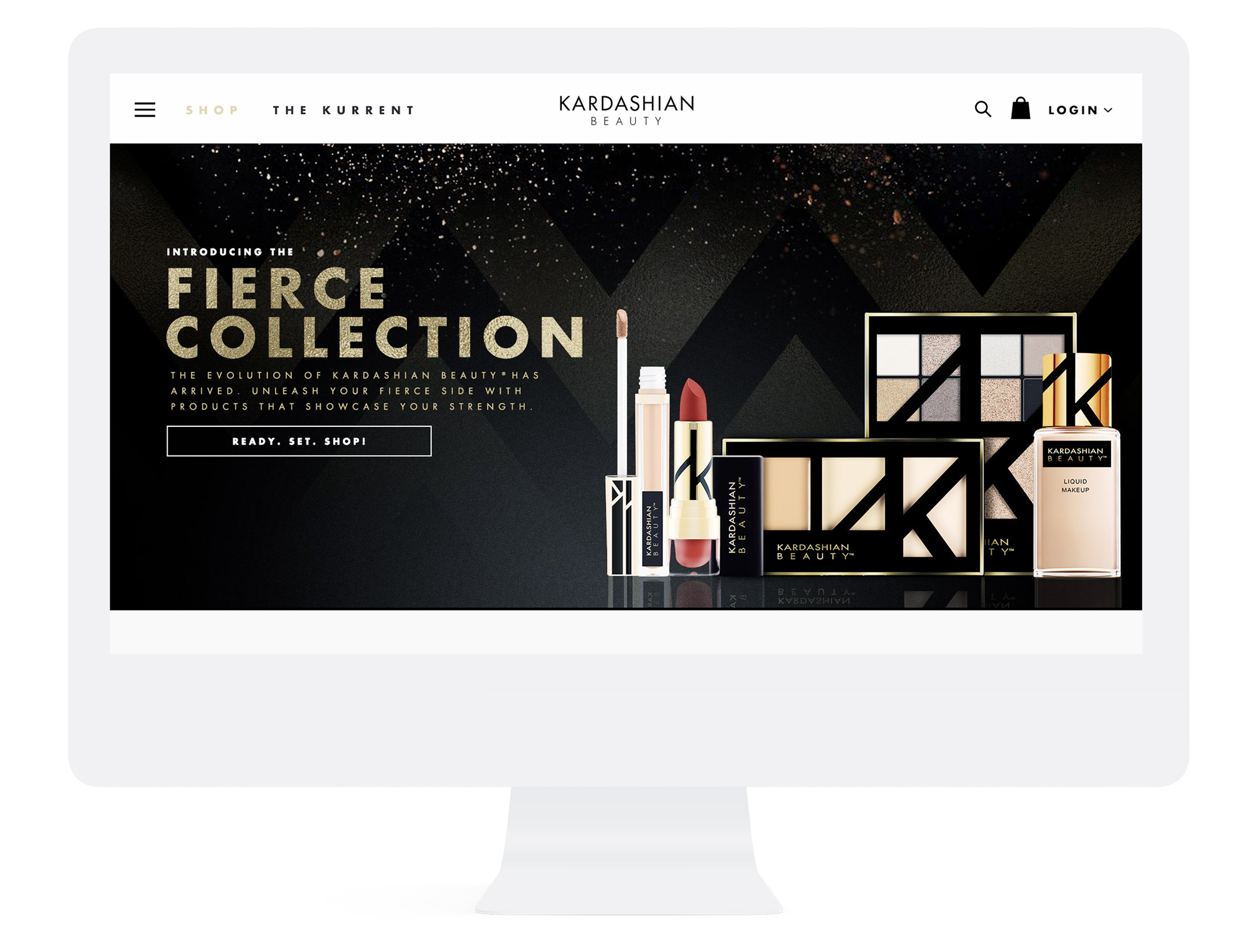
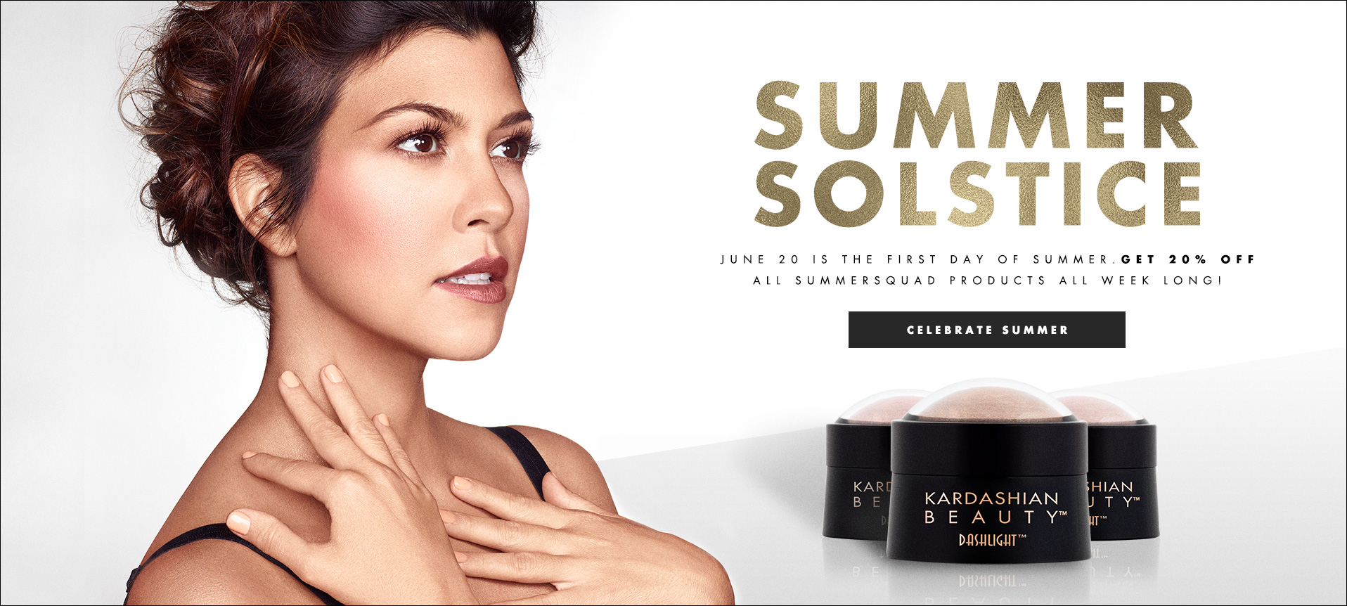
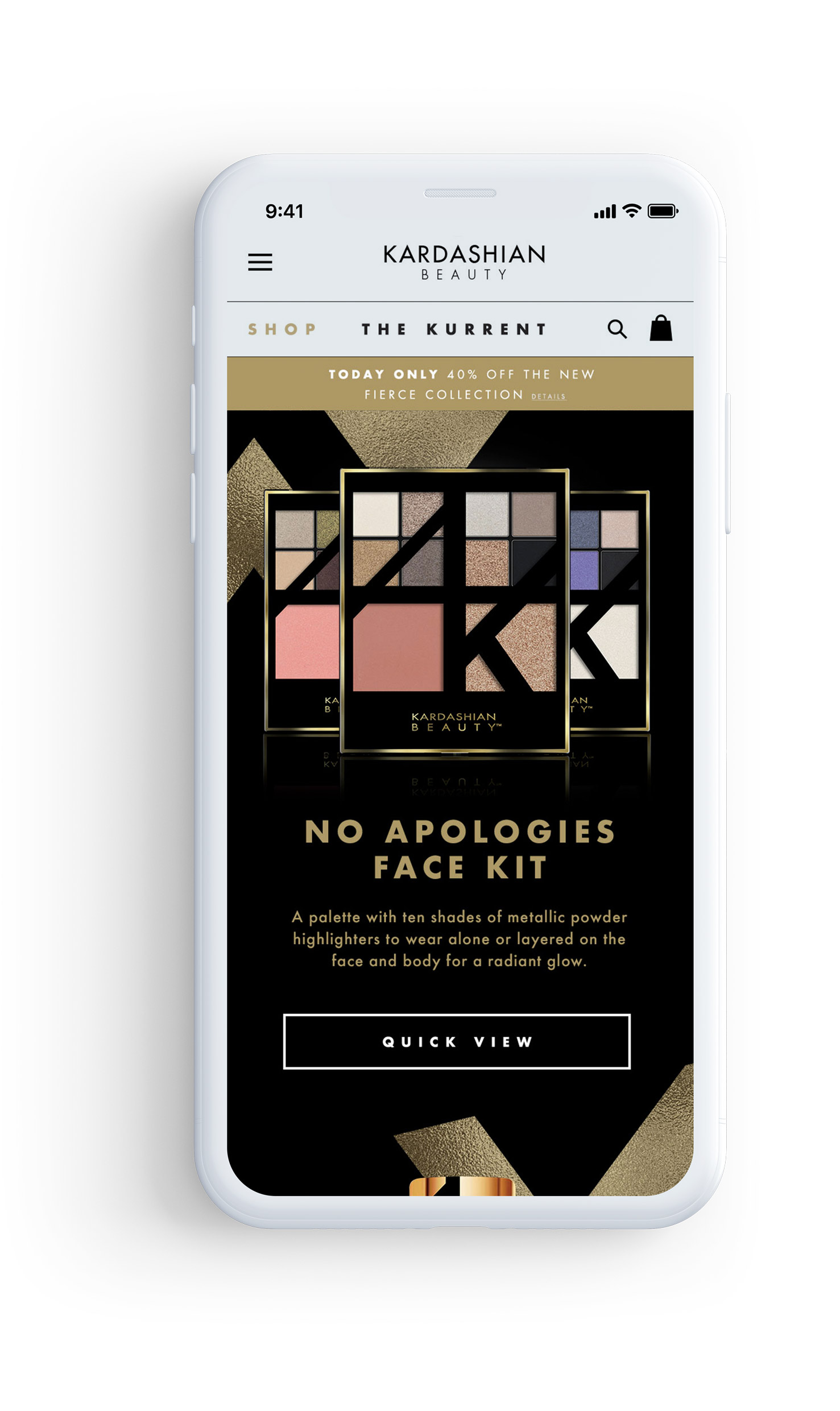
Coming off of a summer camping where the website was bright and colorful, we really wanted to go back to the classic black and gold colors. I brought back the original chevron design and used that as the main pattern that connected the products to each other. I wanted to keep the landing page pretty light, showcasing each new product with the ability to quickly view each without clicking into a detailed page. It was very gratifying to have a hand in creating a page that thousands of customers would click to shop on.
Coming off of a summer camping where the website was bright and colorful, we really wanted to go back to the classic black and gold colors. I brought back the original chevron design and used that as the main pattern that connected the products to each other. I wanted to keep the landing page pretty light, showcasing each new product with the ability to quickly view each without clicking into a detailed page. It was very gratifying to have a hand in creating a page that thousands of customers would click to shop on.
Coming off of a summer camping where the website was bright and colorful, we really wanted to go back to the classic black and gold colors. I brought back the original chevron design and used that as the main pattern that connected the products to each other. I wanted to keep the landing page pretty light, showcasing each new product with the ability to quickly view each without clicking into a detailed page. It was very gratifying to have a hand in creating a page that thousands of customers would click to shop on.

• CONCLUSION
My favorite aspect of this project was the constant reinvention of products design. This was one of the longest projects that I worked on, creating graphics to promote special holidays to creating post that showcased entirely new products. I feel like I got to experience the challenges of having to constantly try and come up with new creations for the same product.
![]() view next project
view next project
ONLY IN IRVINE
America’s best master-planned city.

![]() view next project
view next project
HOTEL
TRANSYLVANIA
3
Don’t miss the boat!