![]()
2019 • Truwomen
TRU
WOMEN
• Social Campaign • Product Design • UI / UX
2019 • Truwomen
TRU
WOMEN
• Social Campaign • Product Design • UI / UX
![]()

Welcome to
Super Natural Indulgence.
Welcome to
Super Natural Indulgence.
Welcome to
Super Natural
Indulgence.
My goal for this project was to conceptualize and create a full social media campaign & website redesign around TRUWOMEN’s plant fueled protein bars. The women behind the brand pride themselves on their products, their team and the way they run their company, which empowers women and creates the world they want to see.
My goal for this project was to conceptualize and create a full social media campaign & website redesign around TRUWOMEN’s plant fueled protein bars. The women behind the brand pride themselves on their products, their team and the way they run their company, which empowers women and creates the world they want to see.
My goal for this project was to conceptualize and create a full social media campaign & website redesign around TRUWOMEN’s plant fueled protein bars. The women behind the brand pride themselves on their products, their team and the way they run their company, which empowers women and creates the world they want to see.

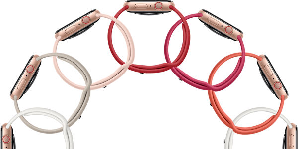
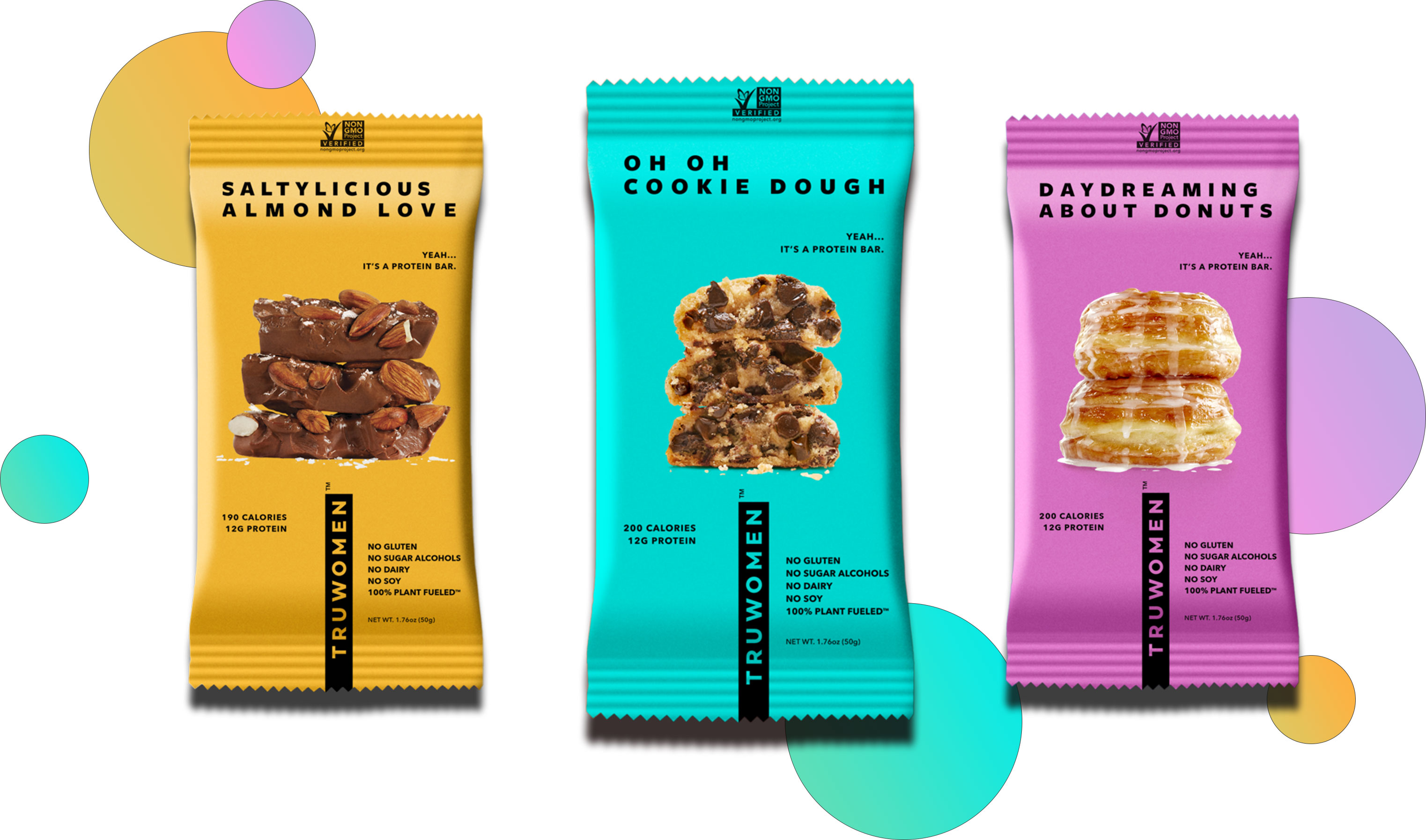
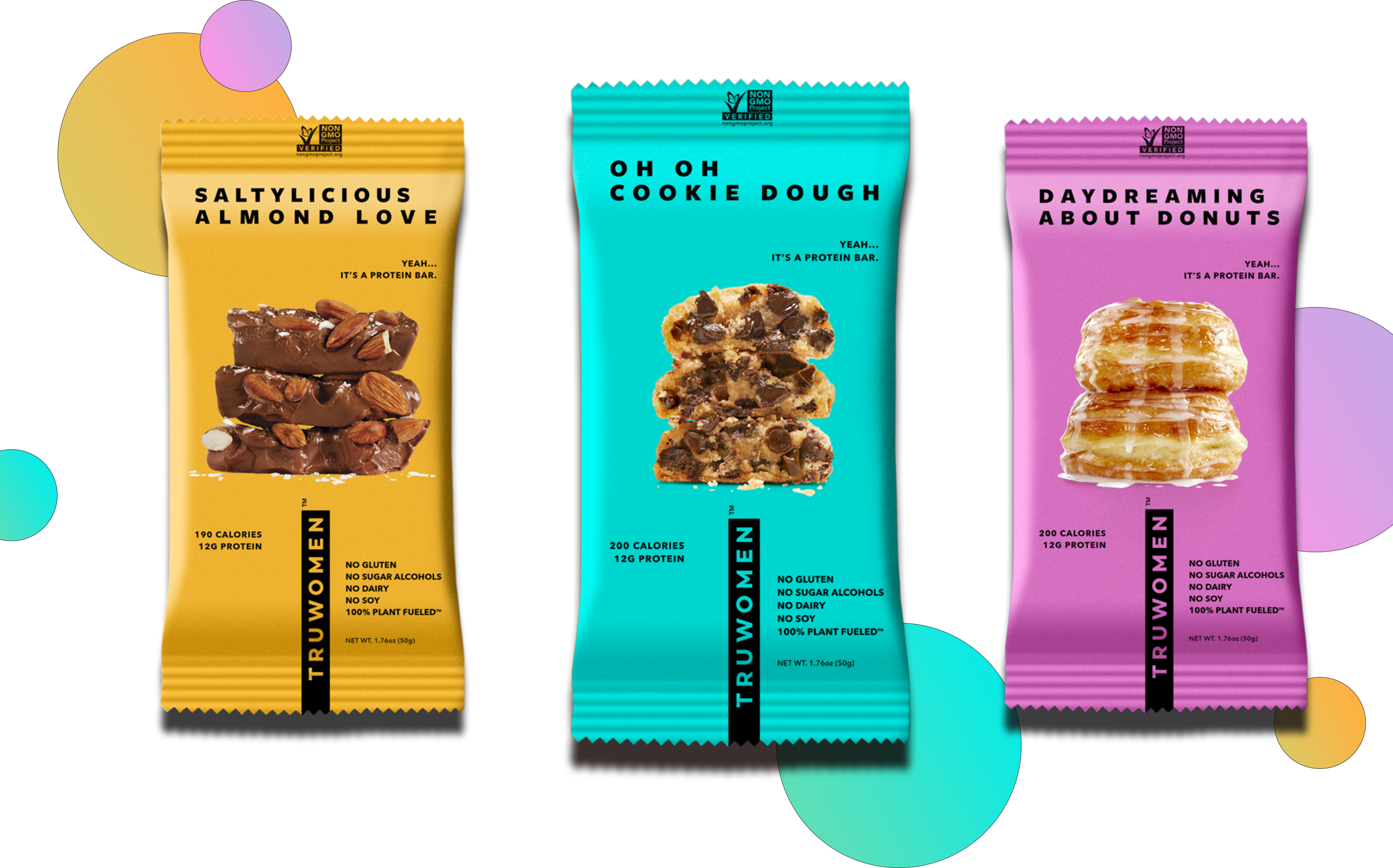
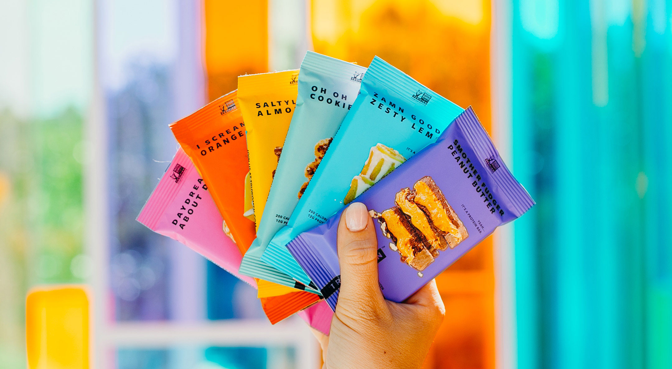
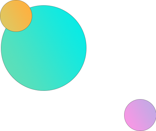
I didn’t stray too far from the color palette that the TRUWOMEN bars were already known for. The 6 bars reflect a vibrant & exciting rainbow of colors. I took those 6 colors and created a gradient that I used across the digital branding. With the array of amazing photos the TRUWOMEN team take year around, I primarily focused on the Summer & Spring months. These colorful photos confirmed the use of the rainbow gradient. The various amounts of colors in a rainbow can sometimes be a challenge to use so I tried to keep a minimal grid approach as well as use thin key-line strokes to break up the design.
I didn’t stray too far from the color palette that the TRUWOMEN bars were already known for. The 6 bars reflect a vibrant & exciting rainbow of colors. I took those 6 colors and created a gradient that I used across the digital branding. With the array of amazing photos the TRUWOMEN team take year around, I primarily focused on the Summer & Spring months. These colorful photos confirmed the use of the rainbow gradient. The various amounts of colors in a rainbow can sometimes be a challenge to use so I tried to keep a minimal grid approach as well as use thin key-line strokes to break up the design.
I didn’t stray too far from the color palette that the TRUWOMEN bars were already known for. The 6 bars reflect a vibrant & exciting rainbow of colors. I took those 6 colors and created a gradient that I used across the digital branding. With the array of amazing photos the TRUWOMEN team take year around, I primarily focused on the Summer & Spring months. These colorful photos confirmed the use of the rainbow gradient. The various amounts of colors in a rainbow can sometimes be a challenge to use so I tried to keep a minimal grid approach as well as use thin key-line strokes to break up the design.
• SOCIAL MEDIA
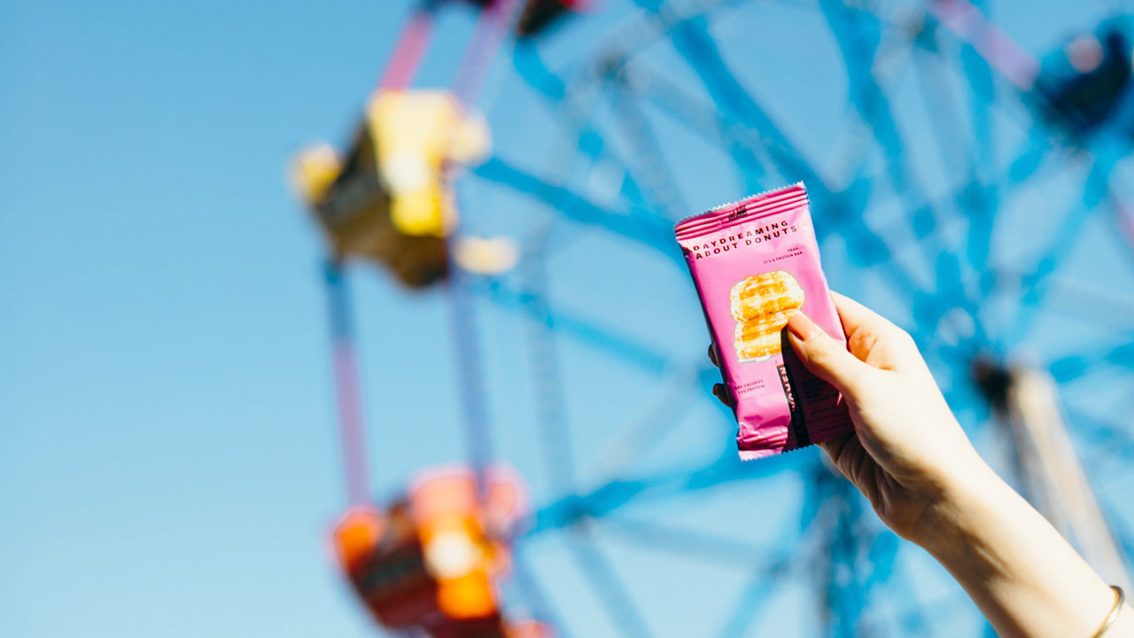
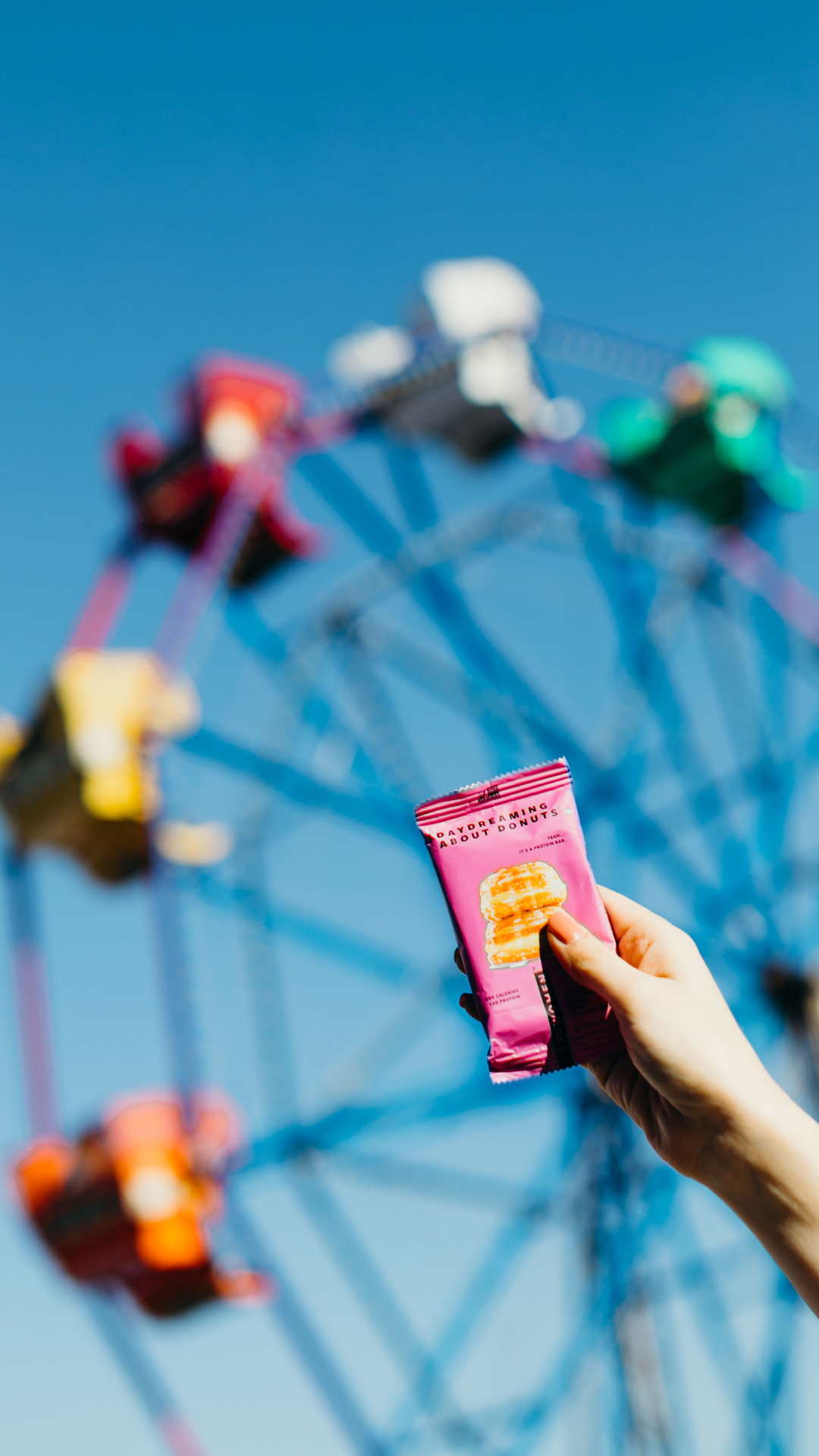
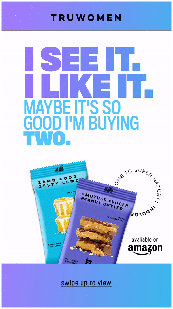
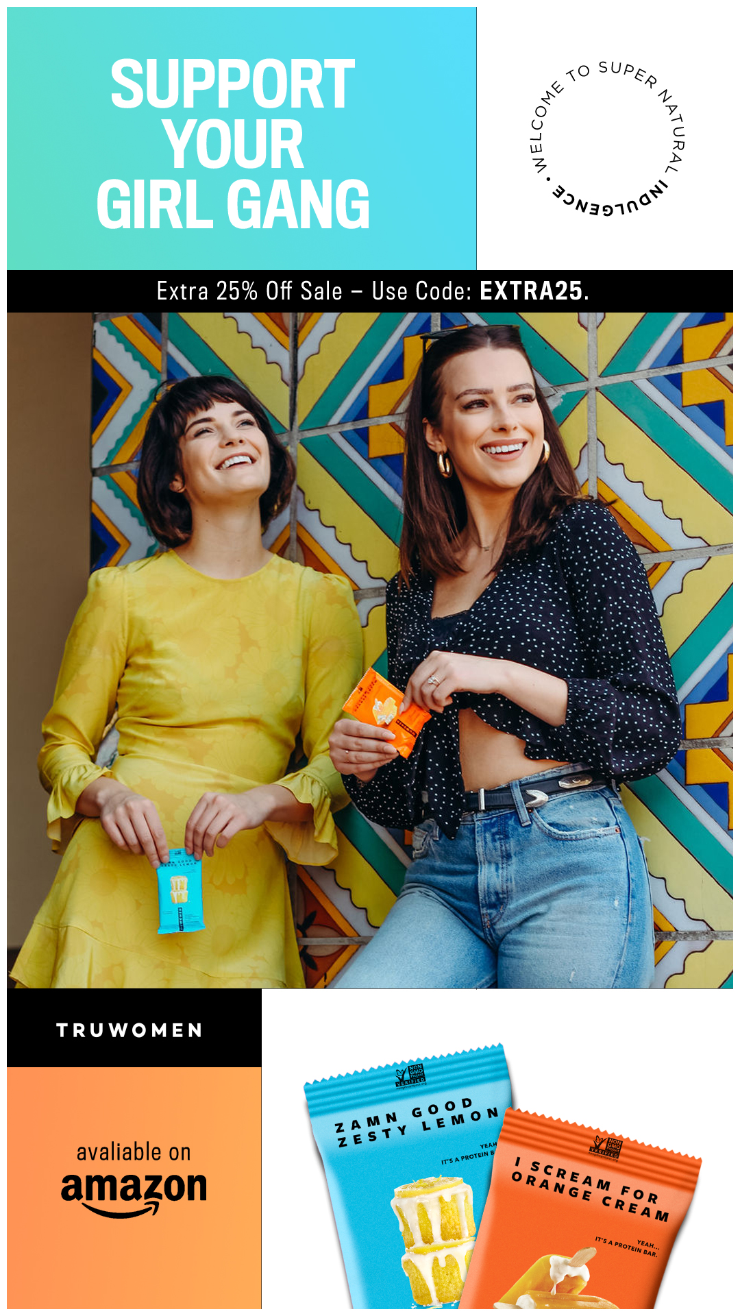
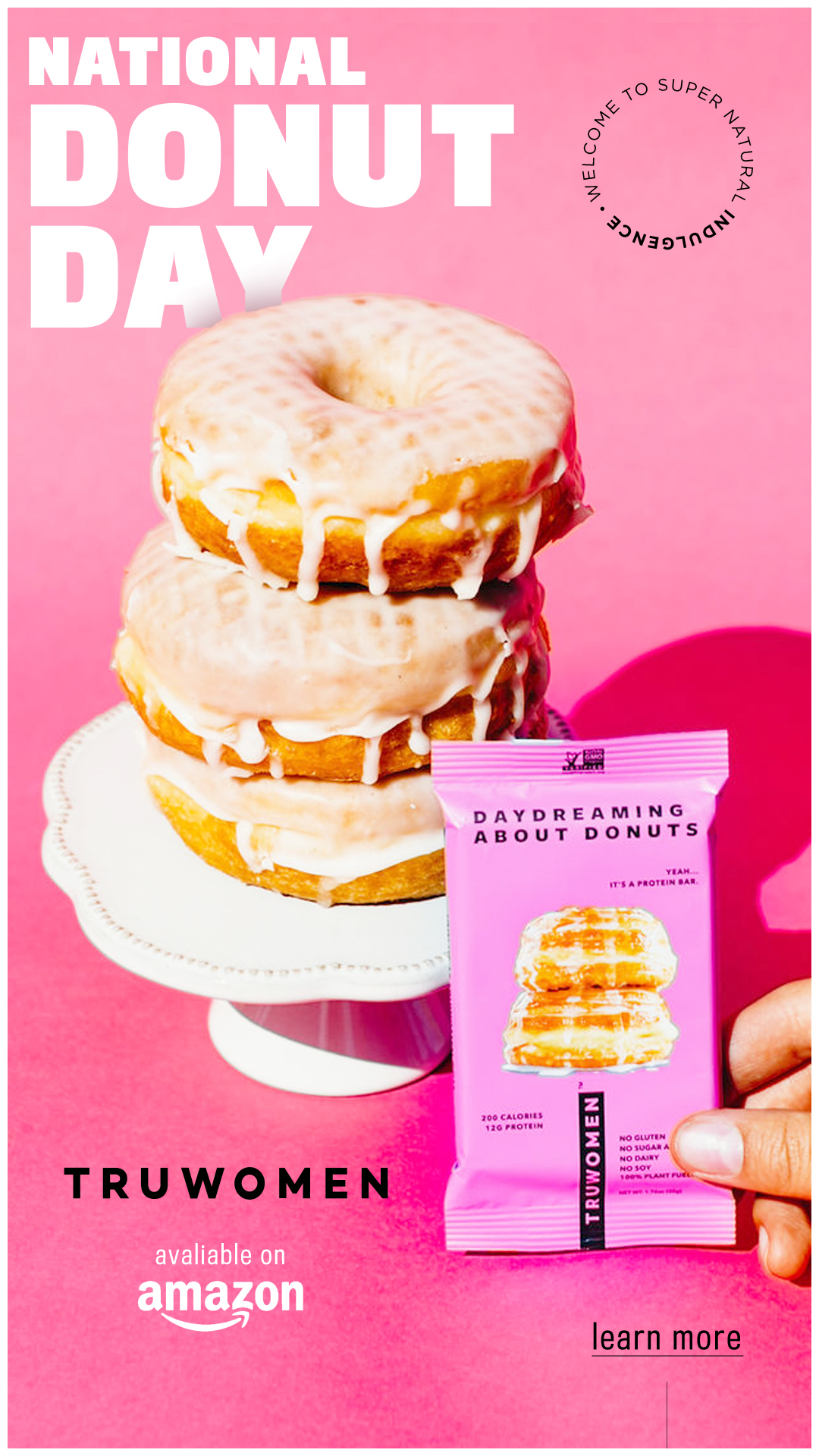
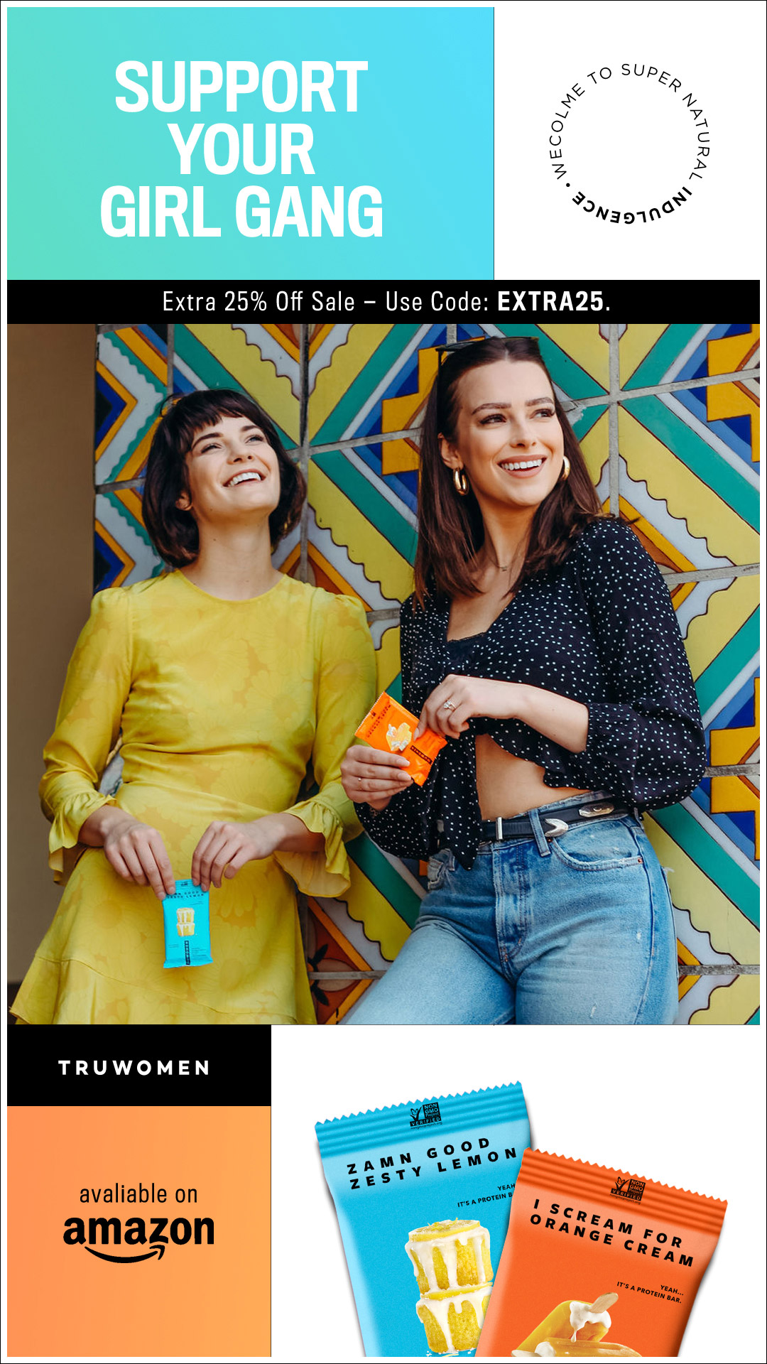
With over 70K followers on Instagram, TRUWOMEN already has a giant social presence. I focused on designing engaging and creative content that would live on their Instagram via post or through their Instagram Stories. The social content focused on showing off their protein bars and lifestyle imagery around empowering and uplifting women.
• SOCIAL MEDIA
With over 70K followers on Instagram, TRUWOMEN already has a giant social presence. I focused on designing engaging and creative content that would live on their Instagram via post or through their Instagram Stories. The social content focused on showing off their protein bars and lifestyle imagery around empowering and uplifting women.

![]()
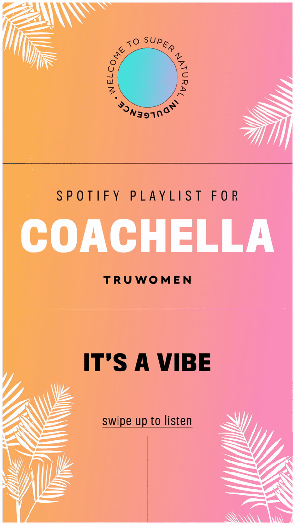
The women behind the brand came up with various quotes that were inspiring but also fun to play with when it came to merging the typography and photos together. I wanted the photography to speak for itself but I also wanted to create a couple visually compelling elements that I could use on all the creative content. This included the continuous use of the gradient sphere. I also created graphics centering around national holidays, ingredients, music events and user engagement.
![]()
The women behind the brand came up with various quotes that were inspiring but also fun to play with when it came to merging the typography and photos together. I wanted the photography to speak for itself but I also wanted to create a couple visually compelling elements that I could use on all the creative content. This included the continuous use of the gradient sphere. I also created graphics centering around national holidays, ingredients, music events and user engagement.


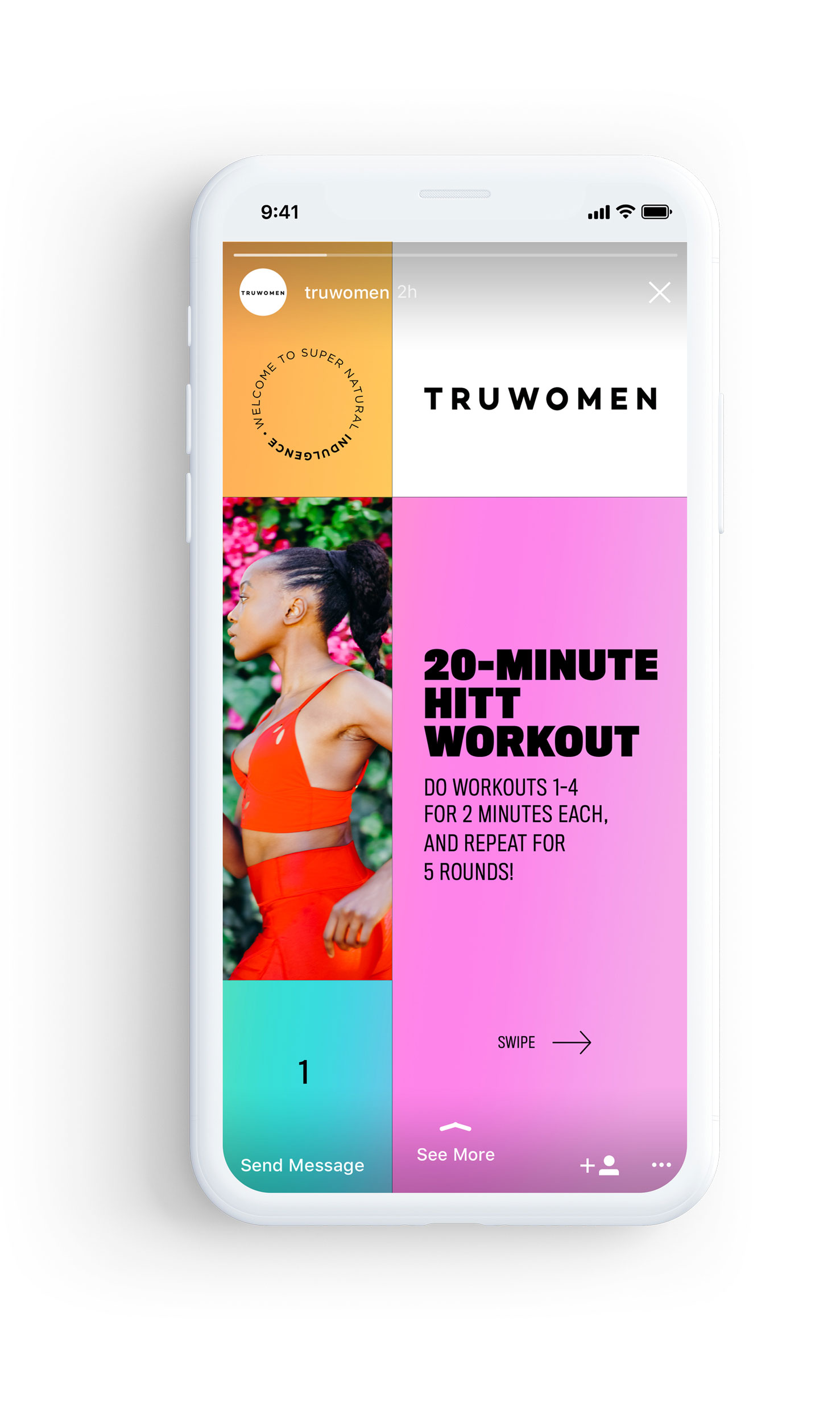

Since Instagram Stories are so popular and a great tool for engaging with audiences, TRUWOMEN wanted to leverage this by creating custom content that users could tap through and follow along with. The focused for these centered around quick and easy exercising tips.
Since Instagram Stories are so popular and a great tool for engaging with audiences, TRUWOMEN wanted to leverage this by creating custom content that users could tap through and follow along with. The focused for these centered around quick and easy exercising tips.
Since Instagram Stories are so popular and a great tool for engaging with audiences, TRUWOMEN wanted to leverage this by creating custom content that users could tap through and follow along with. The focused for these centered around quick and easy exercising tips.

• PARTNERSHIPS
The partnership between TRUWOMEN and AMAZON allows users to purchase their products directly through the Amazon store. Since this is where most users would directly go I wanted to redesign the Amazon landing page to match the new creative look. I also wanted to tout the main reasons to buy from TRUWOMEN which included using their beautiful photography, their healthy ingredients and most importantly their product reviews.
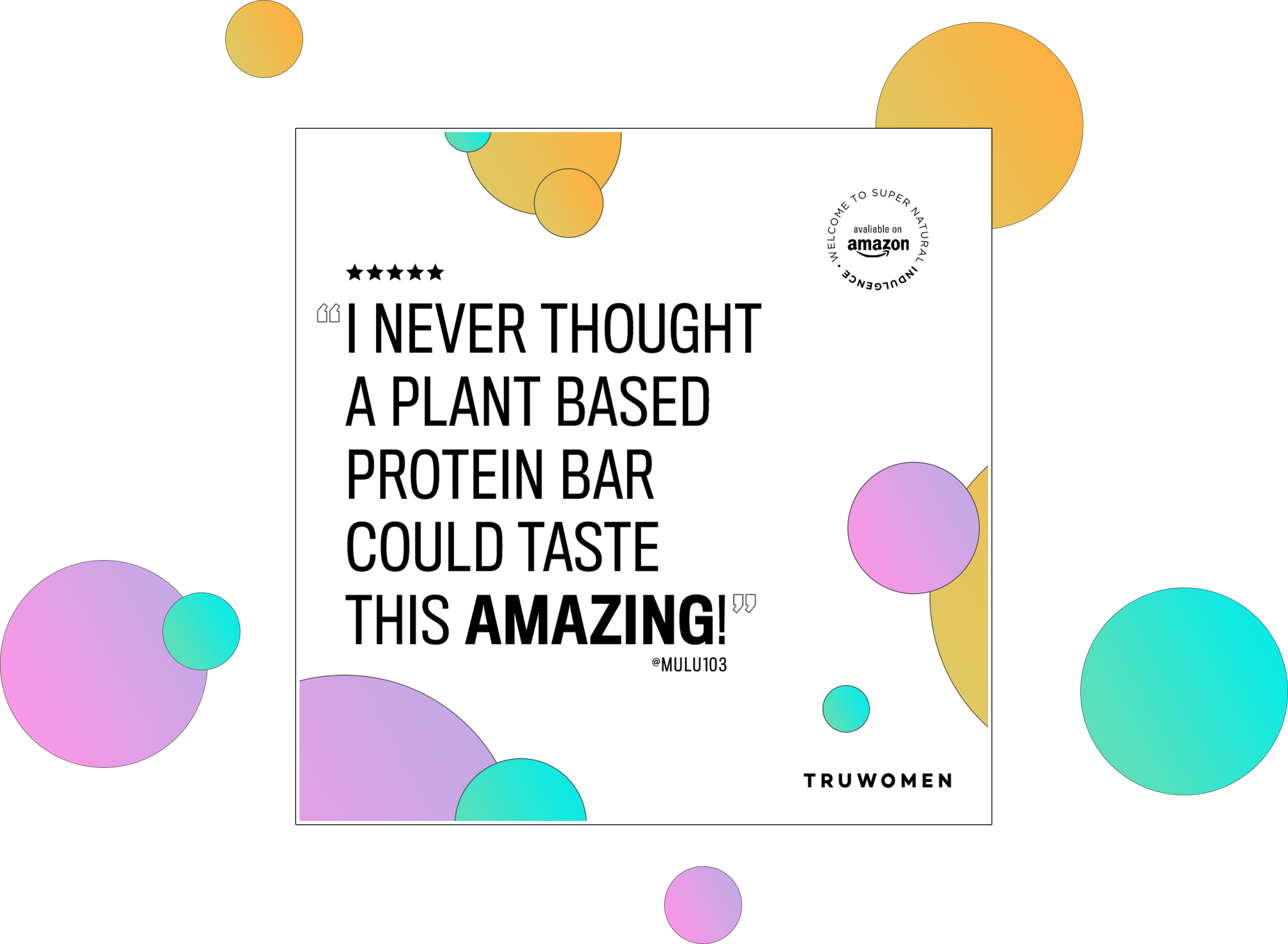
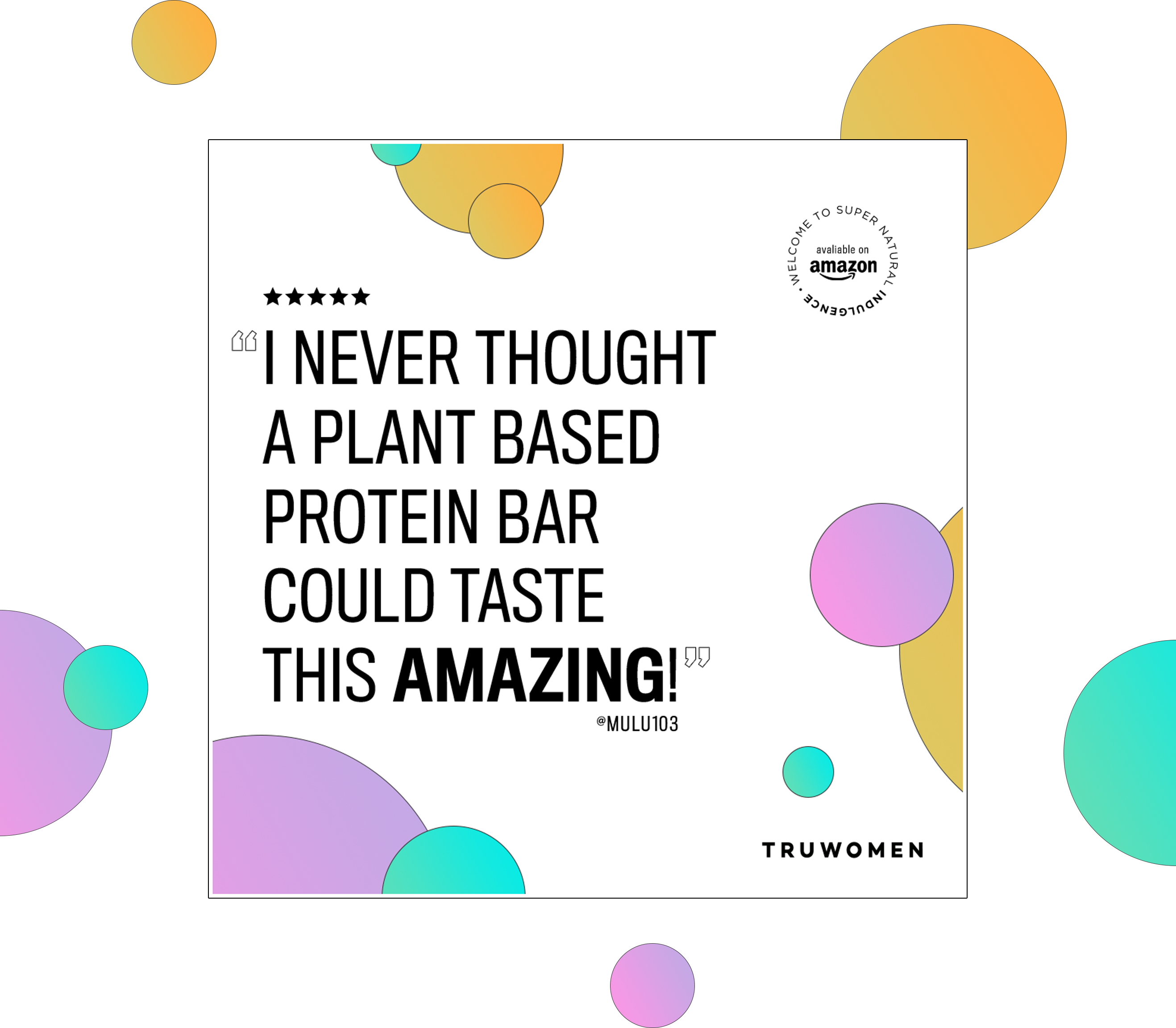
There were several great reviews from publications and I wanted to create social post to reflect this. Users could easily swipe to view articles from notable media outlets discussing products as well as the women behind the brand.
There were several great reviews from publications and I wanted to create social post to reflect this. Users could easily swipe to view articles from notable media outlets discussing products as well as the women behind the brand.
There were several great reviews from publications and I wanted to create social post to reflect this. Users could easily swipe to view articles from notable media outlets discussing products as well as the women behind the brand.
![]()
![]()
![]()
![]()
![]()
![]()
![]()
![]()
![]()
![]()
![]()
![]()
![]()
![]()
![]()


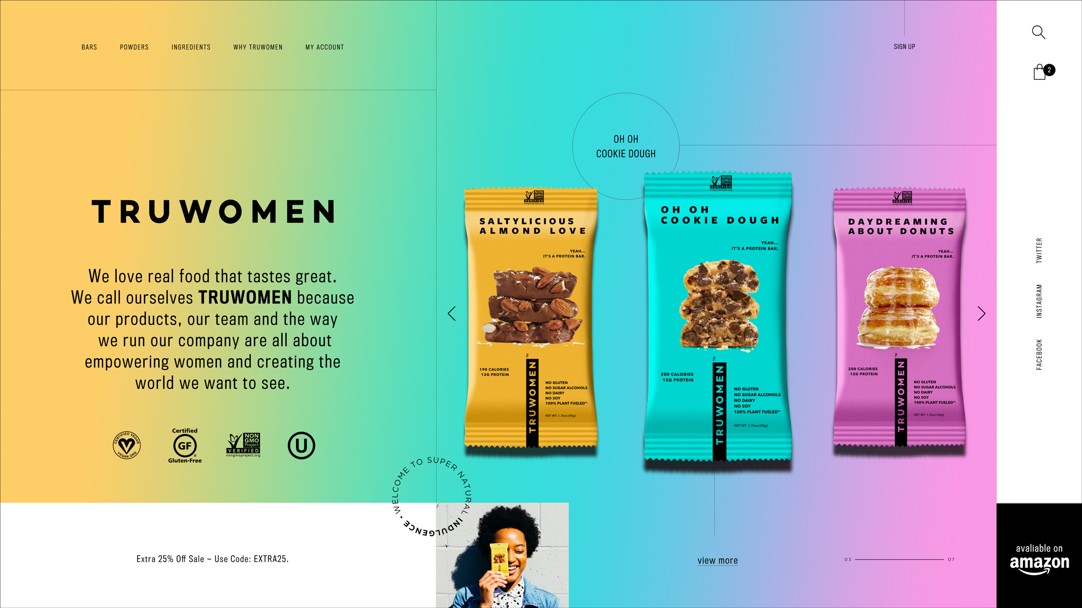
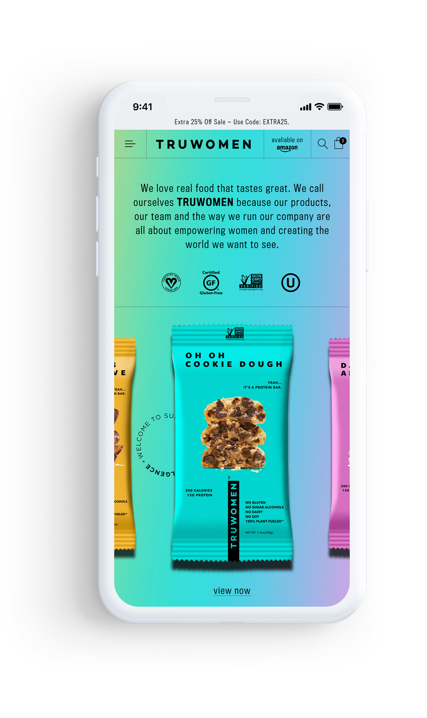
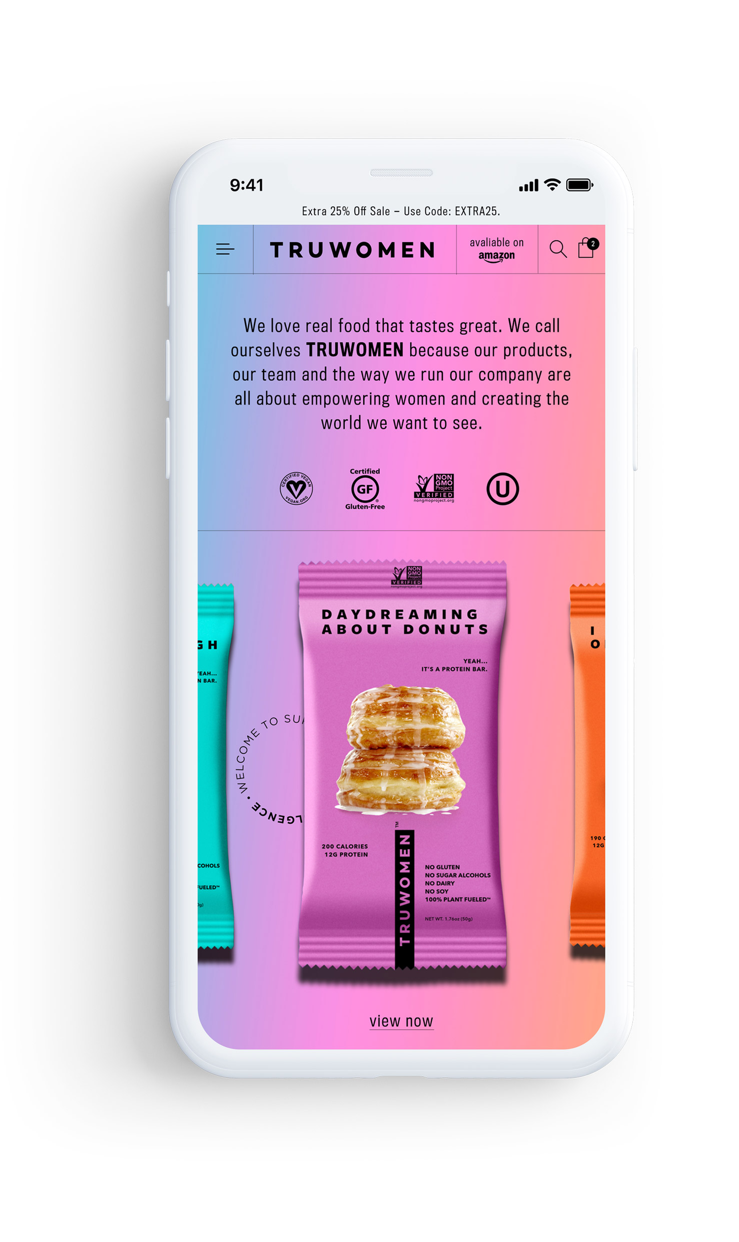
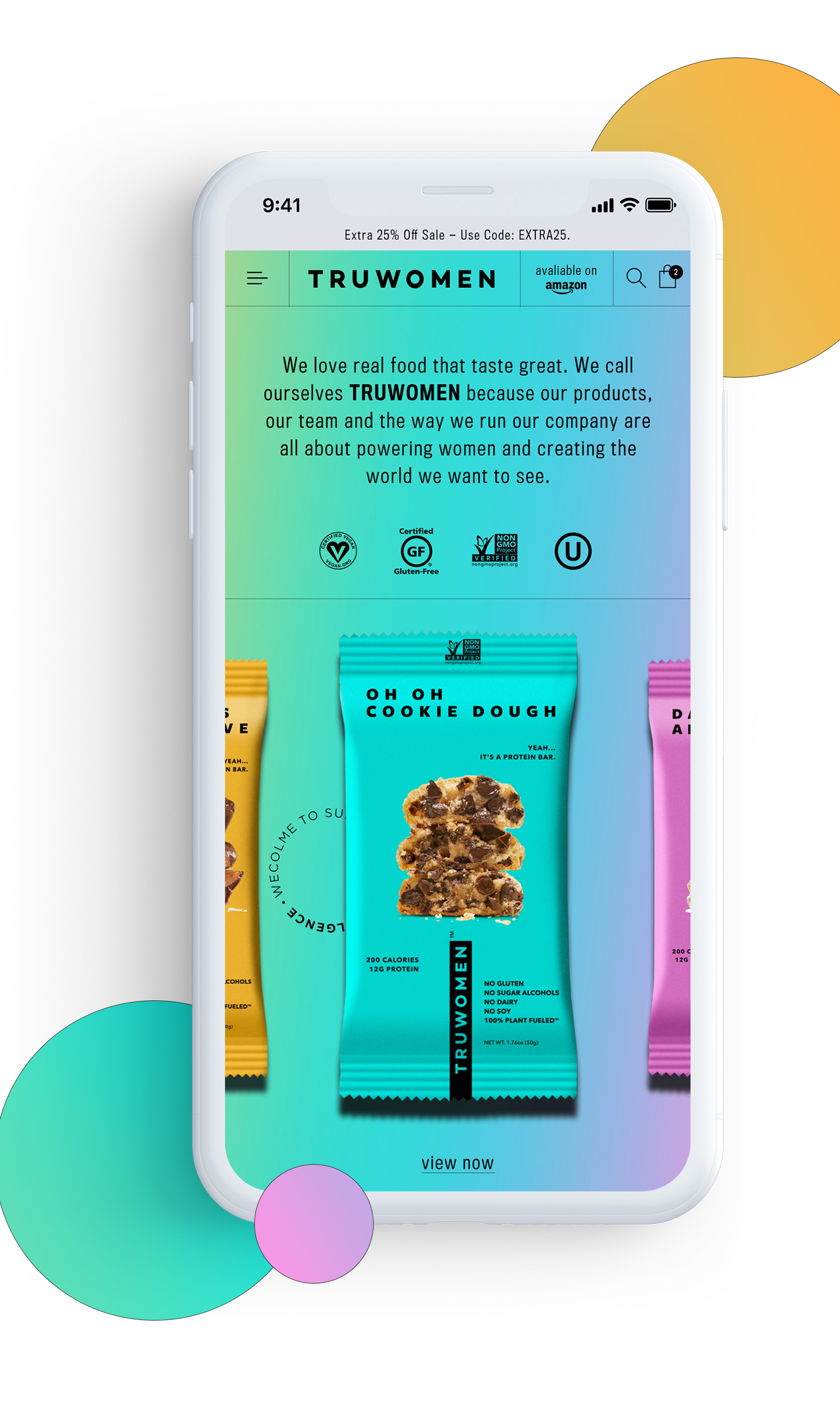
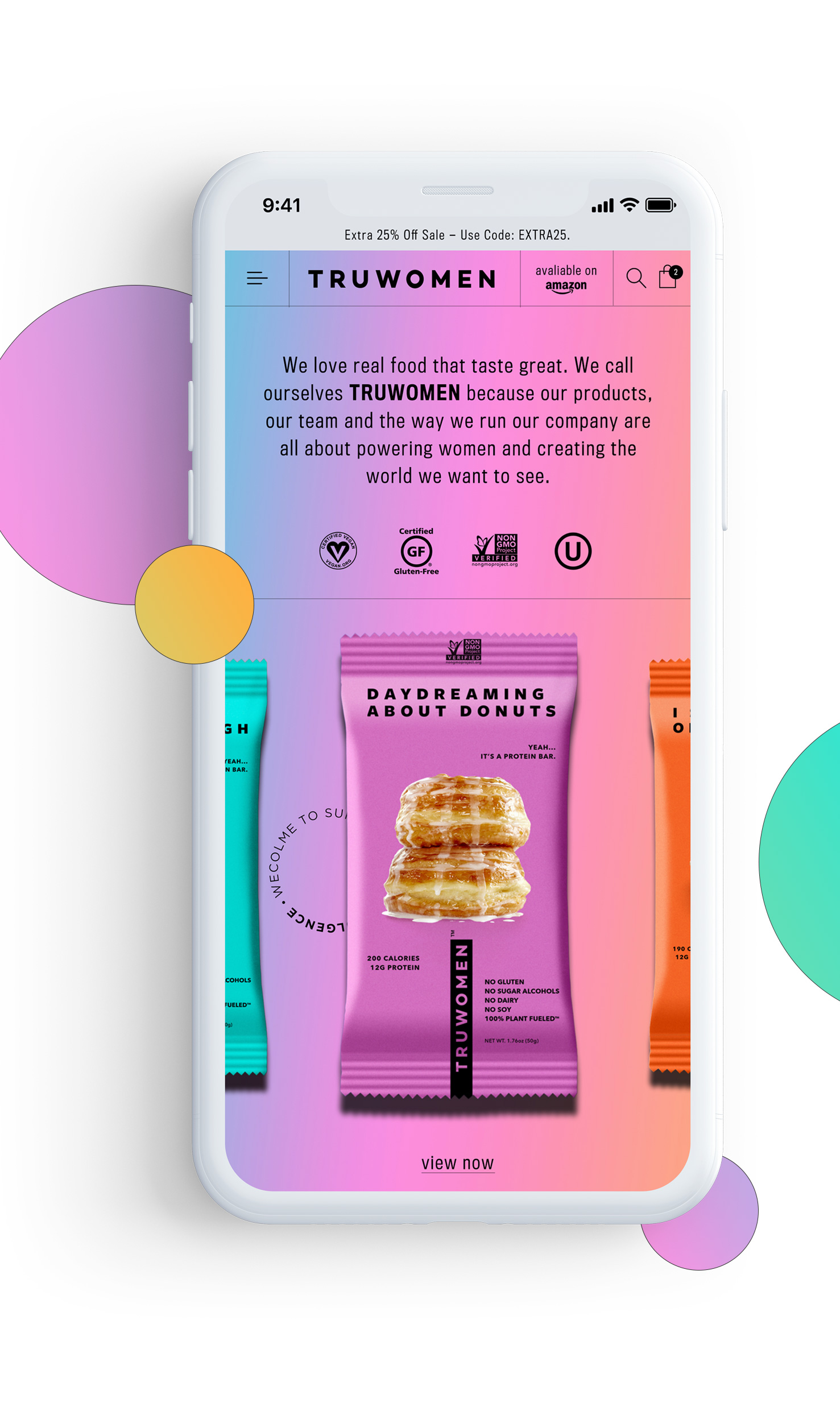
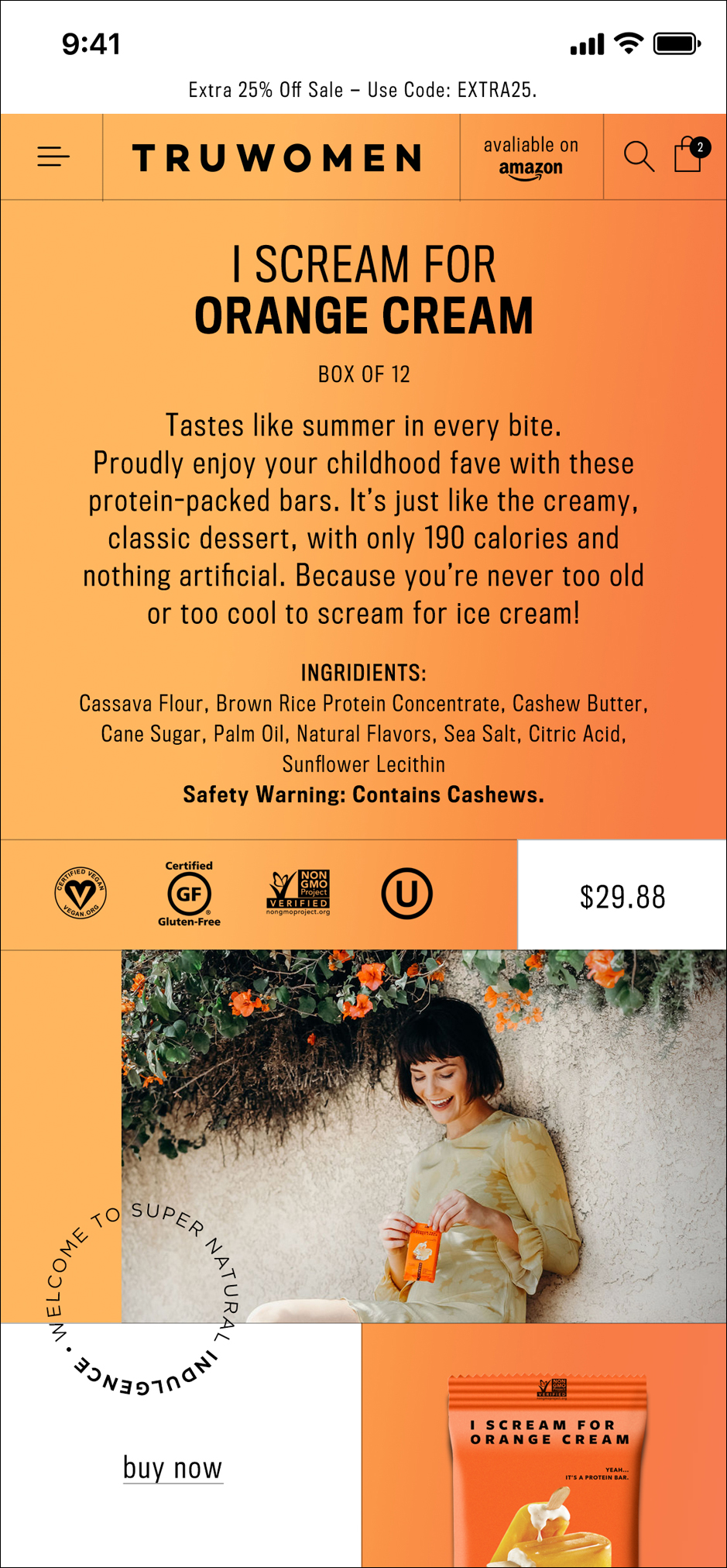
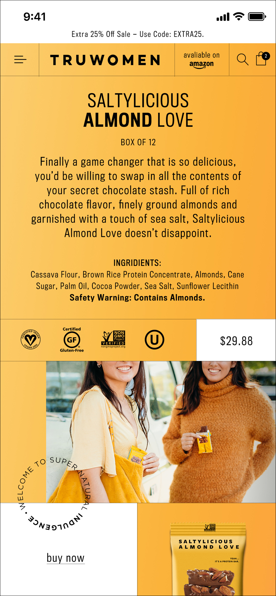
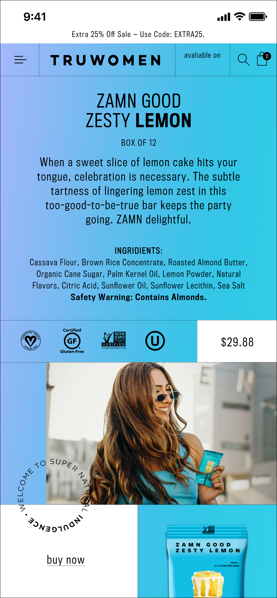
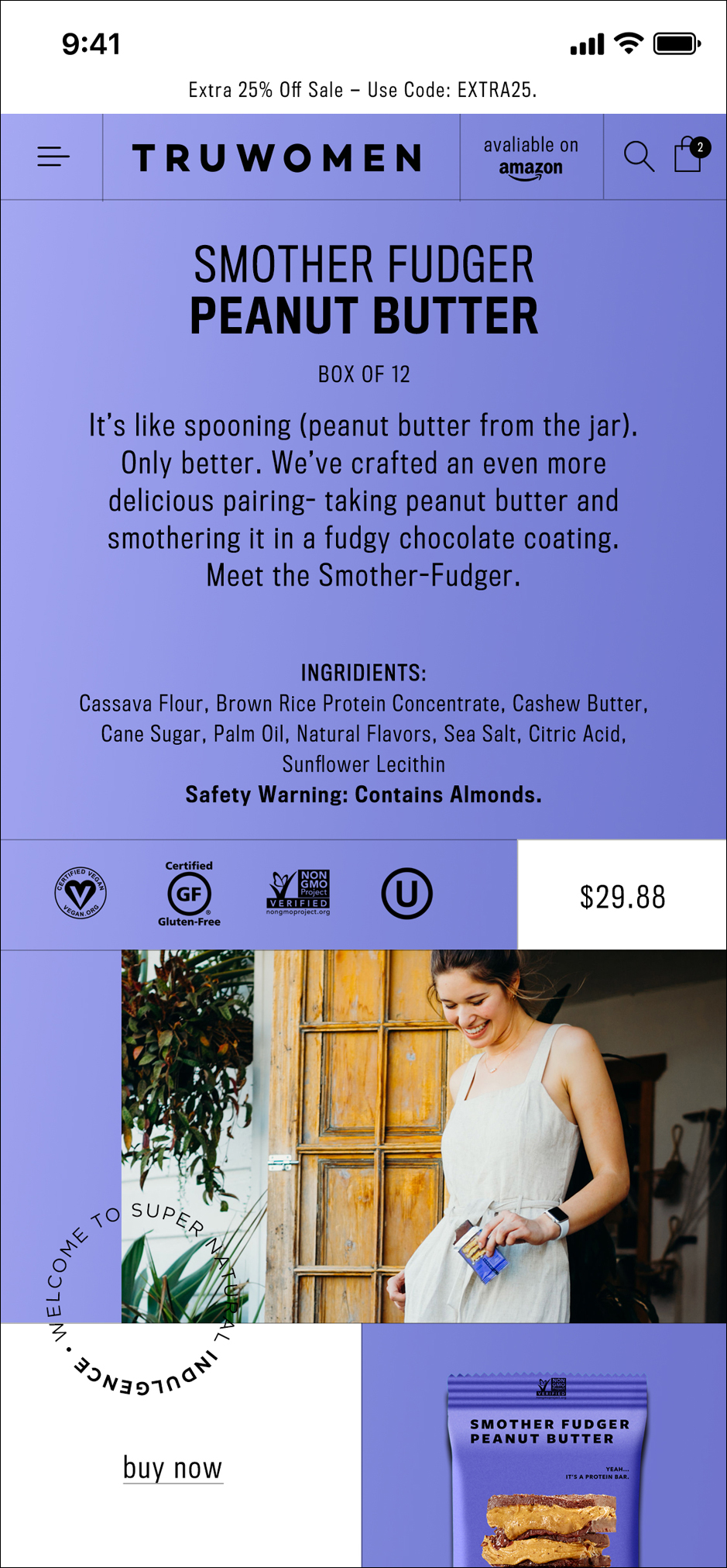
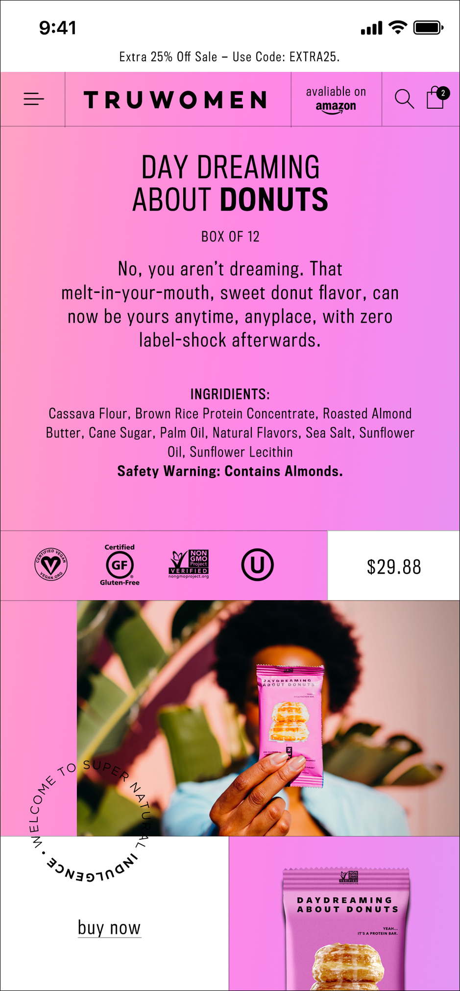
• WEB DESIGN
The most enjoyable part about this project was creating a new look for the website. The rainbow gradient is such a prominent design element in the brand and I wanted that to be the focal point for the new site. I kept the copy and design very minimal and light so that the protein bars were the center of attention. As you click or swipe to select a bar the gradient changes to reflect the color chosen.


![]()
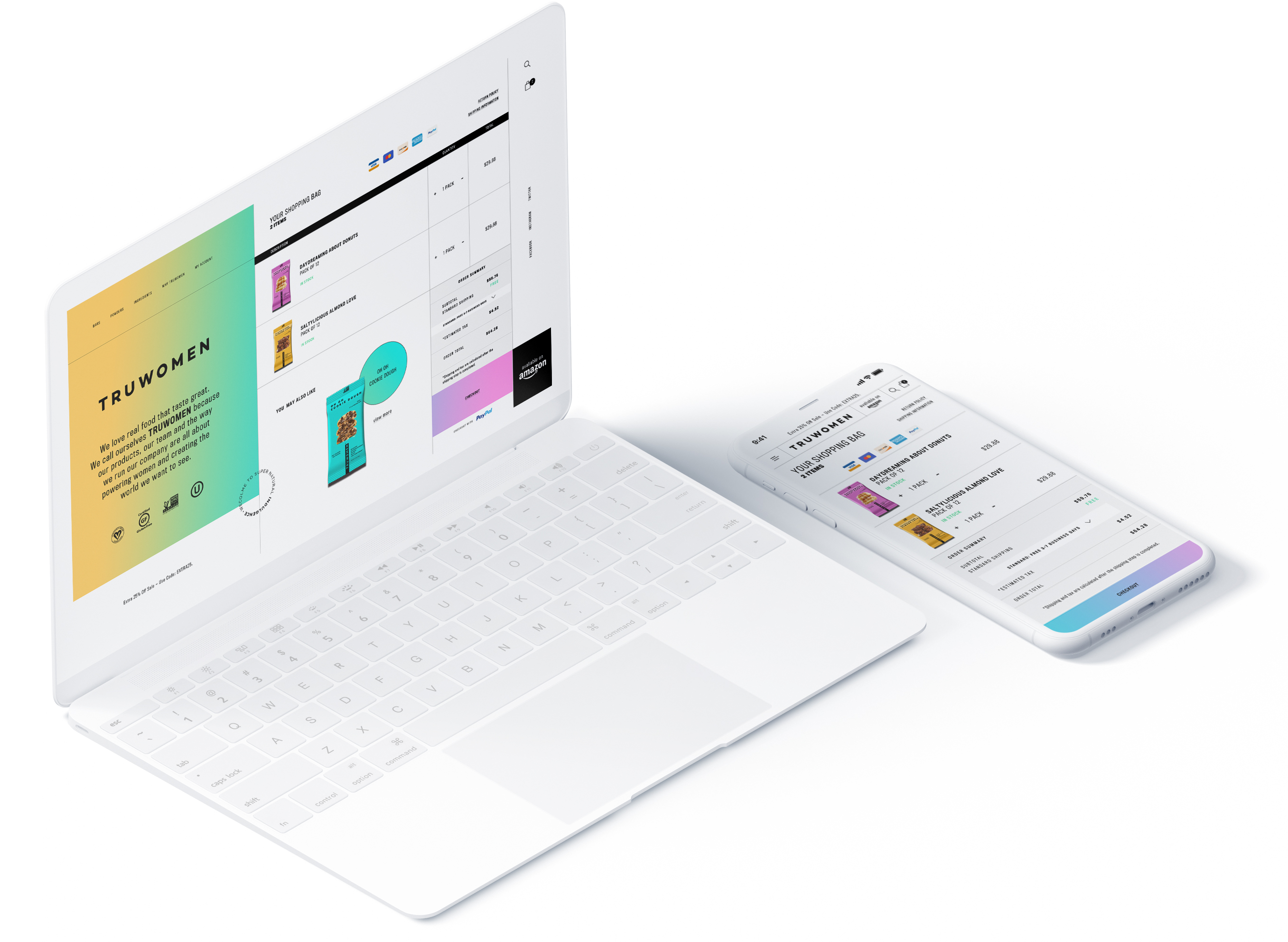
Currently users are directed to Amazon when purchasing products through the TRUWOMEN site. I wanted to create and showcase a minimal, functioning shopping cart experience. With the new look, users on desktop can easily view all the information in their cart while also easily being able to continue shopping through the split screen design.
Currently users are directed to Amazon when purchasing products through the TRUWOMEN site. I wanted to create and showcase a minimal, functioning shopping cart experience. With the new look, users on desktop can easily view all the information in their cart while also easily being able to continue shopping through the split screen design.
Currently users are directed to Amazon when purchasing products through the TRUWOMEN site. I wanted to create and showcase a minimal, functioning shopping cart experience. With the new look, users on desktop can easily view all the information in their cart while also easily being able to continue shopping through the split screen design.

• CONCLUSION
This project was important to me because I was able to have such an important role in designing the look of the social campaign. The thing I loved the most was being able to see the likes and engagement the followers had with the post. It was fulfilling to work with a brand that has a strong message and a great product that is healthy for people.
![]() view next project
view next project
APPLE
Celebrate Spring Festival